5 Kitchen Island Color Ideas That’ll Make Your Whole Kitchen Look Custom
Your kitchen island is basically the stage, and everything else is the background dancers. So if your island color is giving “builder beige,” we need to talk.
The good news? You don’t need a full renovation or a reality TV budget. You just need one smart color move that makes your island look intentional, a little fancy, and like you totally meant to do that.
Here are 5 kitchen island color ideas that feel fresh, livable, and not like you’re trying too hard (even if you are, a little).
1. The “Soft Black” Island That Makes Everything Look Expensive
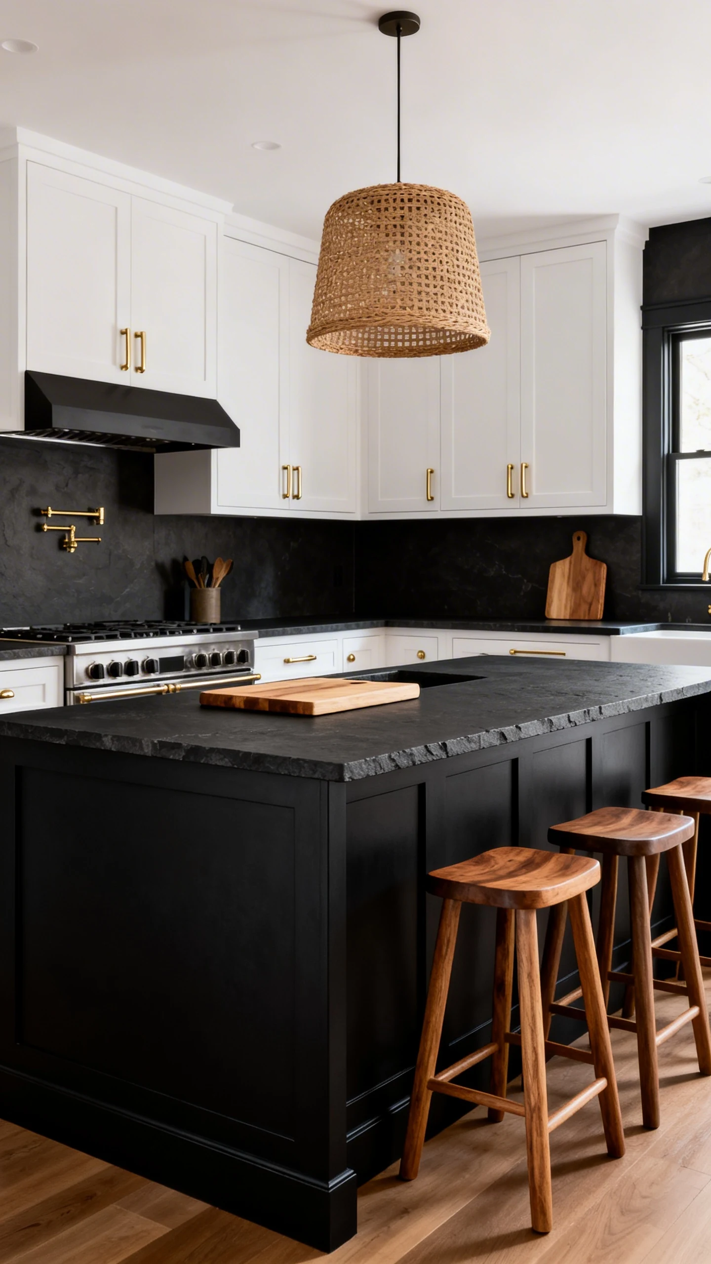
Let’s start with the drama. A soft black island is the quickest way to make a kitchen look high-end—without going full gothic mansion.
Think charcoal, blackened slate, or that inky black that still shows a hint of warmth. It’s moody, but not “I only cook by candlelight” moody.
Why It Works
Soft black acts like a neutral, but it adds contrast and definition. It makes white cabinets look crisp, wood tones look richer, and your countertops look like they cost more than they did. (We love a glow-up.)
Make It Look Intentional (Not Like You Ran Out of White Paint)
- Use warm metals like brass or champagne bronze hardware to keep it from feeling cold.
- Add texture with a matte or satin finish—high gloss can scream “I tried in 2009.”
- Ground it with natural elements like wood stools, a woven pendant shade, or a cutting board moment.
- Pick the right black: If your counters are warm, choose a black with warm undertones; if they’re cool, go charcoal.
FYI: soft black is also super forgiving. Smudges? Crumbs? Life? It hides a lot better than you’d think.
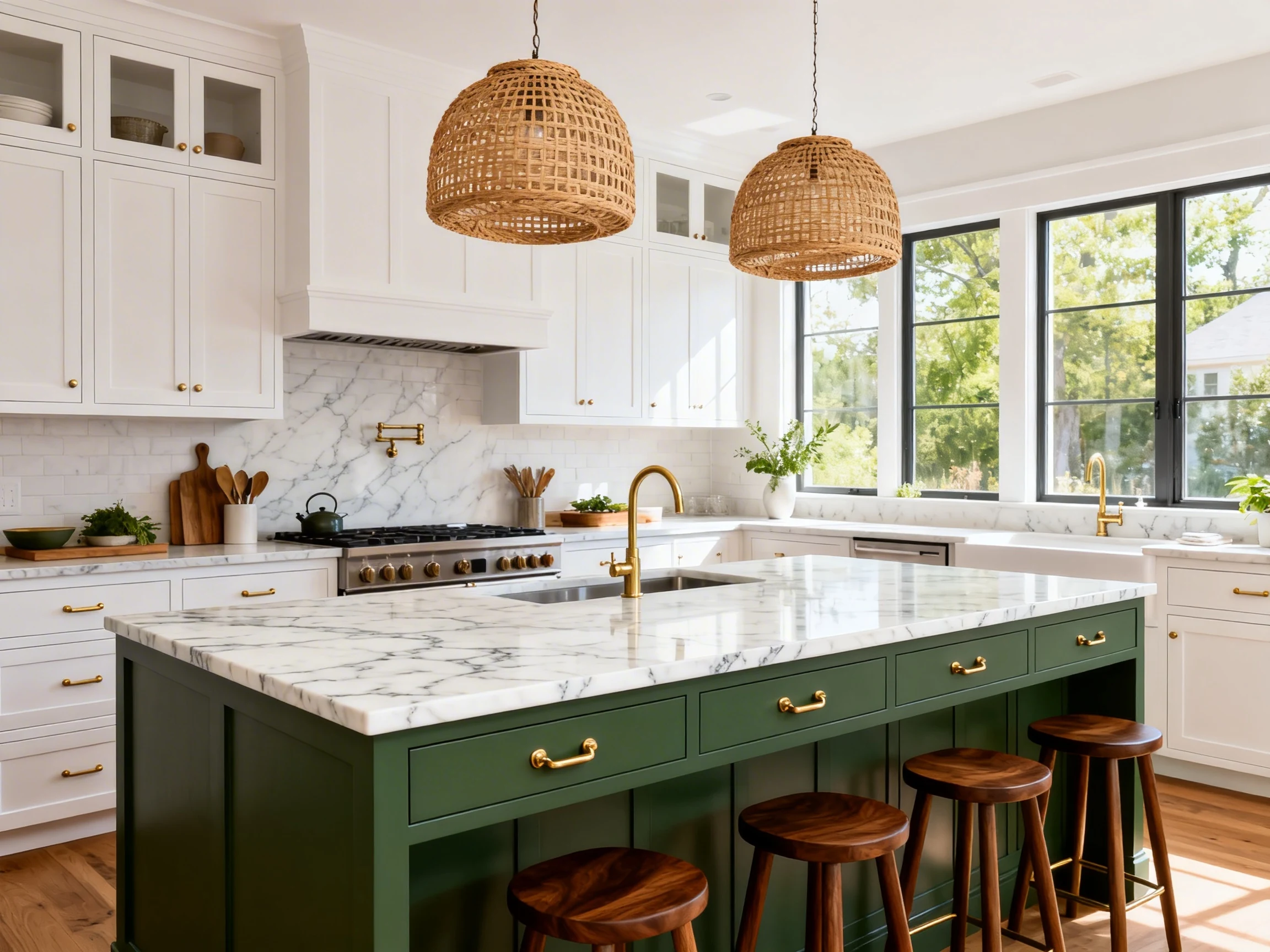
2. A Muted Sage Green Island for Calm, Cozy, “I Have My Life Together” Energy
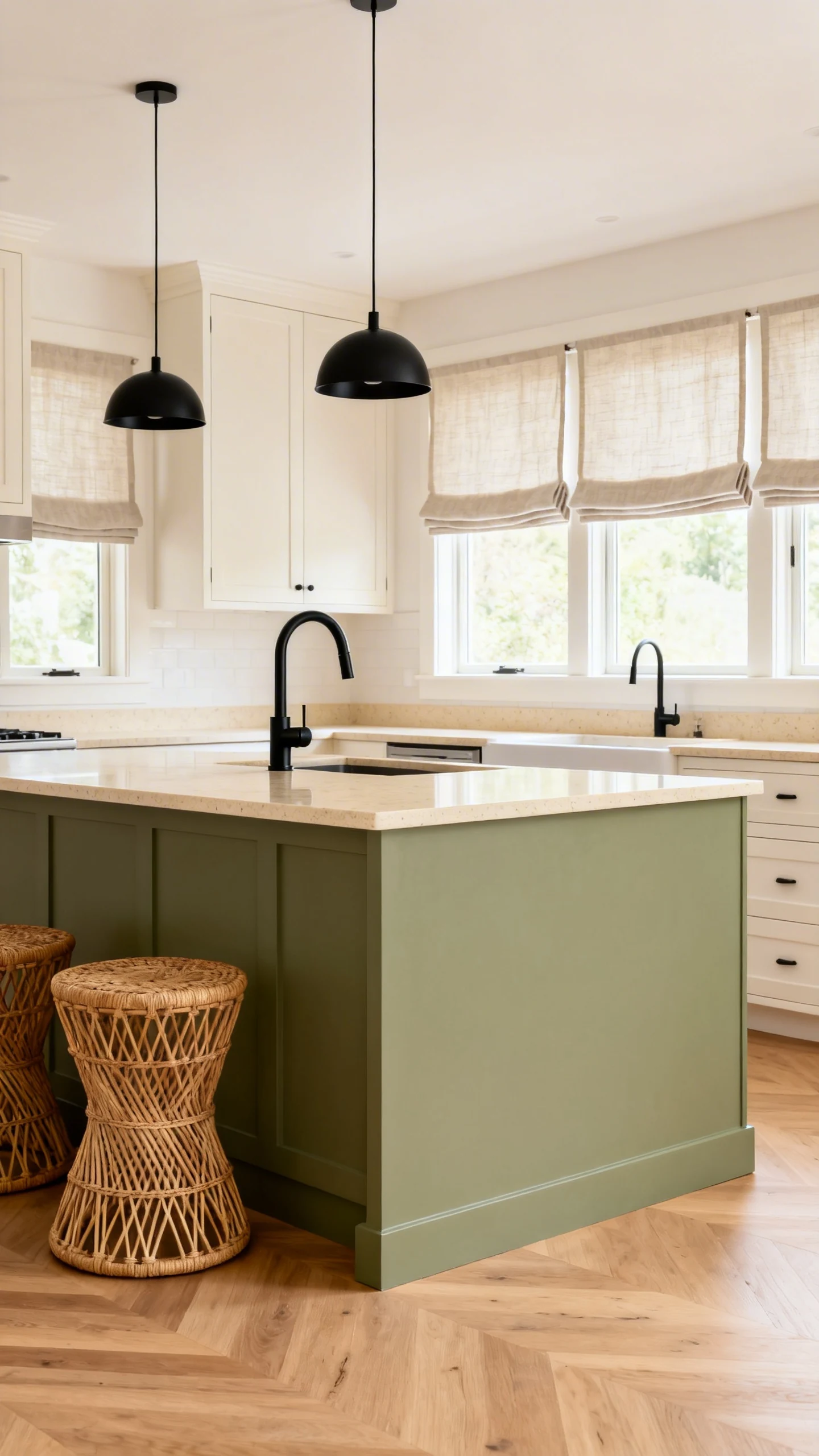
If you want your kitchen to feel soothing instead of shouty, go for muted sage green. It’s the color equivalent of fresh air and a clean countertop (even if yours isn’t clean right now—no judgment).
Sage works especially well if your kitchen already leans neutral. It adds personality without turning your island into the main character in a chaotic way.
Where Sage Really Shines
This is one of those kitchen island color ideas that plays nicely with almost everything: white cabinets, light oak floors, creamy quartz, even darker stone if the sage is soft enough.
How To Style It So It Doesn’t Feel “Country Craft Store”
- Keep the green dusty, not bright—think “herb garden,” not “lime popsicle.”
- Pair with creamy whites for a cozy, not stark, contrast.
- Add black accents (faucet, pendants, hardware) to modernize the whole look.
- Use natural textures like linen Roman shades or rattan stools for that calm, layered vibe.
IMO, sage is the safest “color” choice if you’re nervous about committing. It’s trendy, yes, but it’s also timeless enough to not haunt you later.
3. A Navy Blue Island That Feels Classic (And Hides Chaos Like a Champ)
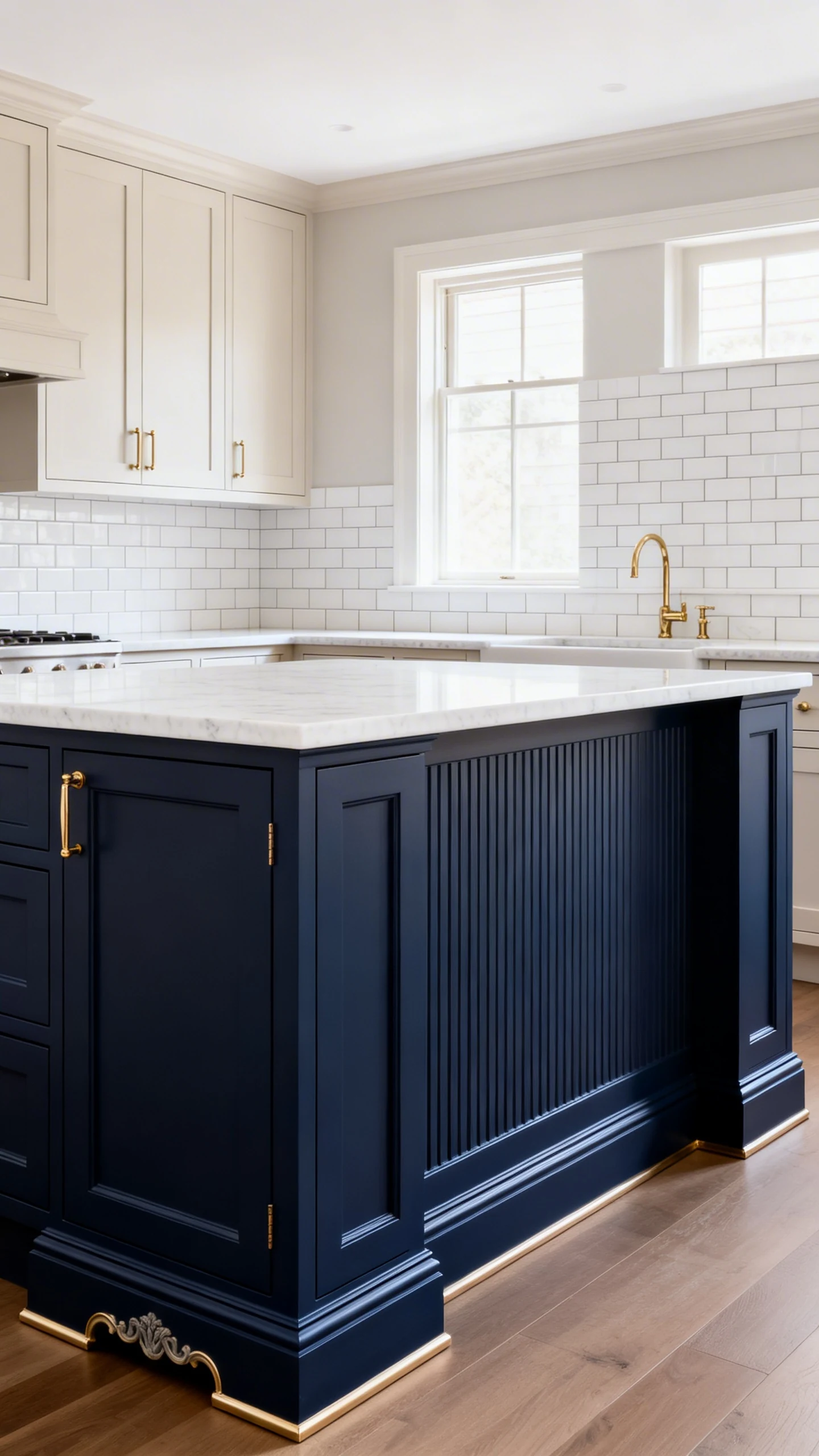
Want a color that feels bold but still classic? Navy blue is your friend. It’s like the perfect blazer of kitchen colors: always looks put-together, never feels too loud.
Plus, navy has that magical ability to hide little scuffs and everyday mess. If your island gets heavy traffic (aka life happens), this is a smart move.
Best Pairings for a Navy Island
Navy looks amazing with white perimeter cabinets, but it also works with soft greiges, warm woods, and even pale blue-gray walls. The trick is keeping the rest of the space light enough so the island doesn’t feel like a giant block.
- Countertops: white quartz, marble-look surfaces, or light granite to brighten it up.
- Hardware: brass for warmth, polished nickel for classic, matte black for modern edge.
- Backsplash: simple white tile, zellige, or subtle pattern if you’re feeling brave.
Quick “Designer” Touches That Make Navy Look Custom
- Extend the island color to matching open shelves or a built-in pantry for cohesion.
- Add furniture-style details like legs, beadboard panels, or a decorative toe kick.
- Choose a slightly softer navy if you have low natural light—super dark blues can get heavy.
Also, navy makes your bar stools look more expensive. It’s not science, it’s vibes.
4. A Warm Clay or Terracotta Island for Instant “Styled Home” Personality
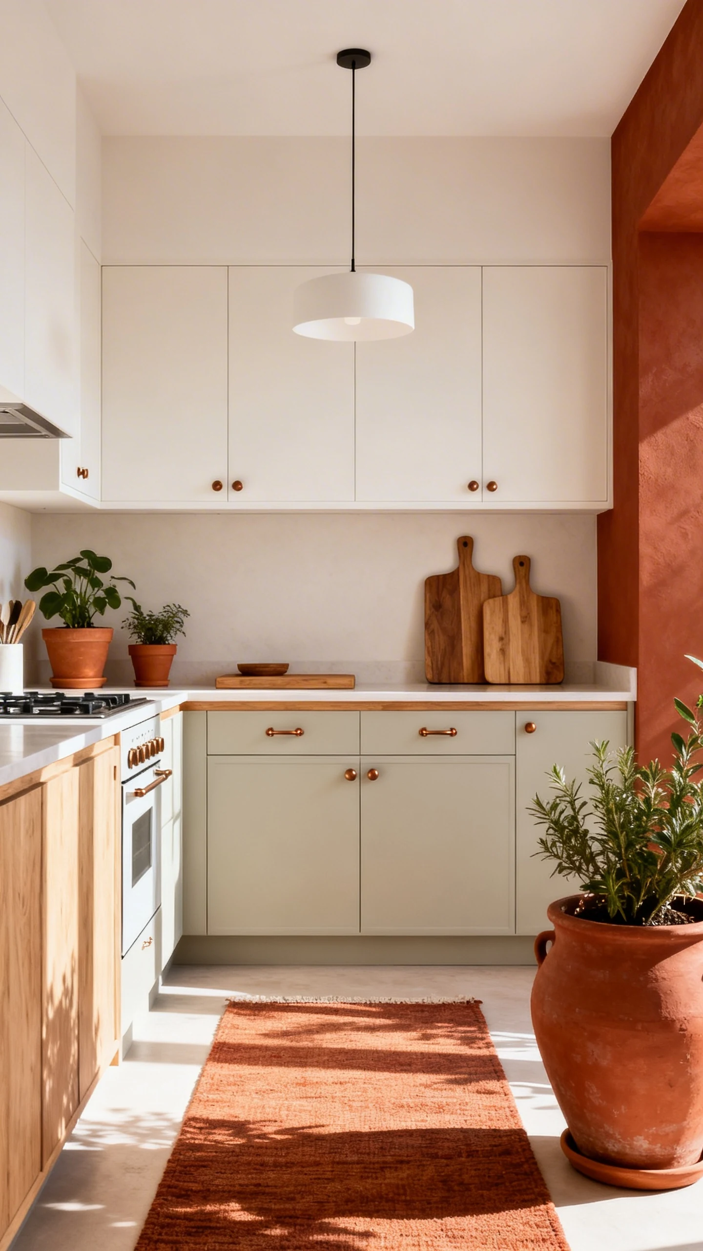
Okay, let’s talk about the fun one. A clay, terracotta, or dusty rust island is for people who want their kitchen to feel curated, not cookie-cutter.
This color family brings warmth in a way that white and gray never will. It’s like your kitchen got a sunny vacation and came back glowing.
Why This Color Works Surprisingly Well
Terracotta tones are earthy, which makes them feel grounded and natural—especially with stone, wood, and warm metals. They also add contrast without the starkness of black.
How To Keep It Chic (Not “Southwestern Theme Park”)
- Pick a muted version: think dusty clay, not bright orange.
- Balance with neutrals like creamy whites, warm greiges, or light oak cabinetry.
- Use simple lighting (clean lines, minimal shapes) so the island color is the star.
- Repeat the warmth with terracotta planters, a warm-toned rug, or wood cutting boards.
Rhetorical question: do you want your kitchen to feel like a showroom, or like an actual home with personality? Exactly.
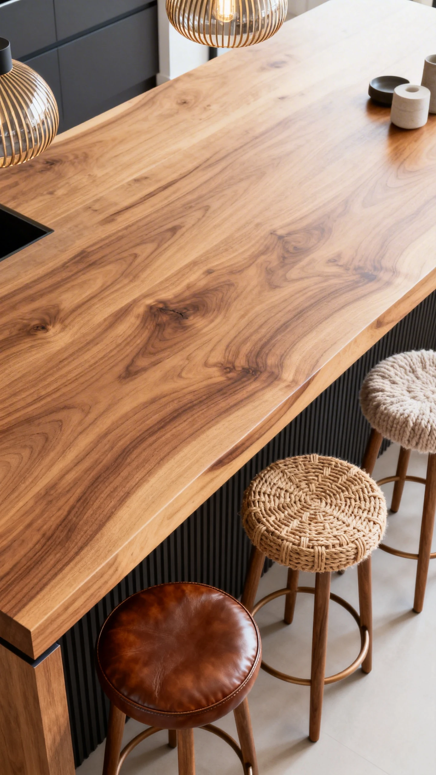
5. A Natural Wood-Tone Island That Never Goes Out of Style
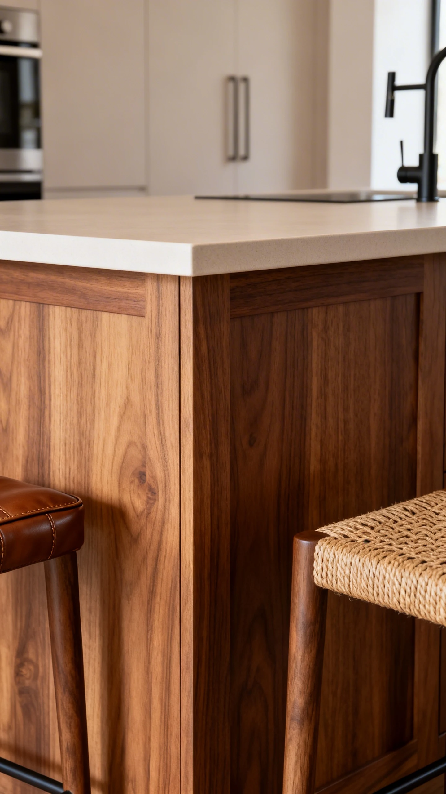
If paint commitment makes you sweat, a wood-tone island is the timeless option that still feels special. It adds warmth, texture, and that “custom kitchen” look without relying on a trendy color of the year.
And yes, you can absolutely do wood on the island even if you have wood floors. You just need the tones to play nicely instead of fighting like siblings.
How To Nail the Wood Look
The secret is choosing the right undertone. Warm oak feels cozy and modern. Walnut feels rich and a little dramatic. Lighter woods feel airy and Scandi-calm.
- Match undertones: warm wood with warm whites; cooler wood with cooler grays.
- Mix, don’t match: your island wood should complement the floor, not duplicate it perfectly.
- Choose the right finish: matte or satin reads more current than super shiny.
- Keep counters simple: let the wood grain be the visual texture.
Easy Upgrades That Make a Wood Island Look Next-Level
- Statement pendants above the island for that “designer did this” energy.
- Thicker countertop edge or waterfall sides if you want a modern twist.
- Textured stools in leather, woven, or boucle to layer the look.
And if you’re worried about wood being “too traditional,” just pair it with modern hardware and clean-lined lighting. Boom—updated.
Choosing the right island color is basically choosing the vibe of your kitchen. Go moody, go calm, go classic, go earthy, or go timeless wood—just make it feel like you.
Pick one of these kitchen island color ideas, commit, and enjoy that moment when someone walks in and goes, “Wait… did you renovate?” You’ll say no, obviously. Let them wonder.