5 Kitchen Cabinet Color Ideas That’ll Make Your Whole Kitchen Look Expensive
So you’re staring at your kitchen cabinets like they personally offended you. Relatable.
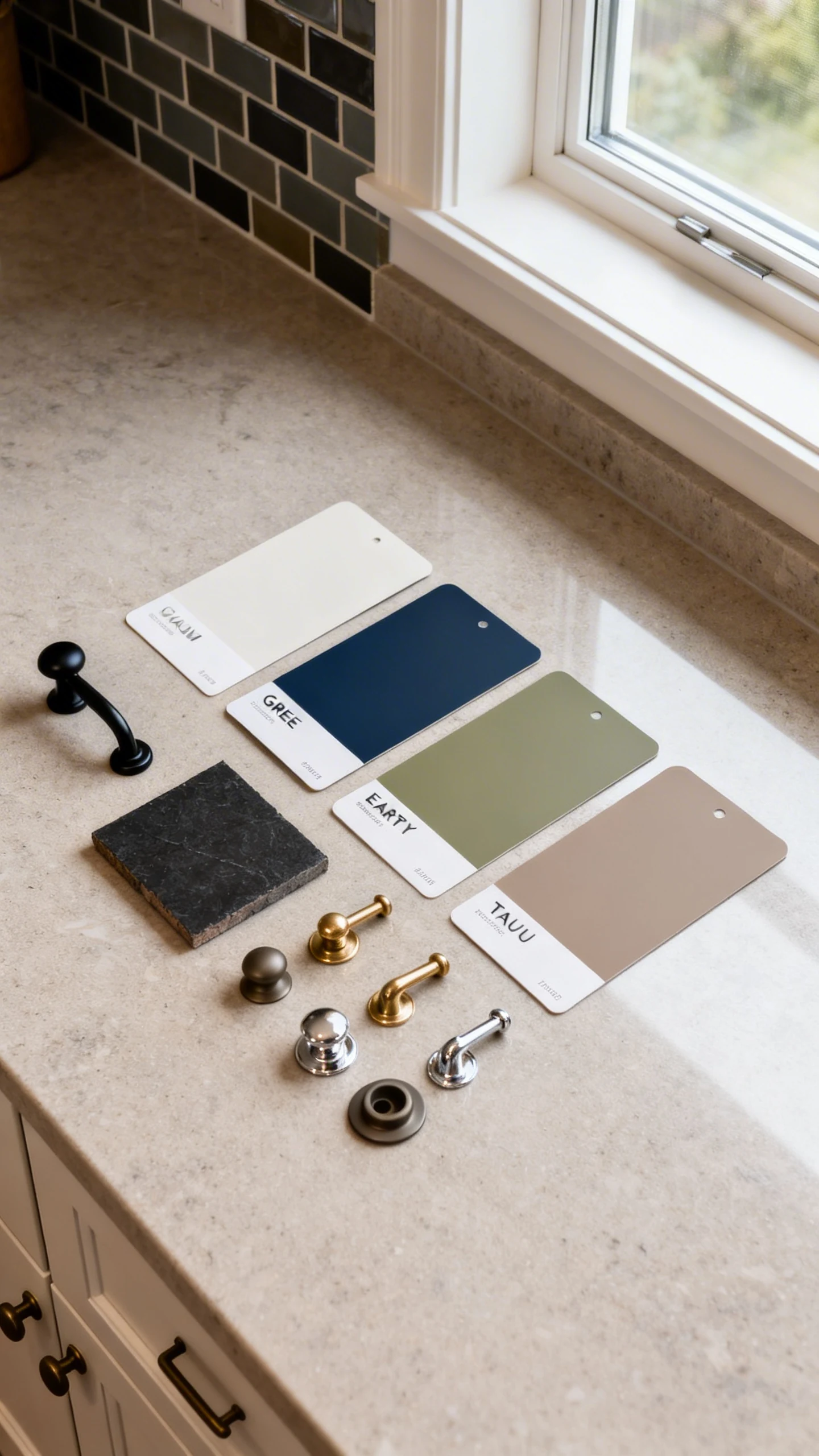
Cabinet color is one of those sneaky choices that changes everything—your counters, your backsplash, even how “clean” your kitchen looks when you definitely didn’t deep-clean. And yes, it can make a builder-basic kitchen look custom without selling a kidney.
Here are 5 kitchen cabinet color ideas that actually work in real homes, with real lighting, and real life happening.
1. The “Soft White, Not Boring” Classic
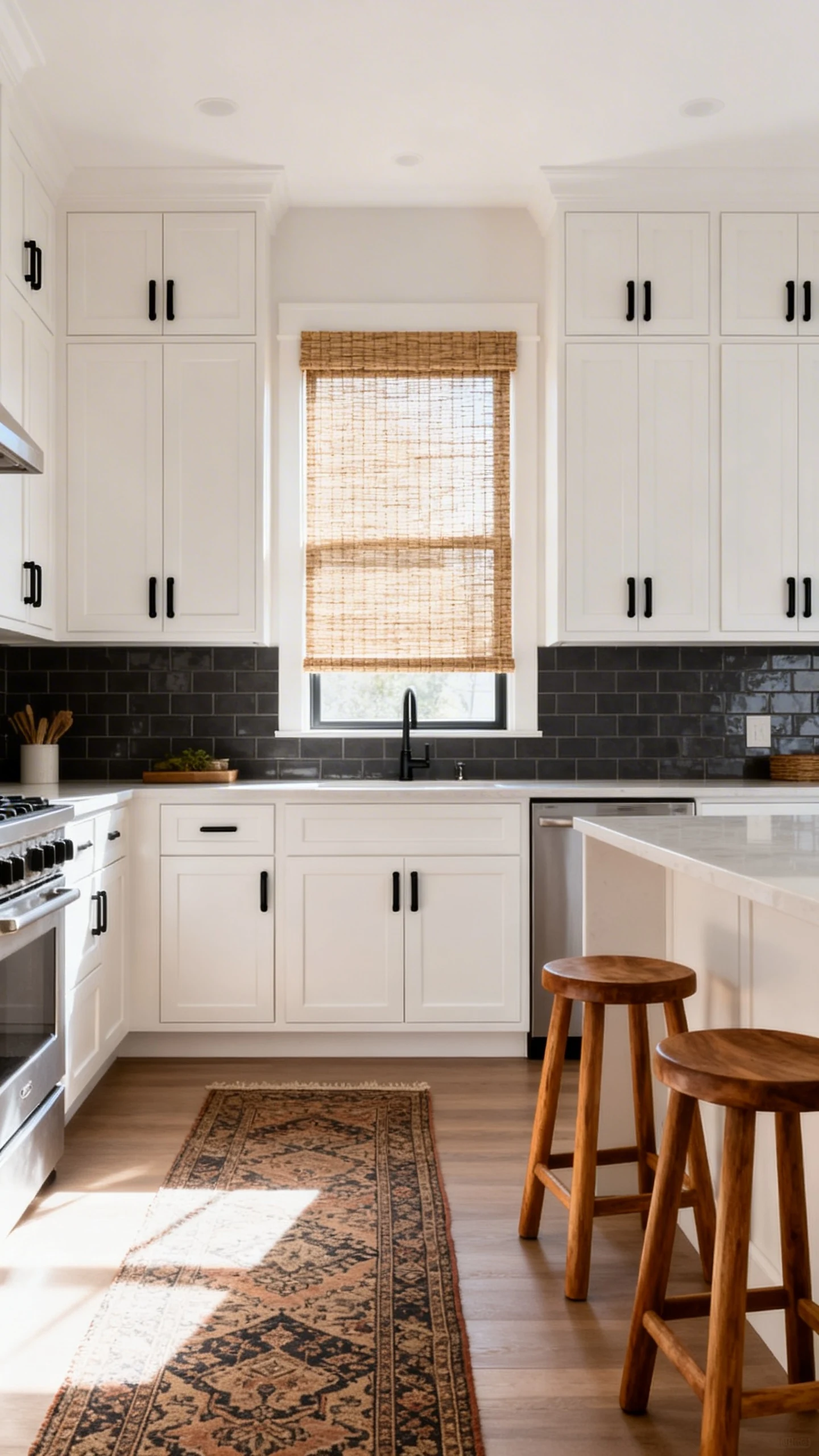
White cabinets get dragged online for being “basic,” but honestly? They’re classic for a reason. The trick is choosing a white that looks intentional, not like you grabbed the cheapest paint and prayed.
Go for a soft, warm white if you want cozy. Go for a crisp, clean white if you want modern and bright. Either way, your kitchen instantly looks bigger, lighter, and way more put-together.
How To Keep White Cabinets From Looking Flat
White needs a little styling backup, otherwise it can feel like a blank email draft. Give it contrast and texture so it looks designed, not default.
- Choose the right hardware: matte black for edge, brass for warmth, chrome for clean and modern.
- Add a moody backsplash: white cabinets plus a dark tile is an instant glow-up.
- Mix finishes: wood stools, woven shades, or a vintage runner keep it from feeling sterile.
- Use the right sheen: satin or semi-gloss wipes clean without screaming “shiny.”
FYI, white cabinets also hide “design indecision” better than almost any other color. You can swap your decor ten times and they’ll still cooperate.
2. The “Greige” Neutral That Doesn’t Try Too Hard
If white feels too stark and beige feels… like 2004 called, meet greige. It’s that perfect middle ground between gray and beige, and it makes a kitchen feel calm, warm, and quietly expensive.
Greige is also wildly forgiving. It plays nice with warm woods, cool stone, and that backsplash you picked at midnight while scrolling. IMO, it’s the “adult” neutral that still feels interesting.
Best Pairings For Greige Cabinets
The magic of greige is that it adapts—kind of like that friend who can hang with any group. But it still needs the right supporting cast.
- Countertops: creamy quartz, white marble-look, or even darker soapstone for drama.
- Hardware: brushed brass for warmth, or pewter for a softer, lived-in vibe.
- Wall color: warm white or a pale clay tone keeps it cohesive.
- Wood accents: oak, walnut, or bamboo bring out the “beige” side in the best way.
One more thing: greige is a lighting chameleon. If your kitchen gets tons of natural light, it can read lighter and airier. In darker kitchens, it goes moodier and richer—still cute, just more “evening dinner party.”
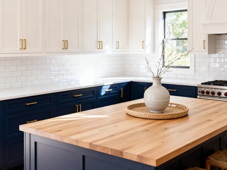
3. The “Moody Navy” Statement That Still Feels Timeless
Want color but you’re scared of commitment? Navy cabinets are your sweet spot. Navy brings drama without feeling trendy in a “you’ll regret it by Tuesday” way.
It’s bold, but it’s also basically a neutral. It pairs with white, wood, gold, black, marble, butcher block—navy is that overachiever that makes everything around it look better.
Where Navy Cabinets Look The Best
You don’t have to go full navy everywhere unless you want the full vibe. You can use navy strategically and still get that designer look.
- Lower cabinets only: keeps the room grounded without shrinking it.
- Kitchen island: a navy island is a classic “custom kitchen” move.
- Pantry wall: makes a functional area look intentional.
- All cabinets: gorgeous in bright kitchens with good lighting.
For the finishing touches, navy loves warm metals. Brass pulls? Yes. Warm wood shelves? Absolutely. And if you do navy, please give it good lighting—don’t let your cabinets suffer in the dark like a forgotten houseplant.
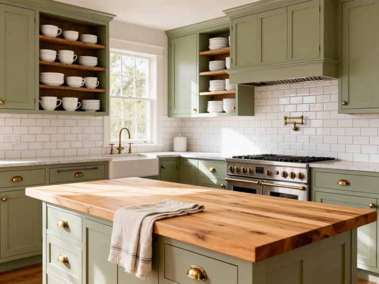
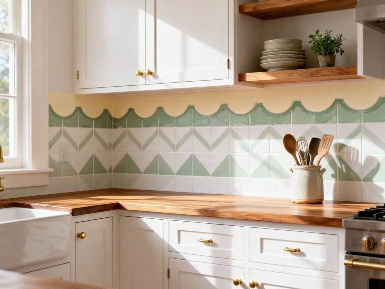
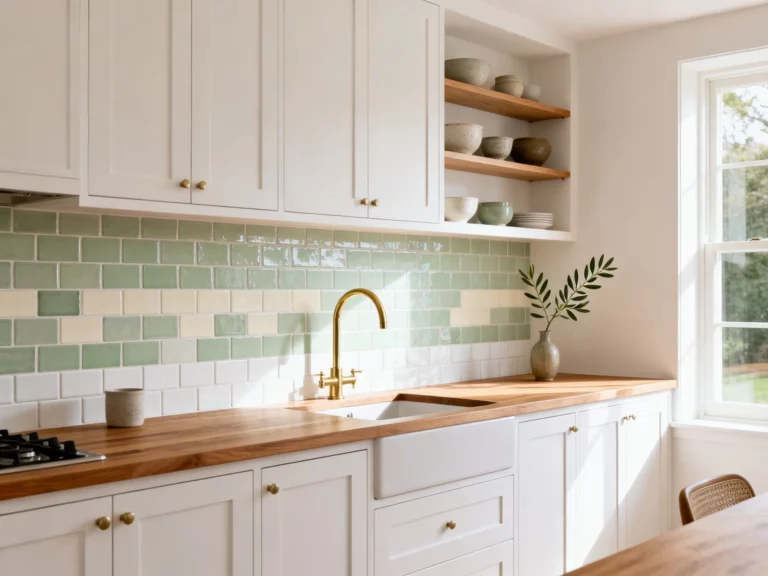
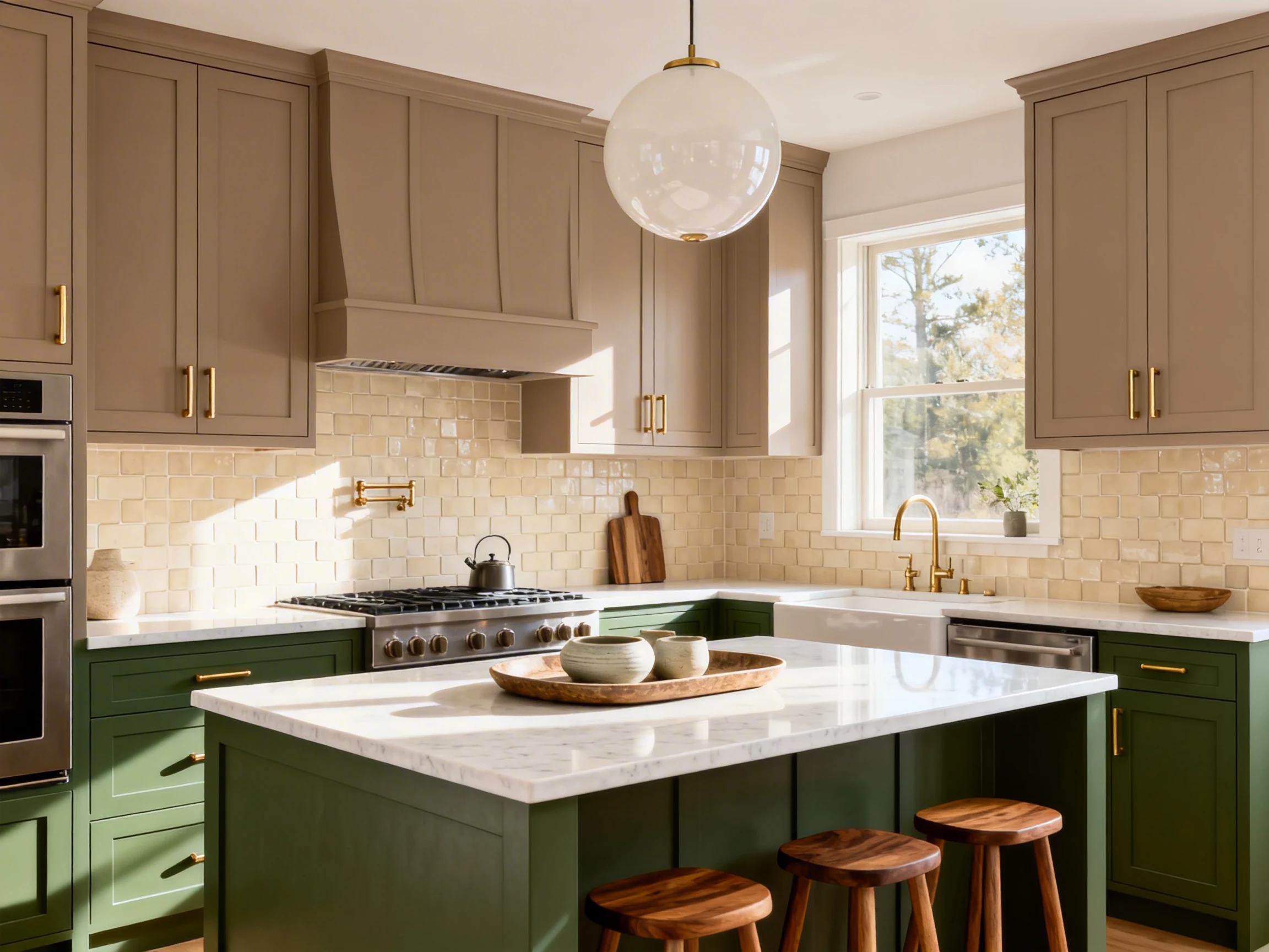
4. The “Earthy Green” Cozy Color That Feels Fresh
Green cabinets are having a moment, but the right green doesn’t feel like a trend. Think sage, olive, or a muted eucalyptus tone—greens that feel grounded and calming.
Earthy green brings that “I live in a charming European cottage” energy, even if your reality is more “I have three water bottles and no matching lids.” It adds color without shouting.
Tips To Nail The Right Green Shade
Green is gorgeous, but undertones matter. A sage that looks dreamy on Instagram can turn weirdly minty in your kitchen lighting. Rude, but true.
- Sample in multiple lights: morning, afternoon, and at night with overheads on.
- Match your fixed finishes: green looks different next to warm tile vs. cool stone.
- Balance with neutrals: creamy walls, light counters, and simple backsplash keep it fresh.
- Add natural texture: wood cutting boards, linen towels, and pottery make it feel curated.
Earthy green also hides mess better than white. Not saying you should embrace chaos, but if your kitchen is a “lived-in” zone, this color is very forgiving.
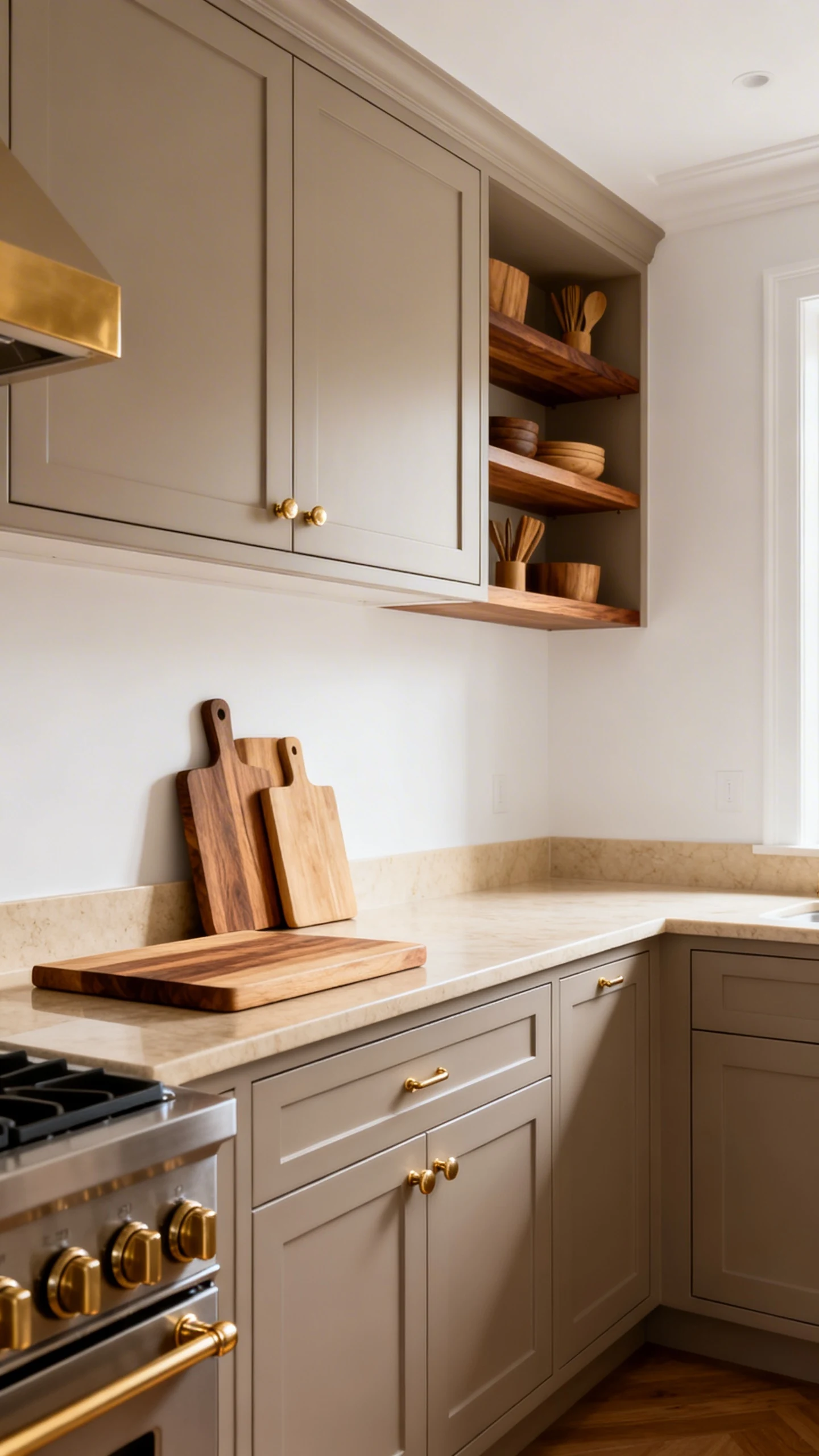
5. The “Warm Taupe” Quiet Luxury Move
If you want your kitchen to look expensive without screaming “look at me,” try warm taupe cabinets. Taupe is like greige’s slightly richer cousin—more depth, more softness, more “designer did this,” even if it was just you and a paint sample wall.
Warm taupe is especially good if you’re tired of cold grays but not ready to go full color. It’s neutral, but it has personality.
How To Style Taupe Cabinets So They Look High-End
This color shines when you lean into warmth and subtle contrast. Think cozy, layered, and a little bit elevated.
- Choose warm whites: ivory walls or creamy counters keep it seamless.
- Use mixed metals: brass plus matte black can look intentional if you repeat each finish.
- Go tonal: taupe cabinets with tan accents and natural wood feels very “quiet luxury.”
- Add a standout detail: a zellige tile backsplash or statement pendants keep it from feeling too safe.
And yes, taupe works in both modern and traditional kitchens. It’s basically the Switzerland of cabinet colors—neutral, reliable, and somehow always in style.
Bottom line: cabinet color isn’t just paint—it’s the vibe. Pick the one that fits how you want your kitchen to feel, not what’s trending this week.
Start with these 5 kitchen cabinet color ideas, grab a few samples, and look at them obsessively for a couple days like the rest of us. You’ve got this.