5 Kitchen Tile Backsplash Ideas That’ll Make Your Countertops Look Expensive
So you want a kitchen backsplash that looks designer… but you also want to keep your sanity (and maybe your budget) intact. Same.
The good news: kitchen tile backsplash ideas aren’t just about picking a pretty tile. It’s about choosing a vibe that makes your whole kitchen feel intentional, even if you still have that one “junk drawer” that’s basically a black hole.
Here are five ideas that genuinely transform a kitchen, from “meh” to “who styled this?”
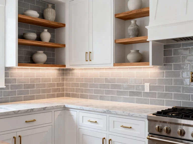
1. Go Classic With Subway Tile, Then Get a Little Sneaky
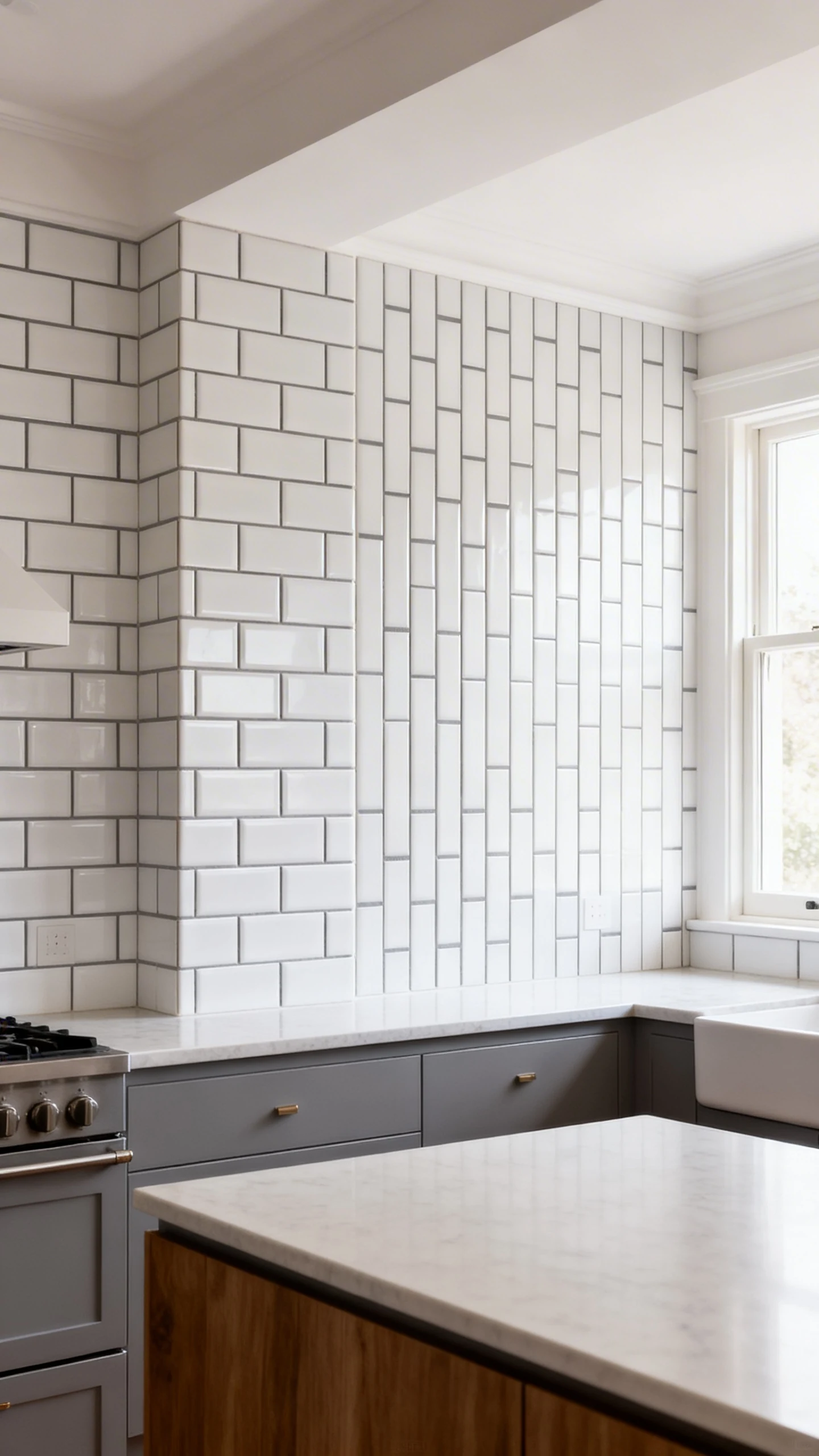
Yes, subway tile. Before you roll your eyes, hear me out. Subway tile is popular because it works. It’s the white T-shirt of backsplashes: reliable, flattering, and somehow always in style.
But the secret sauce is how you use it. The same tile can look basic or custom depending on layout, grout, and finish.
Make It Feel Fresh
Try a layout that isn’t the default “contractor special.” A small change can make it look like you hired someone with a clipboard.
- Vertical stack for a modern, taller look (great for low ceilings).
- Herringbone if you want movement and a little drama.
- Offset/brick if you want classic without thinking too hard.
Grout Is the Plot Twist
FYI, grout can make or break the whole thing. White grout is clean and seamless. Dark grout adds contrast and hides mess, which is honestly a public service if you cook a lot.
- Bright white tile + warm gray grout feels soft and lived-in.
- White tile + charcoal grout feels graphic and crisp.
- Off-white tile + beige grout reads cozy, not sterile.
If you want a safe choice that still looks elevated, this is it. Subway tile is classic, but it doesn’t have to be boring. It just needs better styling than a sad, flat latte.
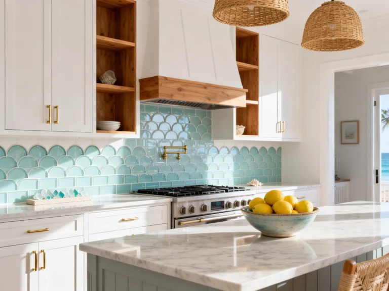
2. Choose Zellige-Style Tile for Instant “I Travel” Energy
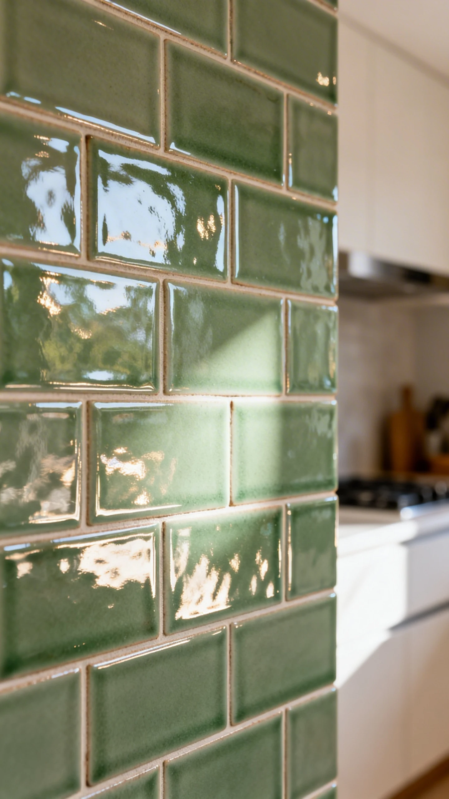
If you want your kitchen to look like it belongs in a boutique hotel where the shampoo costs $48, go for zellige-style tile. It’s glossy, imperfect, and wildly good at catching light.
The charm is in the variation. Each tile reflects differently, so the wall looks alive. It’s basically tile with a personality.
Where It Works Best
IMO, zellige shines when the rest of the kitchen is simple. Let it be the star. Pair it with clean counters and minimal clutter, and it’ll look intentional instead of chaotic.
- White or cream for a luminous, airy kitchen.
- Sage green for that calm, earthy vibe that’s all over design right now.
- Inky blue or charcoal for moody drama without painting everything black.
Quick Reality Check
Because zellige has texture and variation, it can read “rustic-luxe” instead of “perfectly uniform.” If you love a super sleek, sterile look, this might not be your soulmate tile.
But if you want warmth, depth, and that subtle handmade look? You’ll be obsessed. And yes, guests will touch it. They always do.
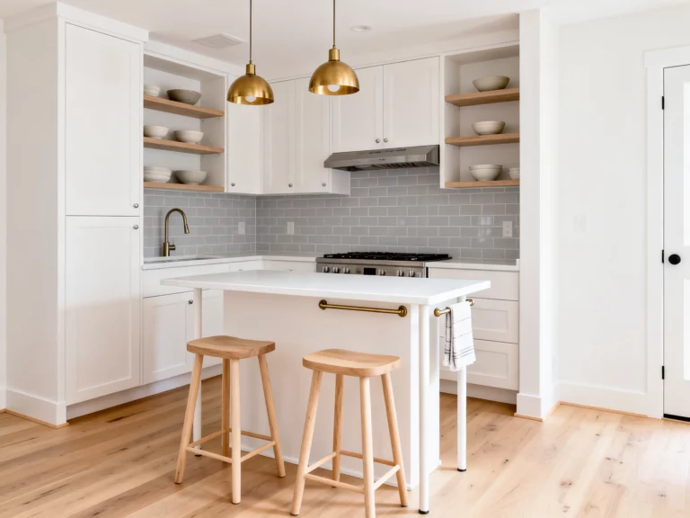
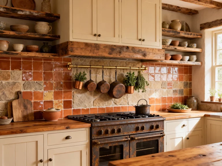
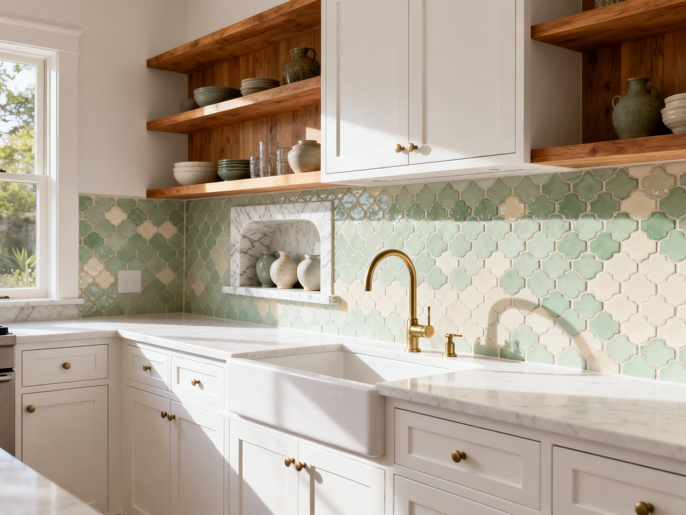
3. Try a Bold Pattern Tile and Let It Do the Talking
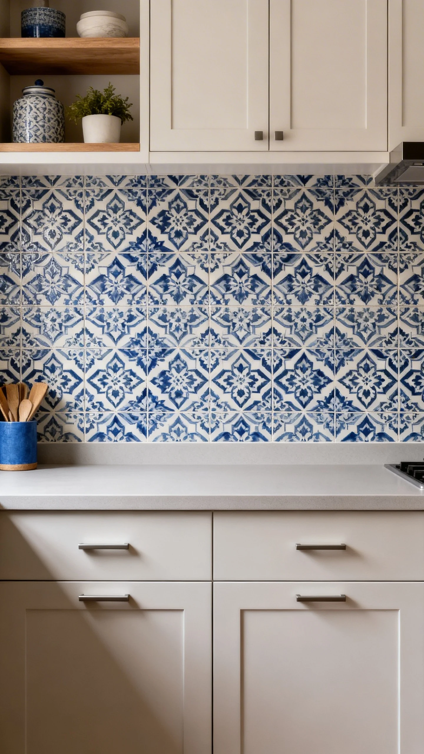
Want a backsplash that basically says, “I have taste”? Go patterned. A statement backsplash can carry the entire kitchen, especially if your cabinets are simple.
This is the move when you want maximum impact without ripping out half the room. It’s like changing your hair instead of your whole personality.
How to Keep Pattern From Feeling Like Chaos
The trick is balance. If the tile is loud, the surrounding finishes should be chill. Let one thing be the drama queen.
- Pair busy tile with solid countertops (no competing marbling).
- Keep cabinet hardware simple and low-profile.
- Repeat one tile color somewhere else, like a rug or bar stools, so it feels planned.
Pattern Ideas That Age Well
Not all bold patterns are created equal. Some scream “trend,” others feel timeless with the right palette.
- Moroccan-inspired for warm, global charm.
- Geometric black-and-white for modern punch.
- Soft florals for cottage-y vibes without going full grandma.
And yes, you can do pattern even in a small kitchen. In fact, it can make a tiny space feel more “designed” and less “I moved in last week.”
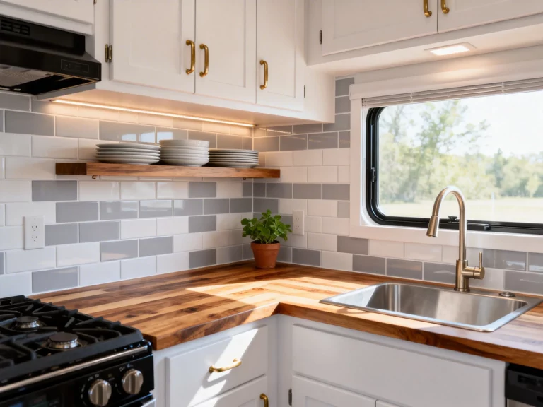
4. Use Large-Format Tiles for a Sleek, Low-Grout Look
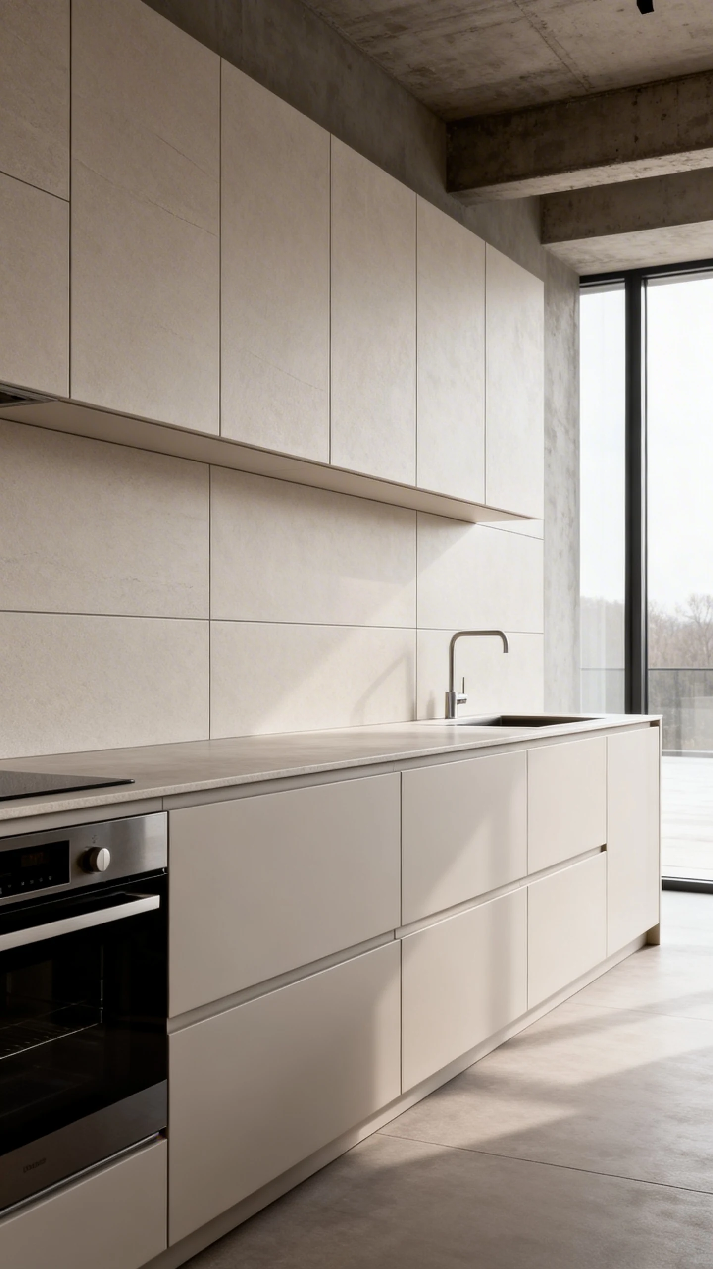
If cleaning grout makes you feel personally victimized, large-format tile is your best friend. Bigger tiles mean fewer grout lines. Fewer grout lines mean less scrubbing. It’s math, but the kind we like.
Large-format tile also looks modern and smooth, especially in kitchens with flat-panel cabinets or minimalist hardware.
Why It Looks Expensive
Large tiles read “high-end” because the surface feels calmer and more continuous. Your backsplash becomes a clean backdrop instead of a busy grid.
- 24×48 porcelain gives that slab-like look without slab pricing.
- Large marble-look porcelain brings drama with easier maintenance.
- Matte concrete-look tiles work beautifully in modern and industrial kitchens.
Pro Tips So It Doesn’t Look Like a DIY Oops
Large-format tile needs a little more planning. Any unevenness shows more, because the surface is so uninterrupted.
- Use a thin grout line for that seamless effect.
- Pick a grout color close to the tile to keep it calm.
- Consider a rectified edge tile for crisp, clean lines.
This is the vibe for people who love a tidy, edited kitchen look. The kind that makes your toaster feel like it should be hidden in a drawer.
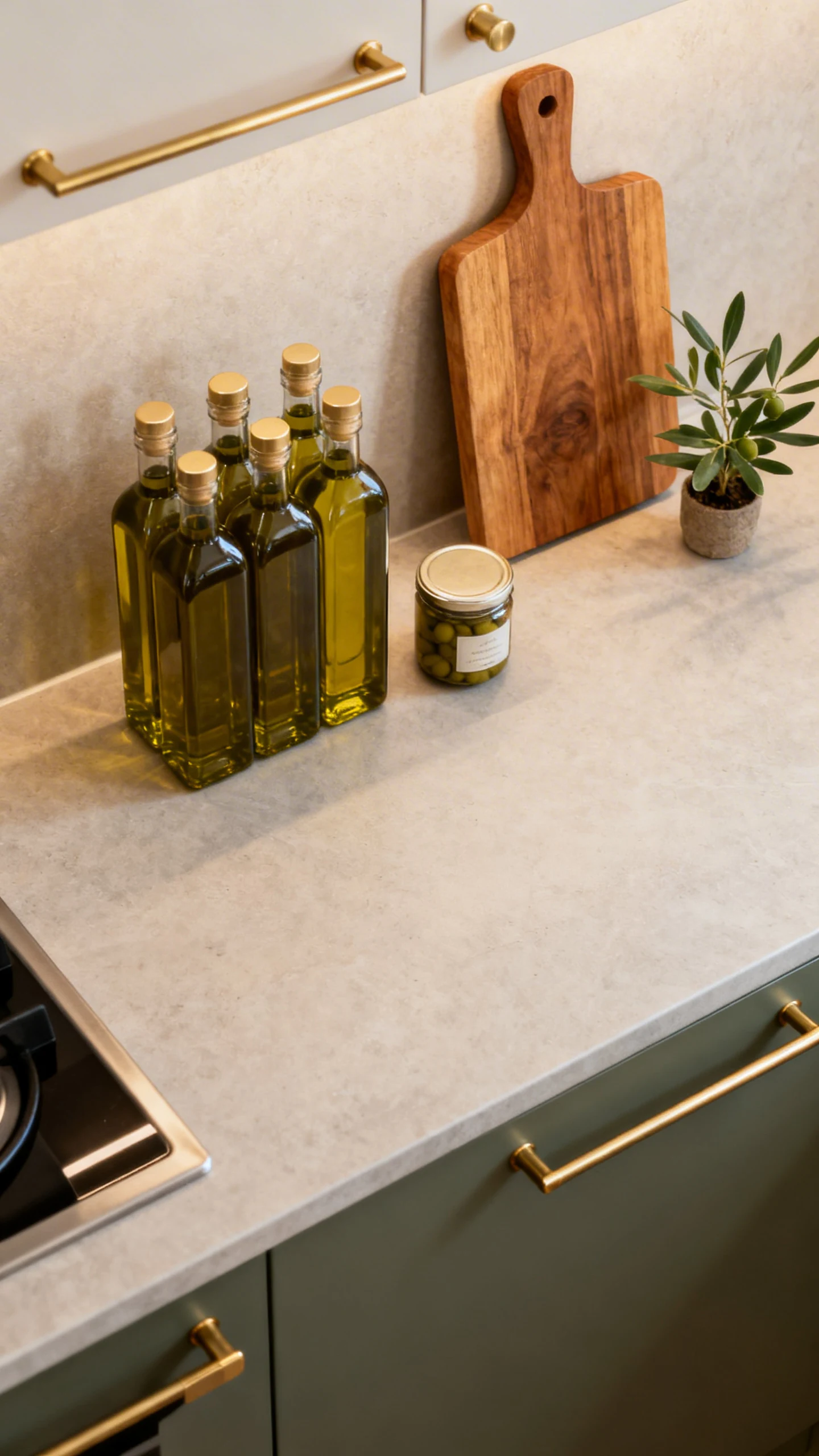
5. Mix Materials: Tile + Stone Shelf + A Little “Designer” Moment
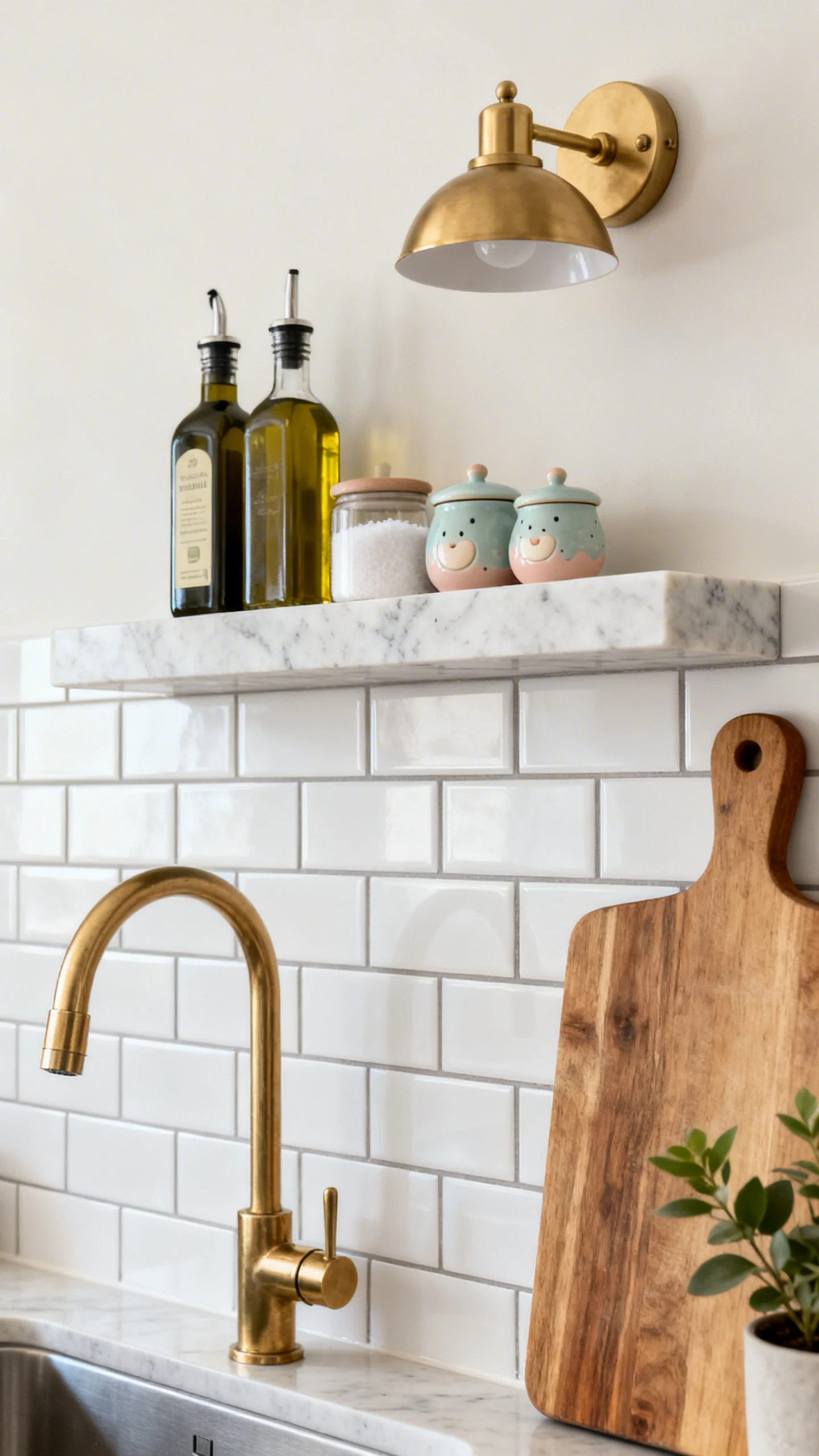
If you want your backsplash to look custom without doing something wildly complicated, mix materials. Think tile plus a stone ledge, or a tile that transitions into a different finish behind the range.
This idea is all about creating a focal point. Not everything has to be the same tile, everywhere, forever. You’re allowed to have a main character area.
Easy Mix-and-Match Combos
Keep it simple: one primary tile, one accent element. You’re designing a kitchen, not a theme park.
- Subway tile with a marble or quartz shelf for oils, salt, and cute little jars.
- Neutral backsplash tile with a stone slab behind the range for a statement zone.
- Textured tile paired with brass rail accents for warmth and function.
Style It Without the Clutter Spiral
Once you add shelves or ledges, styling matters. Keep it curated, not crowded. Ask yourself: is it pretty, useful, or both?
- Limit countertop items to one “pretty” cluster.
- Repeat metals: if your faucet is brass, echo it in hardware or lighting.
- Add one soft element nearby, like a wood cutting board or a small plant.
This is one of my favorite kitchen tile backsplash ideas because it looks high-end but feels personal. Also, it gives you a spot to pretend you’re the kind of person who decants olive oil into matching bottles. We love aspirational living.
You don’t need the biggest renovation or the fanciest appliances to make your kitchen feel stunning. A backsplash can do so much heavy lifting, it’s honestly rude.
Pick one of these five directions, commit to it, and keep the rest of the finishes supportive. Then step back and admire your work like the design genius you clearly are.