5 Bloxburg Kitchen Ideas No Gamepasses That Look Expensive (but Aren’t)
You want a Bloxburg kitchen that screams “custom build” without quietly sobbing over gamepasses. Same. The good news is you can get a seriously cute, functional kitchen with zero gamepasses and a little design finesse.
So let’s talk layouts, budget-friendly tricks, and those sneaky details that make a kitchen look high-end. Ready to make your guests go, “Wait… how did you do that?”
1. The “U-Shape” Layout That Looks Custom On A Starter Budget
If you want your kitchen to instantly feel intentional, go for a U-shaped layout. It’s one of those designs that looks “architect planned” even when you’re basically winging it at 2 a.m.
The best part? You don’t need fancy counters or premium cabinets. The shape does half the work for you, IMO.
How To Set It Up (Without Overthinking)
Start by placing your fridge and oven on two different sides of the U, then tuck the sink along the base. Keep the center open enough to walk through comfortably, because nobody wants to crab-walk around a counter corner.
- Keep at least a small gap for movement so it feels like a real kitchen
- Use matching counters on all three sides for a clean look
- Add one “feature” area, like a coffee corner, so it feels styled
Make It Look Expensive With Tiny Tweaks
The “expensive” vibe comes from consistency. Pick one main color for cabinets and one accent color for decor. That’s it. You’re not painting a mural.
Also, don’t forget lighting. Even basic lights can look fancy when they’re placed evenly and not just slapped in the middle like a sad ceiling dot.
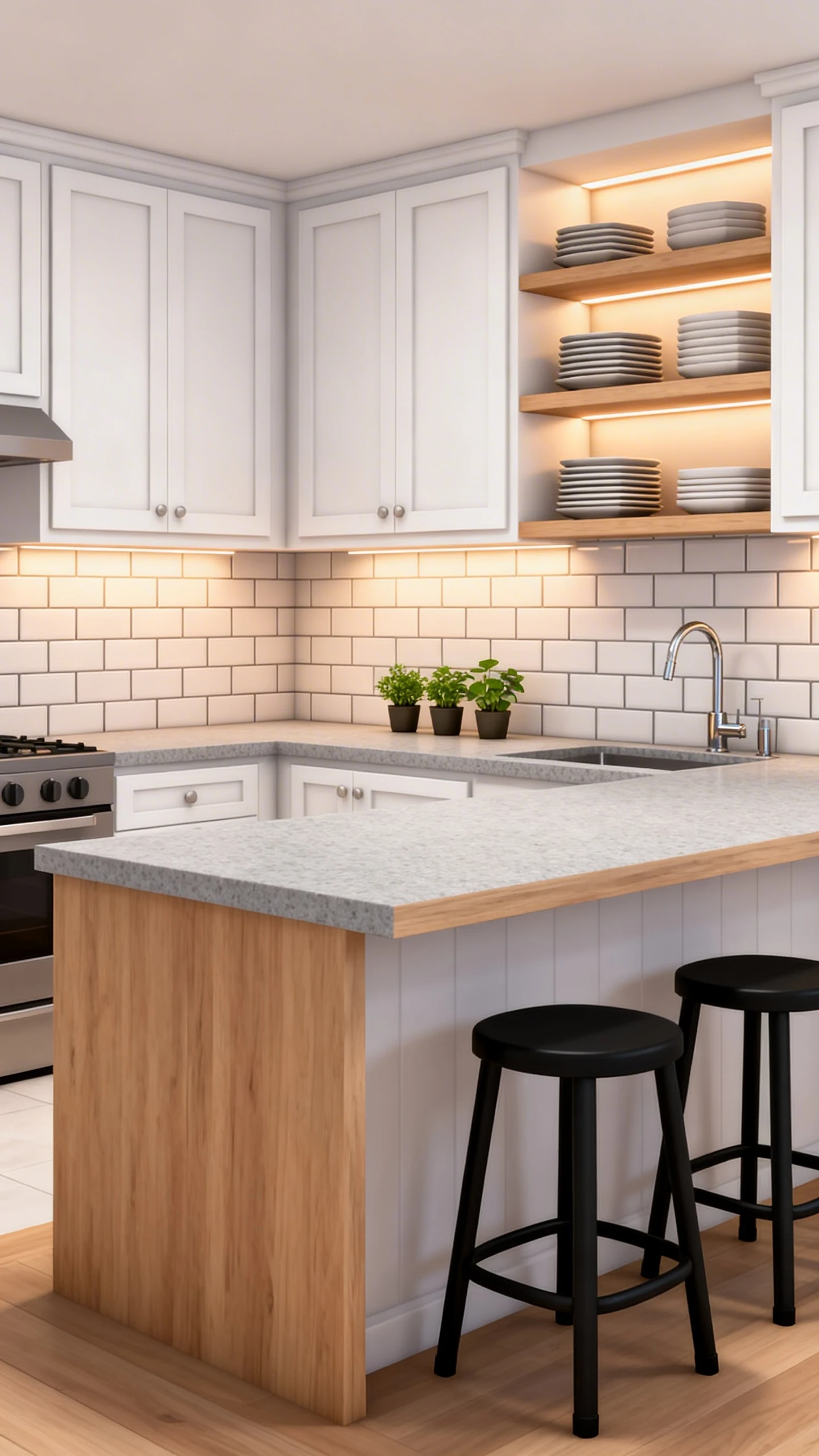
2. The Faux Island Hack That Doesn’t Need Advanced Placement
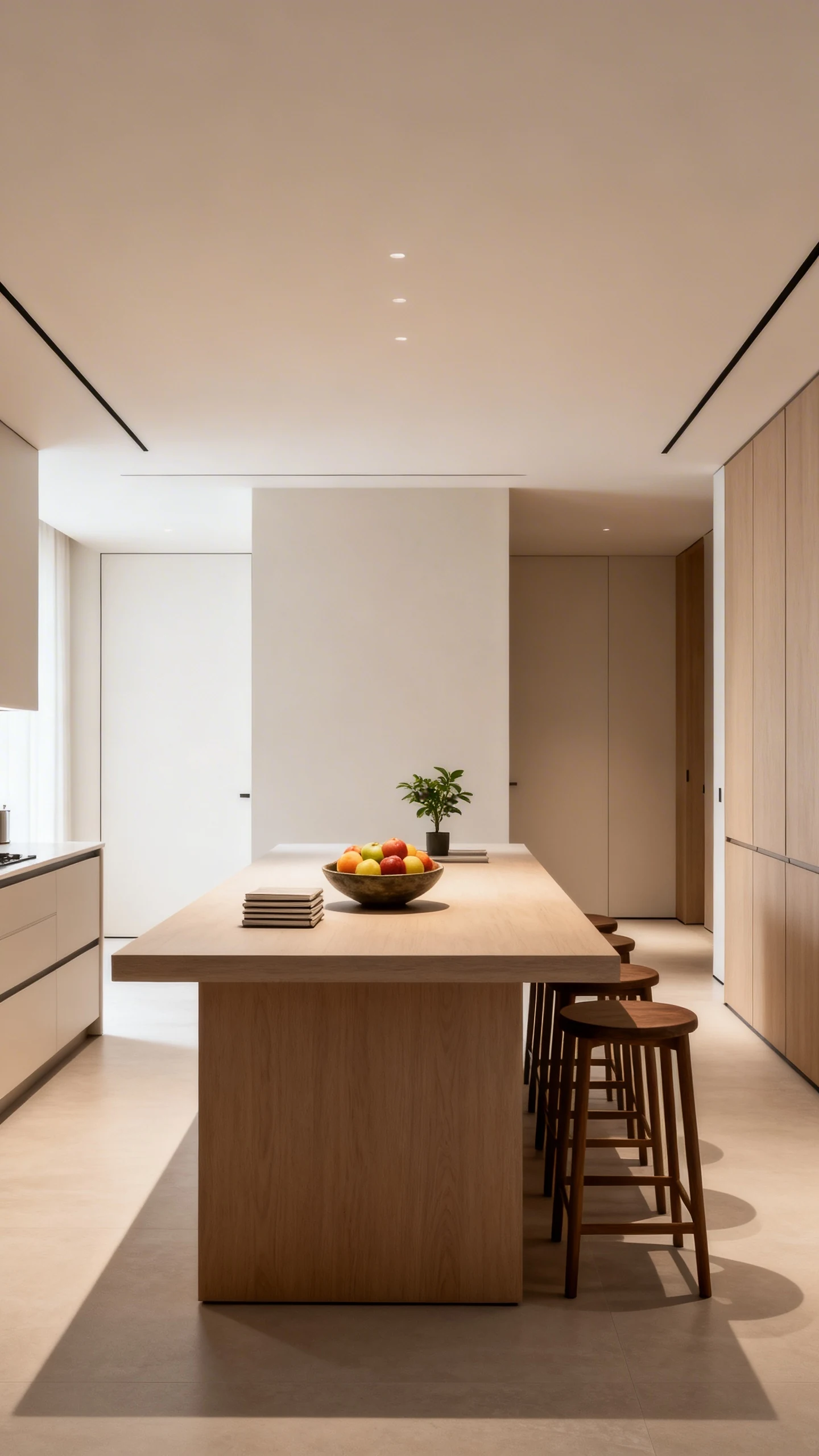
Kitchen islands are the moment. They make your build feel modern, social, and like you totally have your life together. But if you’re not using gamepasses, placing a perfect island can feel… spicy.
No worries. You can do a faux island with regular items and smart spacing.
Build A “Furniture Island” In Two Minutes
Instead of forcing counters to align in complicated ways, use a table or a simple surface as your island base. Then style it like it belongs there on purpose (because it does).
- Choose a table that’s wide enough to read “island”
- Add stools or chairs on one side for that breakfast-bar vibe
- Leave a walking path around it so it doesn’t feel cramped
Style It Like You’re On A Home Tour
Here’s where you fake the luxury. Put a centerpiece on the island and keep it minimal. Think bowl of fruit, a plant, or a couple of stacked items that say “someone lives here and has taste.”
FYI, clutter isn’t styling. Clutter is what happens when you panic-decorate.
3. The Cozy Breakfast Nook That Makes Any Kitchen Feel Bigger
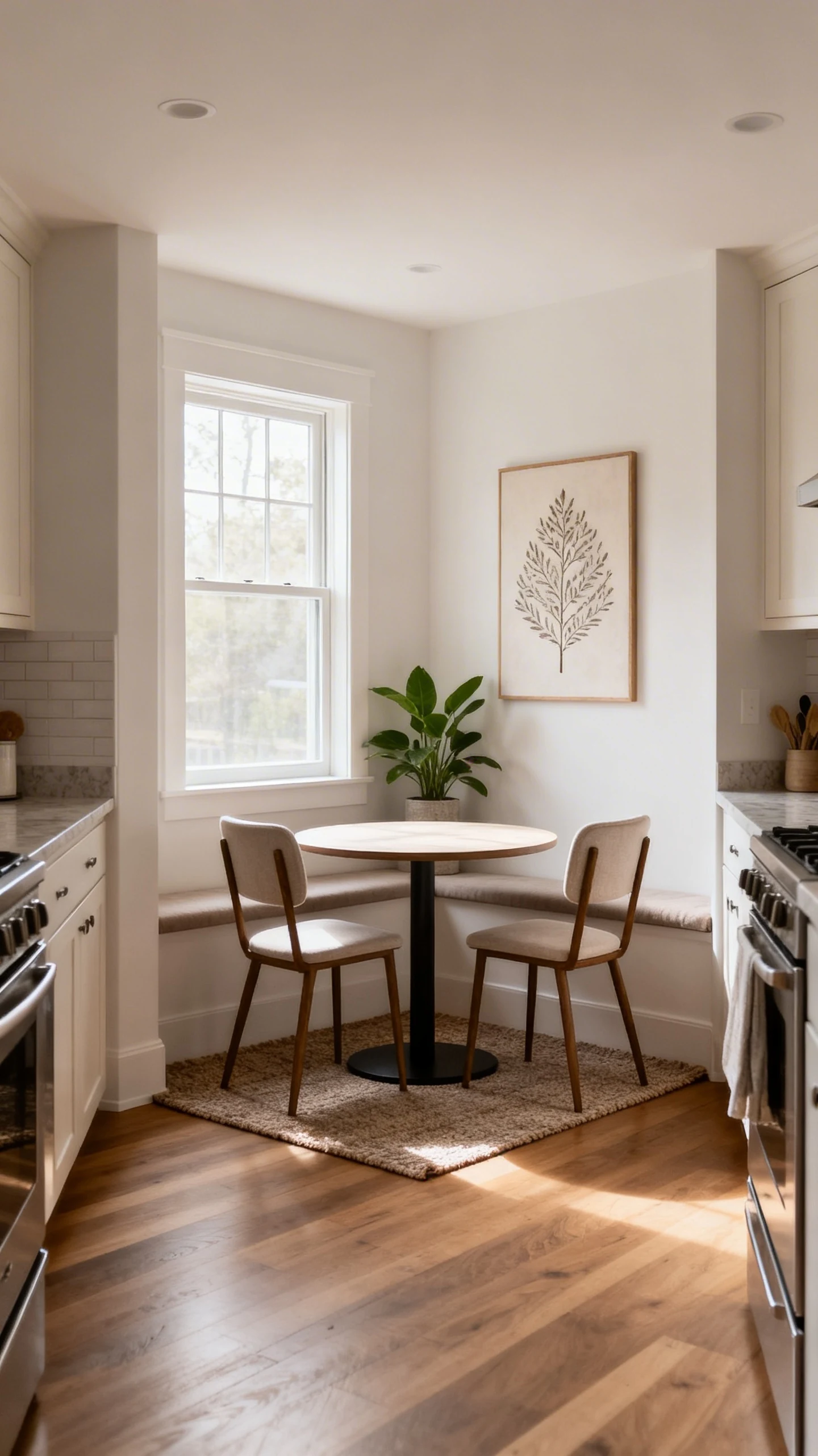
If your kitchen is small, adding a huge dining table nearby can make everything feel tight. But a breakfast nook? That’s the sneaky move. It gives you seating without swallowing the room.
And yes, it also looks ridiculously cute in screenshots.
Where To Put It
Tuck it into a corner near a window or next to an empty wall. Even if you don’t have a window, pretend. Your Sims—sorry, your Bloxburg humans—won’t mind.
- Use a small round or square table to save space
- Pick two to four seats, not eight (be realistic)
- Add a small rug underneath to “zone” the area
Decor That Makes It Feel Intentional
This is where you can add personality without spending a fortune. A nook looks best when it has one standout detail like wall art or a plant nearby.
Stick to one theme: modern, cozy farmhouse, minimalist, or neutral. Mixing every style at once is a bold choice… and not always in a good way.
4. The “Two-Tone” Cabinet Look Using Only Basic Items
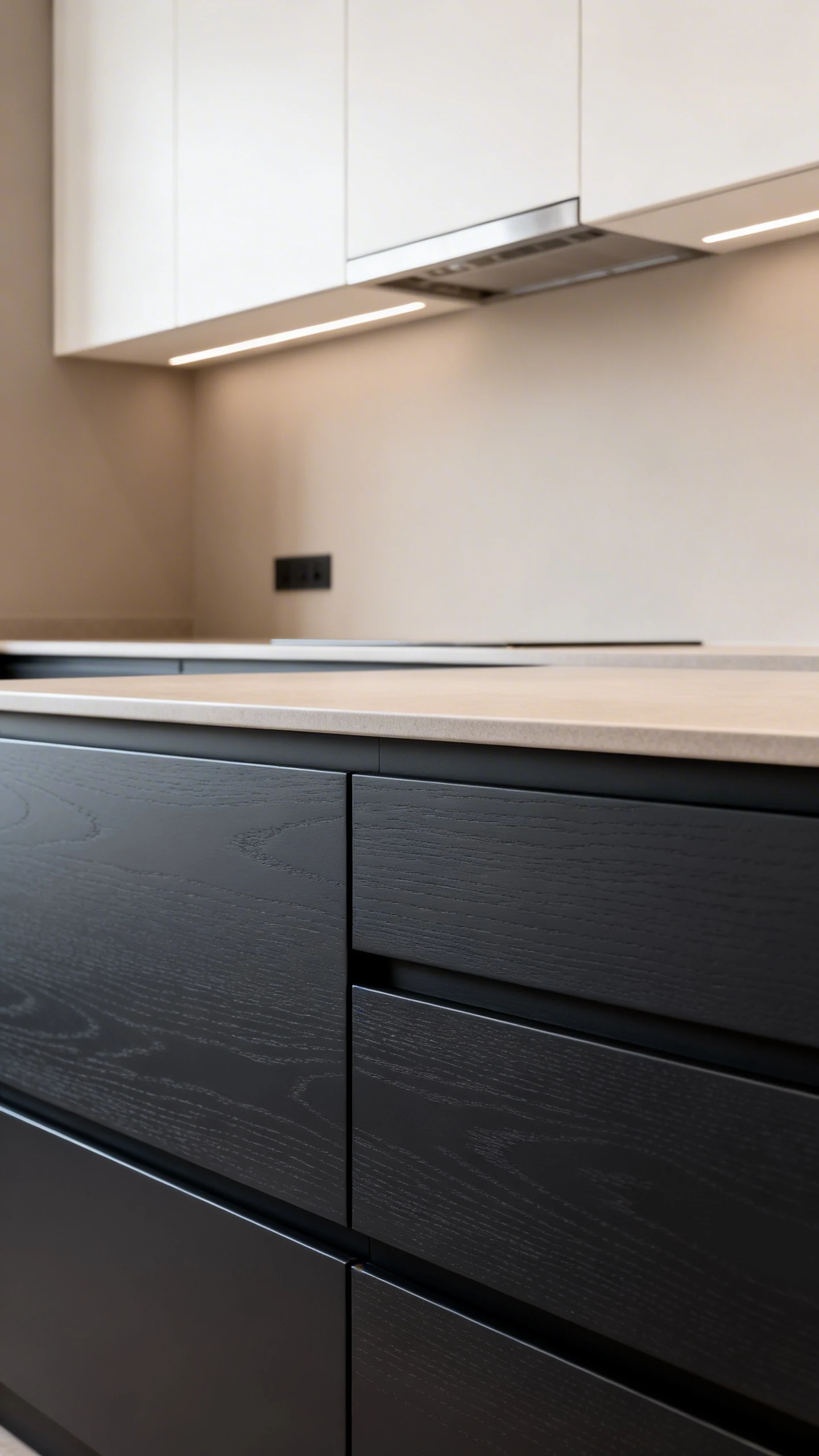
Two-tone kitchens look expensive because they have contrast. They’re also a great way to make basic cabinets feel designer without buying anything fancy.
All you need is a simple color plan and the courage to not make everything the exact same shade of beige.
Easy Two-Tone Combos That Always Work
Pick one darker tone and one lighter tone. Keep your counters and walls neutral so the cabinets can be the star.
- White + Light Wood for a bright, airy vibe
- Gray + White for modern and clean
- Black + White for dramatic “rich aunt” energy
Where To Use Each Color
Use the darker shade on the bottom and the lighter shade on top. It grounds the room and keeps it from feeling heavy. If you do it the other way around, it can look a bit… upside down.
Then repeat your accent color in tiny places like a toaster, plant pot, or wall decor. That repetition is what makes it look designed, not random.
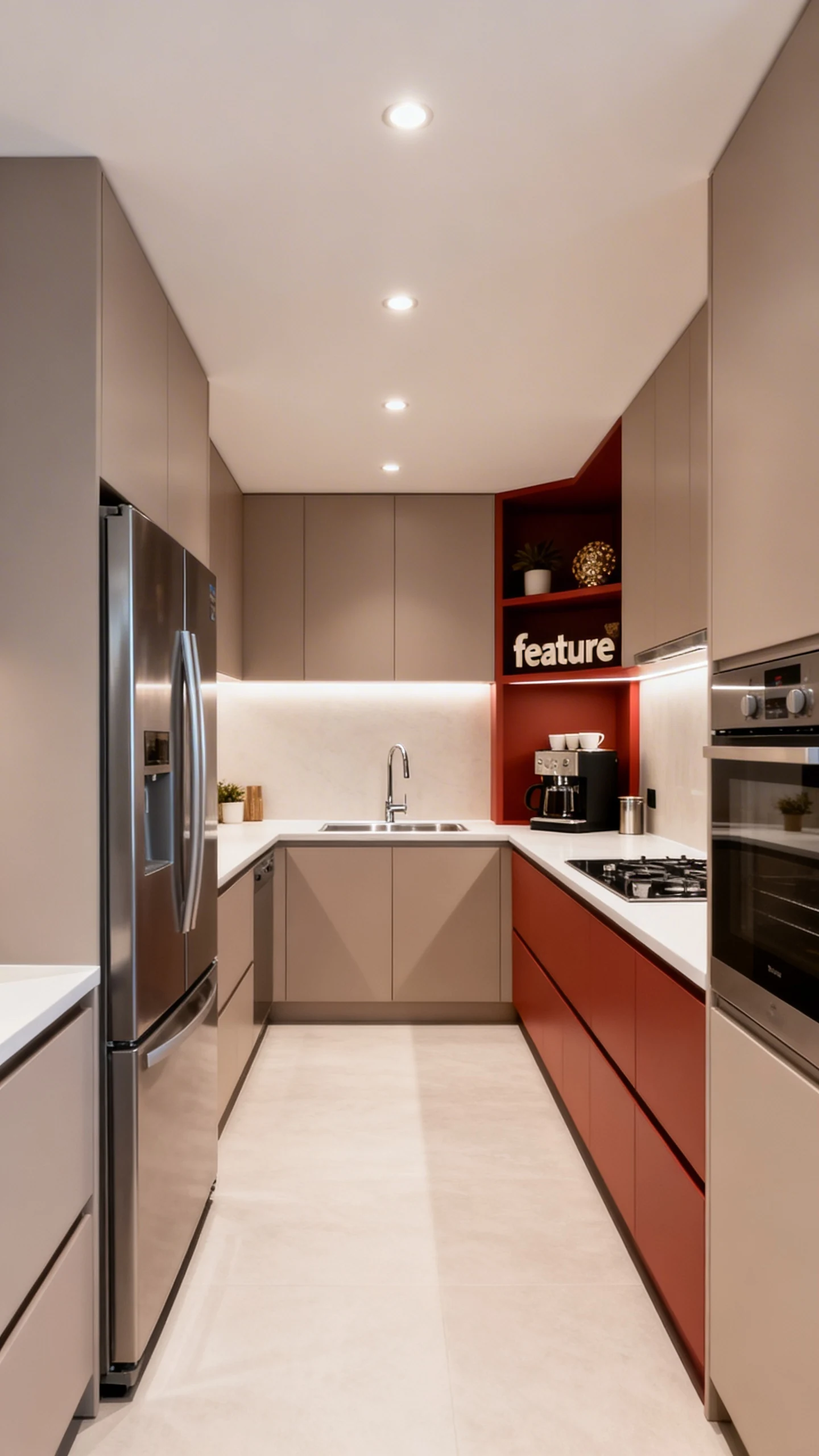
5. The Budget “Built-In” Wall That Hides Appliances And Levels Up Everything
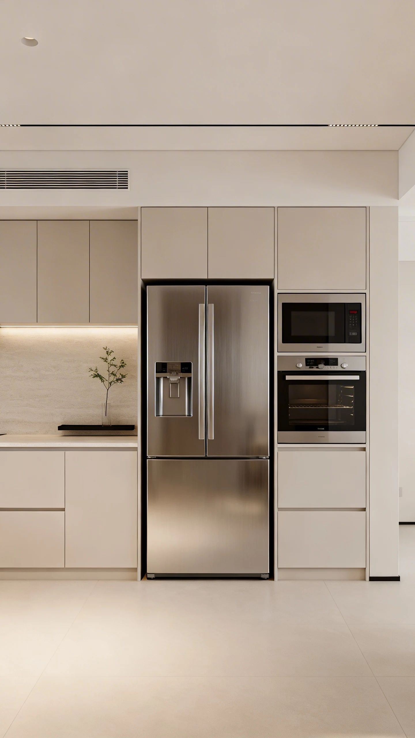
Want that high-end kitchen look where everything feels seamless? The secret is creating a built-in wall zone for appliances. It makes the kitchen feel structured and fancy, like you hired a contractor (you didn’t).
This works especially well if your fridge and oven feel like they’re just floating awkwardly in the room.
Create A Simple Appliance Wall
Pick one wall and commit to it. Place your fridge, oven, and maybe a microwave area all along that line. Then frame it with matching counters or cabinets so it looks cohesive.
- Keep appliances grouped instead of scattered
- Match cabinet colors around the wall for a “built-in” illusion
- Add one strip of decor, like a plant or a small shelf area nearby
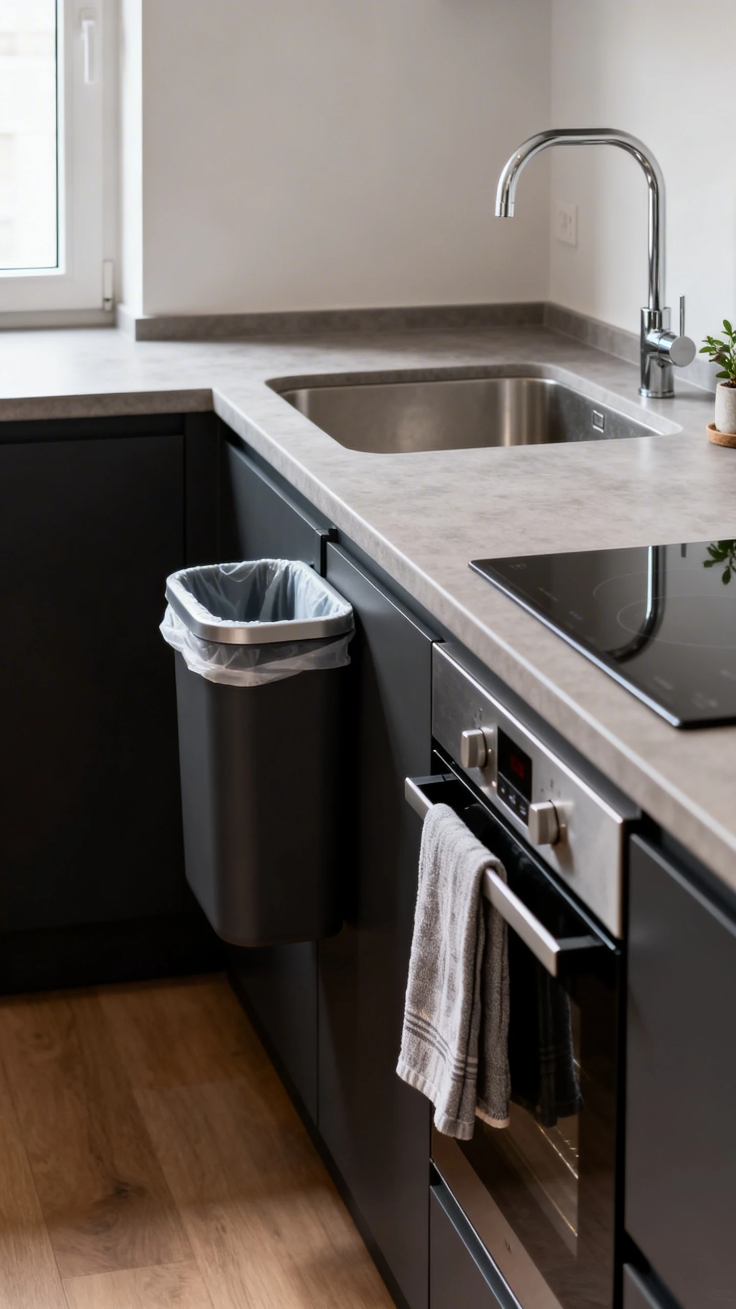
Finish With “Real Kitchen” Details
Here’s the difference between a kitchen that’s fine and a kitchen that’s chef’s kiss. Add details people expect in a real space: a trash can tucked near the sink, a towel near the oven, and a tiny bit of counter decor.
Just don’t overdo it. Your kitchen shouldn’t look like a home goods store exploded. A little styling goes a long way.
Also, make sure your colors aren’t fighting each other. If your appliances are dark, keep cabinets and walls calmer so it doesn’t look chaotic.
Now go build that no-gamepass kitchen and act shocked when everyone compliments it. If you want, tell me your vibe (modern, cozy, farmhouse, minimalist), and I’ll help you pick a color palette that looks expensive without draining your budget.