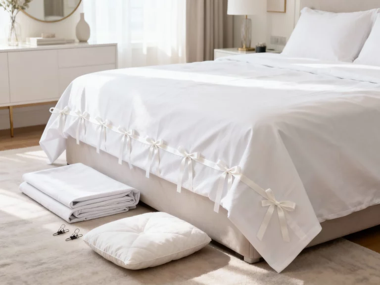
Beautiful Bedsheets Ideas Inspiration: Mix Prints Like a Pro for a Wow Bedroom
If you’ve ever stood in the bedding aisle thinking, “I love all of these… but together?” you’re in the right place.
Mixing prints is the fastest way to make a bed look styled, layered, and a little bit irresistible. The trick is treating your bed like an outfit: one hero piece, a few supporting players, and a couple of accessories that make it feel intentional.
I’m going to walk you through five completely different rooms, each with a full look you can picture instantly. And yes, in every one, the bedsheets are doing the most—in the best way.
1. The Sunlit Parisian Apartment: Stripes + Tiny Florals + Fluffy White Layers
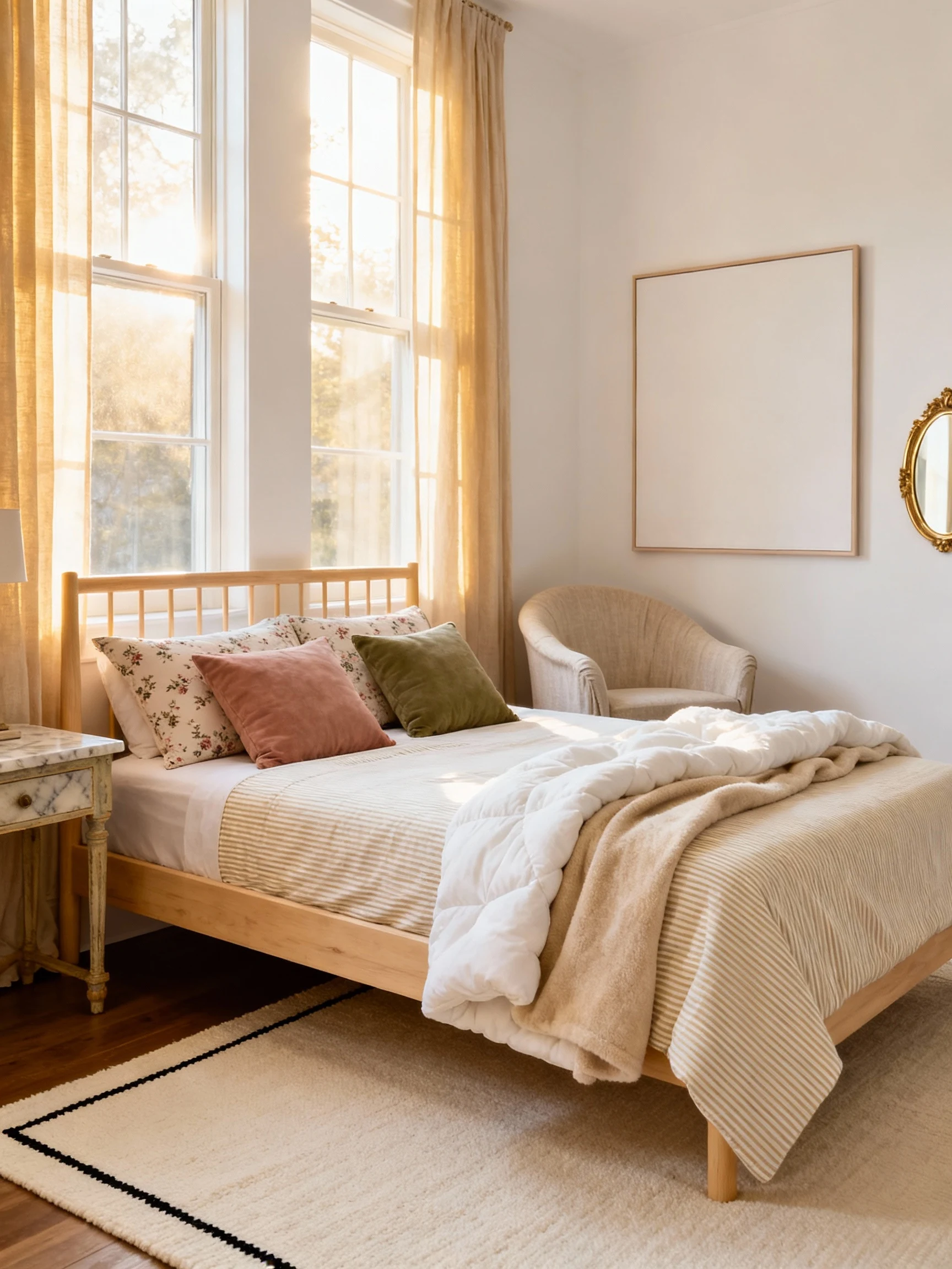
Imagine you walk into a bright bedroom with tall windows, creamy walls, and that soft morning glow that makes everything look expensive.
The bed is the star: crisp ticking stripes on the fitted sheet and duvet cover, with tiny scattered florals on the pillowcases. It feels classic, but not stuffy—like a French rental you’d never want to check out of.
The secret “pro” move here is scale. The stripes are bold and architectural, while the floral is small and almost like confetti.
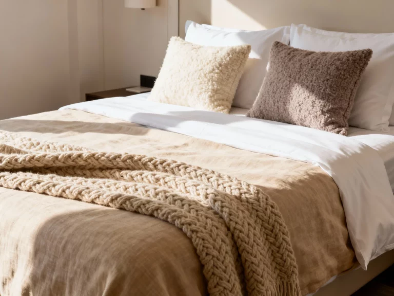
Now layer in comfort: a cloudy white quilt folded at the foot of the bed, plus a butter-soft oatmeal throw tossed like you just casually did that (you totally did).
How The Whole Room Comes Together
The furniture is light and airy: a blonde wood bed frame, a vintage-style marble-top nightstand, and a gently curved linen slipcovered chair in the corner.
On the walls, keep it restrained: one large, simple print with lots of negative space, and a small gilded mirror that bounces light around.
Color Palette: warm white, beige, soft black pinstripes, dusty rose accents.
- Sheets: beige-and-white stripes (your anchor print)
- Pillowcases: micro floral in dusty rose and olive
- Accent pillow: one small velvet lumbar in muted rose
- Rug: flatweave cream with a thin black border
This room feels like a deep breath. It’s proof that mixing prints can still look calm, clean, and grown-up.
2. The Desert Modern Hideaway: Clay Checks + Wavy Lines + Leather And Walnut
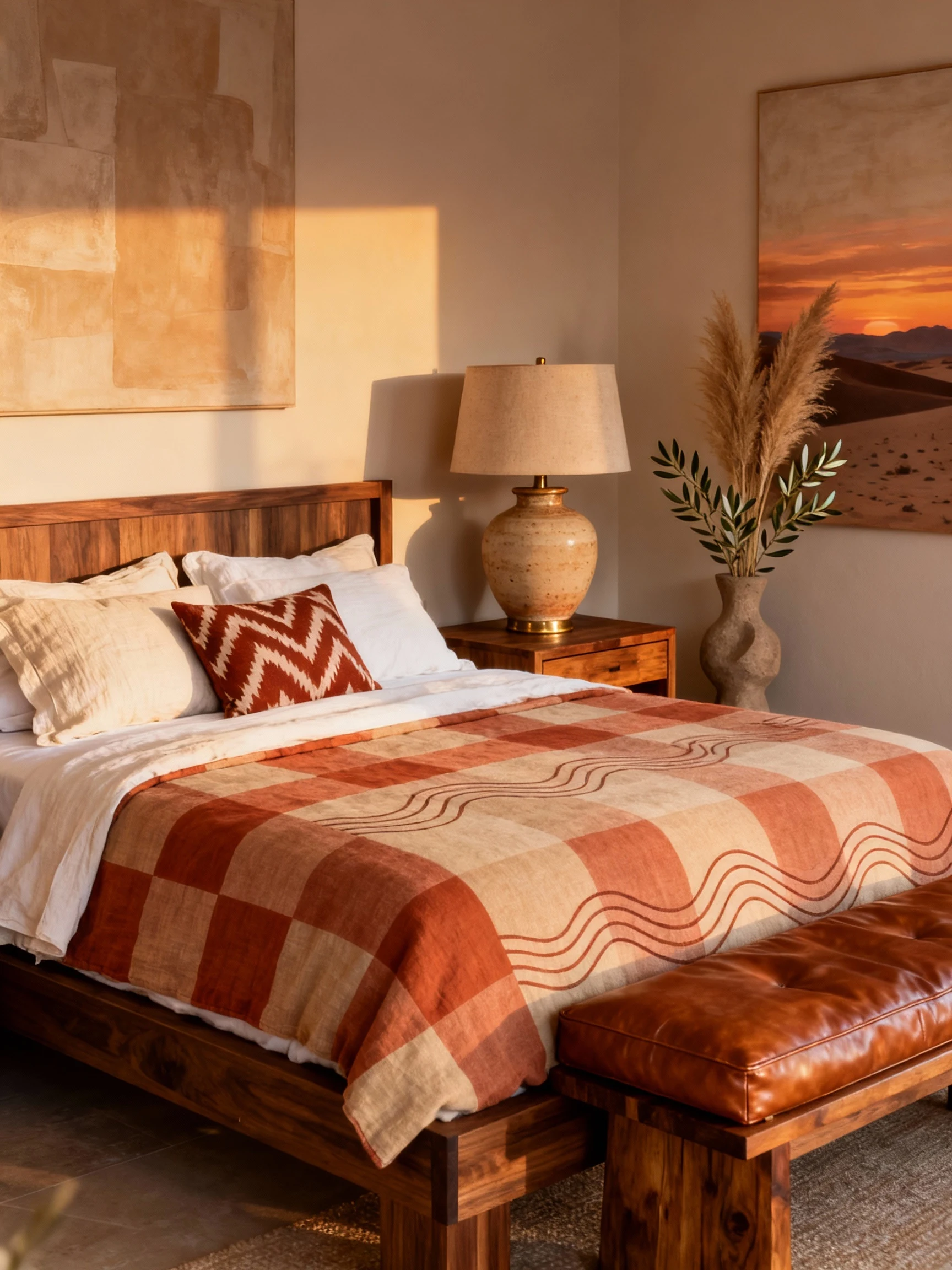
Okay, this one is moodier—but still warm. Walk in and you get those desert-sunset vibes immediately.
The bed starts with terracotta checkered sheets. Not tiny gingham—think bigger, bolder checks that feel graphic and modern.
Then you add a second print that’s totally different but plays nice: a duvet cover with subtle wavy lines in sand and clay. It’s like the sheets are the architecture, and the duvet is the landscape.
Finish with pillows that look curated, not matched: one set in a solid warm white linen, plus one accent pillow in a muddy rust ikat that ties everything together.
How The Whole Room Comes Together
The bed frame is low and grounded—either walnut wood or a simple upholstered frame in a camel fabric.
Add a cognac leather bench at the foot of the bed, and suddenly the whole room feels designed. On either side, pick chunky nightstands with clean lines and warm wood grain.
Lighting matters here. Go for oversized ceramic lamps in a sandy glaze, or wall sconces in aged brass for that desert-hotel polish.
Color Palette: terracotta, sand, camel, walnut, touches of aged brass.
- Sheets: large-scale clay checks (your hero)
- Duvet: tonal wavy line print (your “texture print”)
- Art: one oversized abstract in warm neutrals
- Decor: a sculptural vase with dried pampas or olive branches
This is the room for someone who wants prints to feel bold, but still sophisticated and earthy.
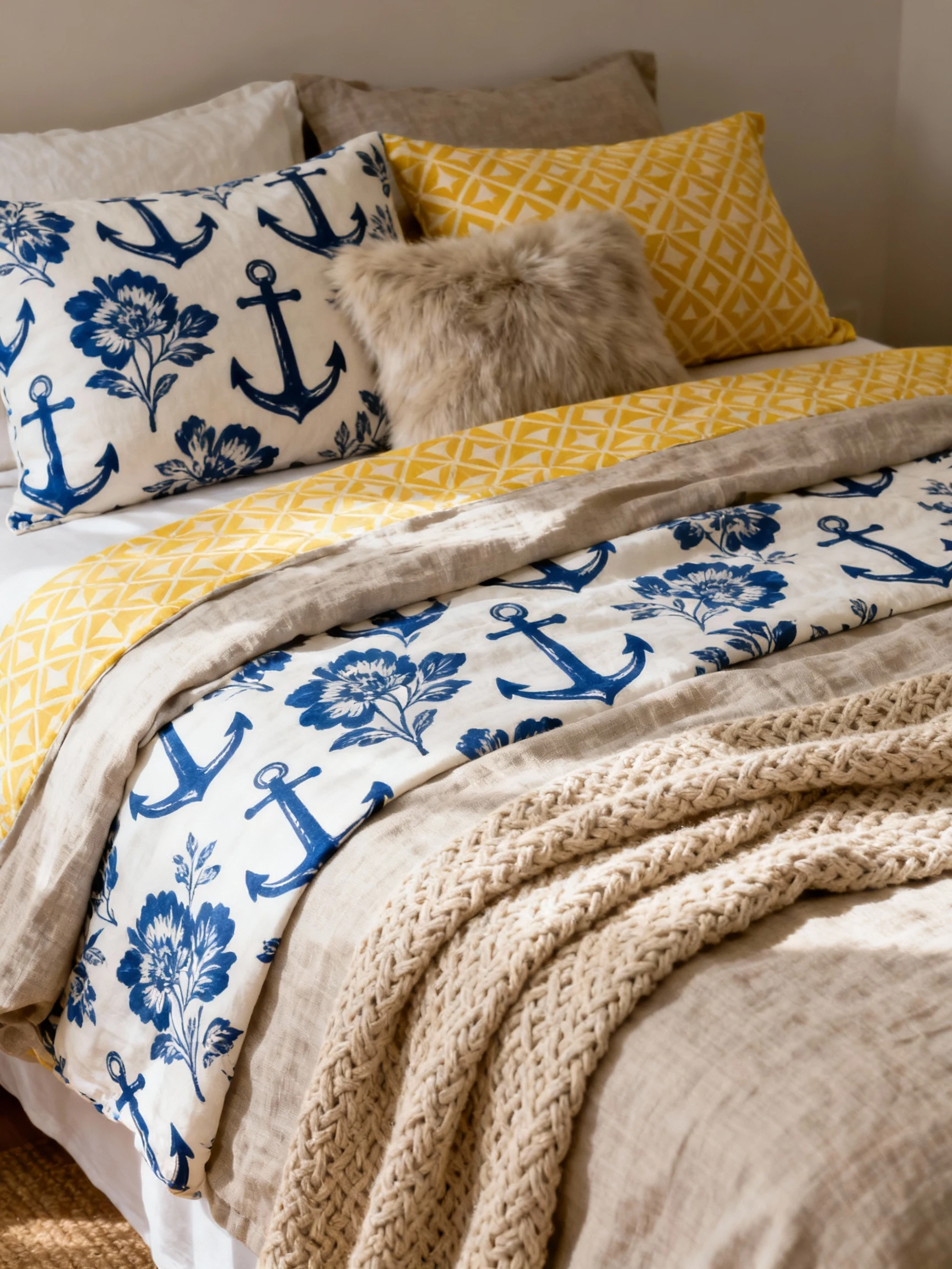
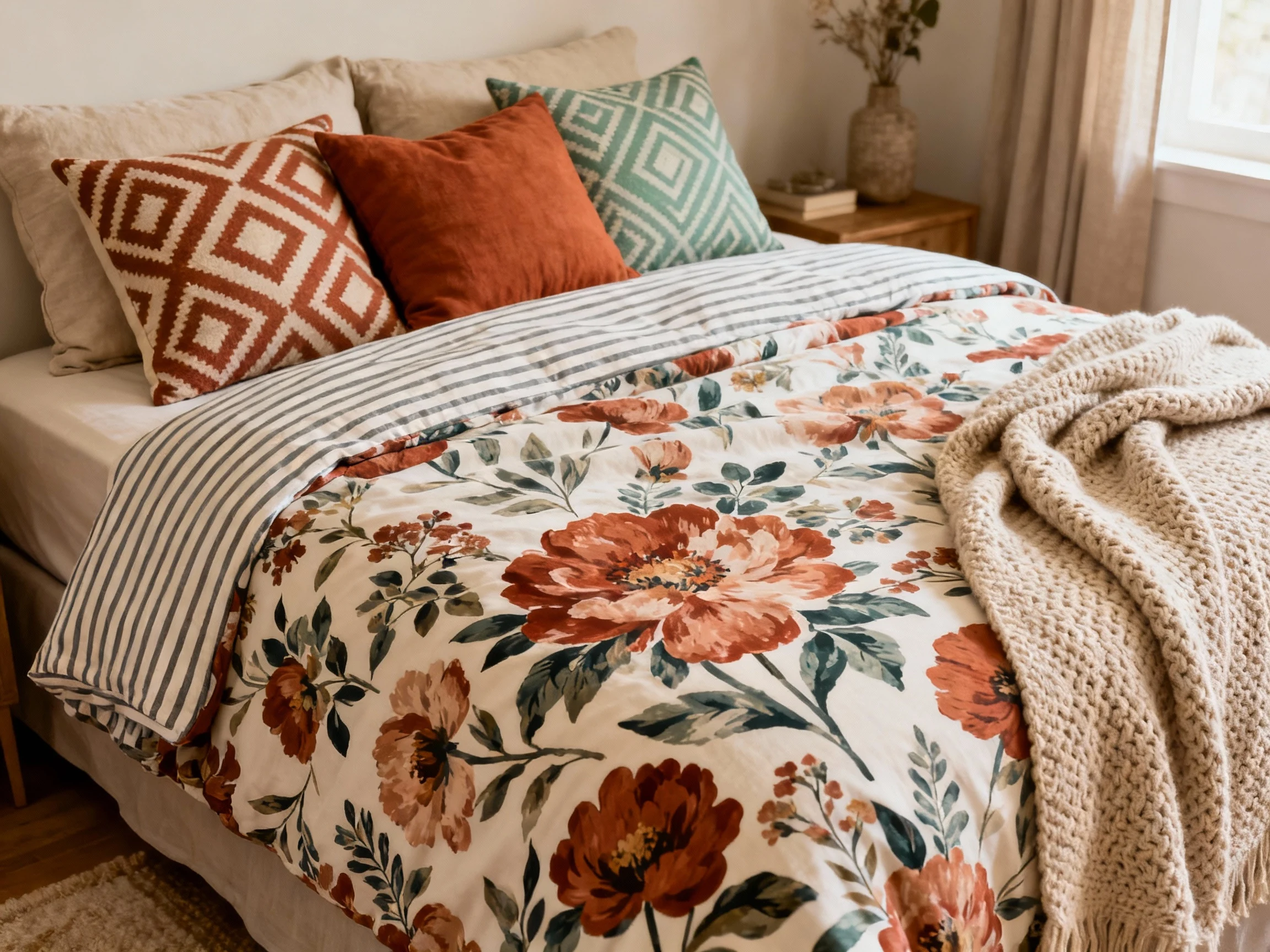
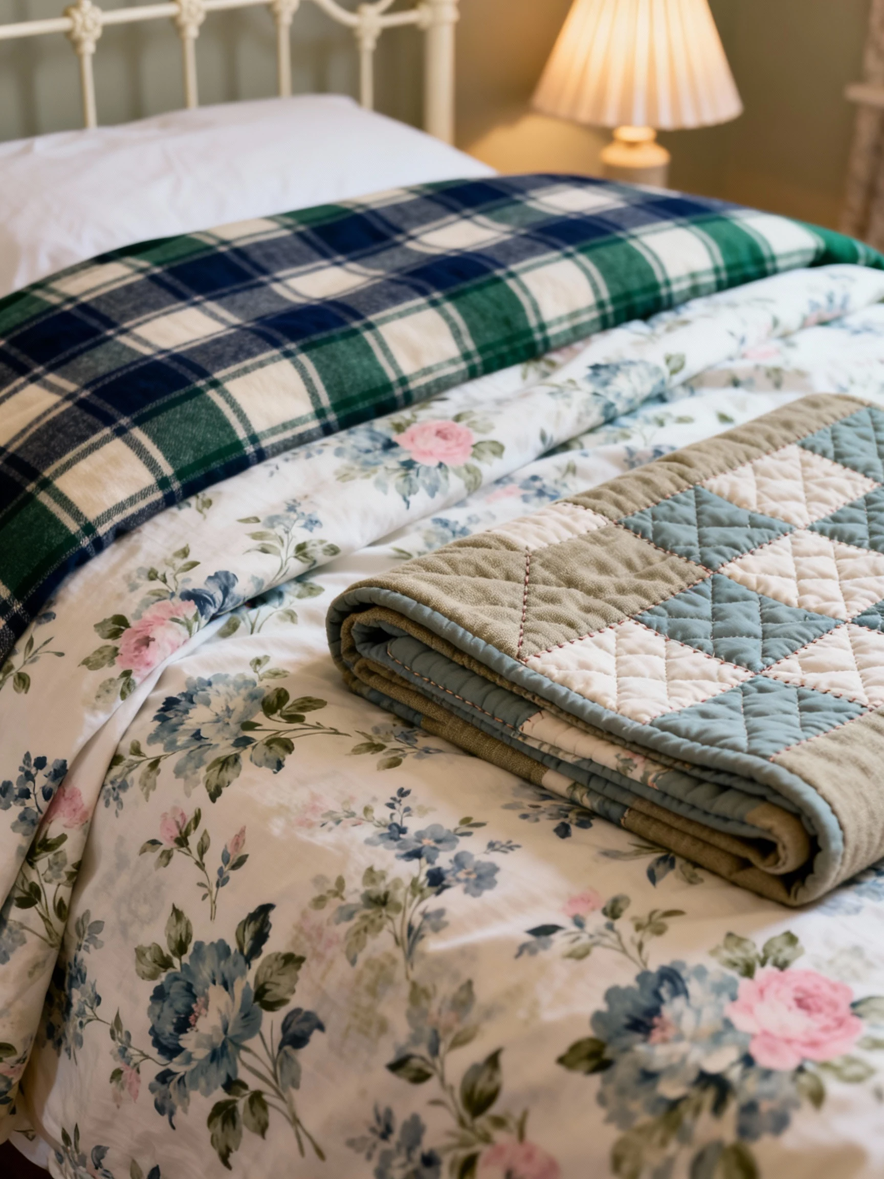
3. The Cozy English Cottage Bedroom: Vintage Floral + Plaid + Quilted Charm
This room is pure storybook, but in a chic way—not theme-park cottage.
The bedsheets are a vintage-inspired floral, the kind with slightly faded colors that look like they’ve been loved forever. Think muted blues, soft greens, and a whisper of pink.
Now here’s the magic: you bring in plaid. A plaid duvet or comforter—something with gentle contrast, like navy and cream or forest green and flax.
Because both prints feel traditional, they blend beautifully. The “pro” part is making sure one is more detailed (the floral) and the other is more structured (the plaid).
How The Whole Room Comes Together
The bed itself should feel charming: a painted metal bed frame in ivory, sage, or soft black works perfectly.
On the floor, add a washed vintage rug with reds and blues that echo the bedding without matching exactly.
Then pile on the cozy: a quilted throw folded neatly, a stack of books on the nightstand, and a little lamp with a pleated shade that makes everything glow.
Color Palette: faded blue, cream, mossy green, touches of warm wood.
- Sheets: vintage floral (busy, romantic, detailed)
- Duvet: medium-scale plaid (structured and grounding)
- Extra layer: a patchwork or quilted throw at the foot
- Window treatment: simple linen curtains in flax
The result is that “I want to curl up here with tea” feeling, and the print mixing looks effortless because it’s rooted in classic patterns.
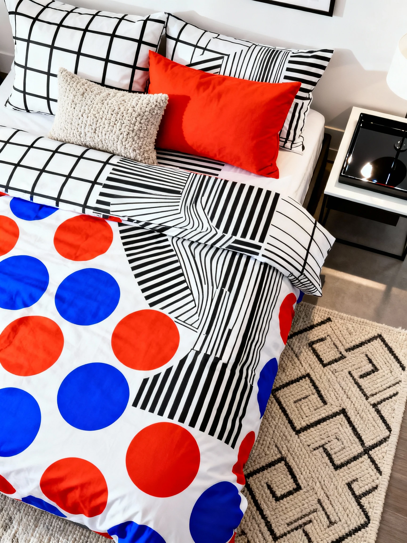
4. The Playful City Loft: Black-And-White Graphic Print + Pop-Color Dots + Neon Art
This one is for my bold friends. The vibe is energetic, a little cheeky, and very “I live in the city and I have opinions.”
Start with a high-contrast base: black-and-white graphic sheets. Think oversized grids, bold stripes, or abstract line drawings.
Then add your wild card: a duvet cover with bright, punchy polka dots or scattered color blocks. Pick two or three colors max—like electric blue and tomato red—so it feels intentional, not chaotic.
The bed gets finished with a couple of solid pillows in one of those pop colors, plus one textured neutral pillow (boucle is perfect) so your eye has a place to rest.
How The Whole Room Comes Together
The furniture should be clean and modern: a platform bed in black or light oak, a sleek nightstand, and maybe a low dresser with flat fronts.
Now for the fun part: wall art. Go big with a neon-style print or bright abstract art that echoes the bedding colors.
Lighting is a statement too: a metal arc lamp or a sculptural pendant. Add a mirror with a thin black frame to bounce the city light around.
Color Palette: black, white, plus 2 vivid accents (try cobalt and red, or lime and hot pink).
- Sheets: bold black-and-white graphic (anchor pattern)
- Duvet: colorful dot or block print (the “party” layer)
- Rug: neutral with a geometric weave to avoid print overload
- Finishing touch: one lacquer tray on the nightstand for shine
This room proves mixing prints can be modern, crisp, and totally confident—like your bed is wearing designer street style.
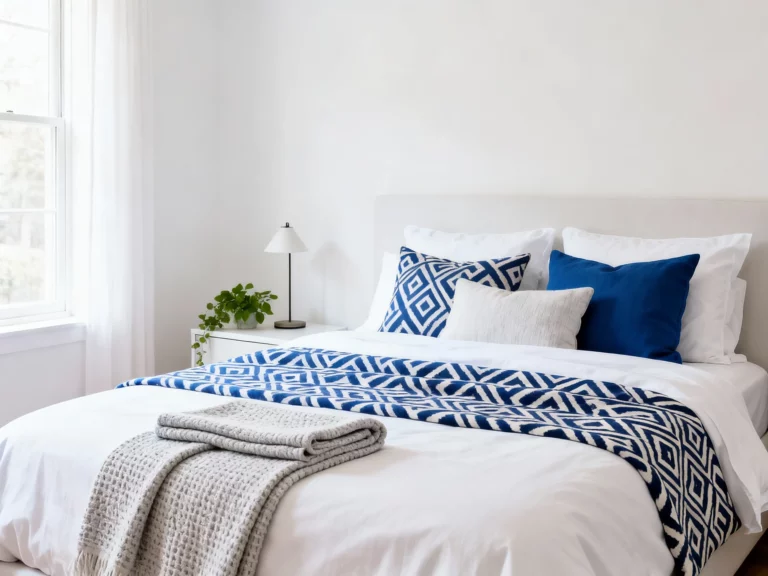
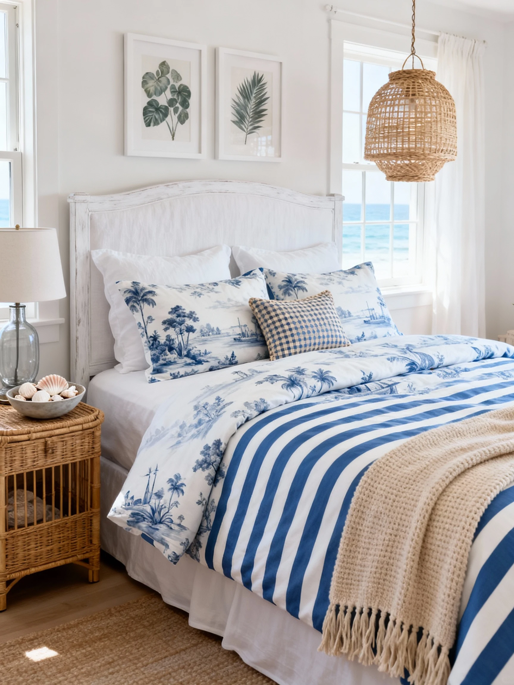
5. The Coastal Grandmillennial Retreat: Soft Blue Toile + Cabana Stripes + Rattan Glow
Picture a bedroom that feels like a seaside vacation home, but with polished, collected charm.
The sheets are the showstopper: classic toile in soft blue on white. It’s detailed and scenic, which instantly makes the bed feel elevated.
Now you mix in something sunny and simple: cabana stripes for the duvet or shams. Wide stripes in blue and white feel coastal, fresh, and they balance the busyness of toile perfectly.
To keep it from feeling too formal, add a third “texture print”: a small pillow in a nubby woven check or a subtle basketweave pattern.
How The Whole Room Comes Together
The furniture leans breezy: a whitewashed wood bed or a simple upholstered headboard in a crisp linen.
Bring in rattan or cane—maybe a rattan nightstand, a woven pendant light, or a pretty chair in the corner with a striped cushion.
For decor, keep it coastal but classy: a glass lamp base, a bowl of shells that doesn’t look like a craft project, and one or two framed botanicals.
Color Palette: soft blue, white, sandy beige, hints of brass.
- Sheets: blue-and-white toile (detailed, traditional)
- Duvet/shams: wide cabana stripes (bold, simple)
- Throw: sandy knit or fringe throw for warmth
- Art: coastal landscapes or botanicals in white frames
This look is equal parts beachy and refined. It’s the kind of bed that makes you want to open the windows and dramatically fluff the pillows.
If you want one easy rule to remember from these rooms, it’s this: pick one anchor print, one supporting print with a different scale, and a couple of solid or textured layers to let the bed breathe.
Mixing prints like a pro isn’t about following strict rules—it’s about creating a vibe that feels like you, then making it look intentional with smart repetition of color and contrast.