5 Subway Tile Kitchen Backsplash Ideas That’ll Make Your Kitchen Look Expensive
You know that moment when you walk into someone’s kitchen and instantly assume they have their life together? Yeah. A good backsplash does that.
And if you’re eyeing subway tile, you’re in excellent company. It’s classic, it’s flexible, and it’s basically the little black dress of kitchens—except it has grout lines and occasionally causes decision fatigue.
Let’s fix that. Here are five subway tile kitchen backsplash ideas that look intentional (not “I panicked at the tile aisle”), with practical tips so you can actually pull them off.
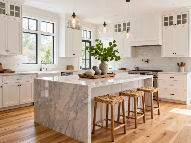
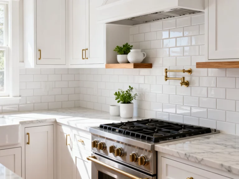
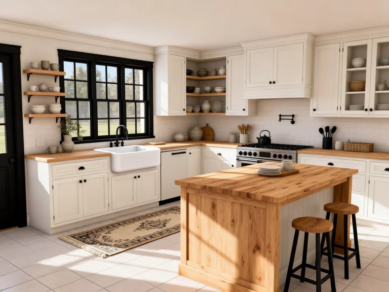
1. Go Classic White… Then Make It Not Boring
Yes, white subway tile is everywhere. No, that doesn’t make it wrong. It makes it a classic that won’t haunt you in three years like that trendy neon pendant light you swore you’d “totally love forever.”
The trick is simple: keep the tile classic and customize the details. That’s where the personality lives.
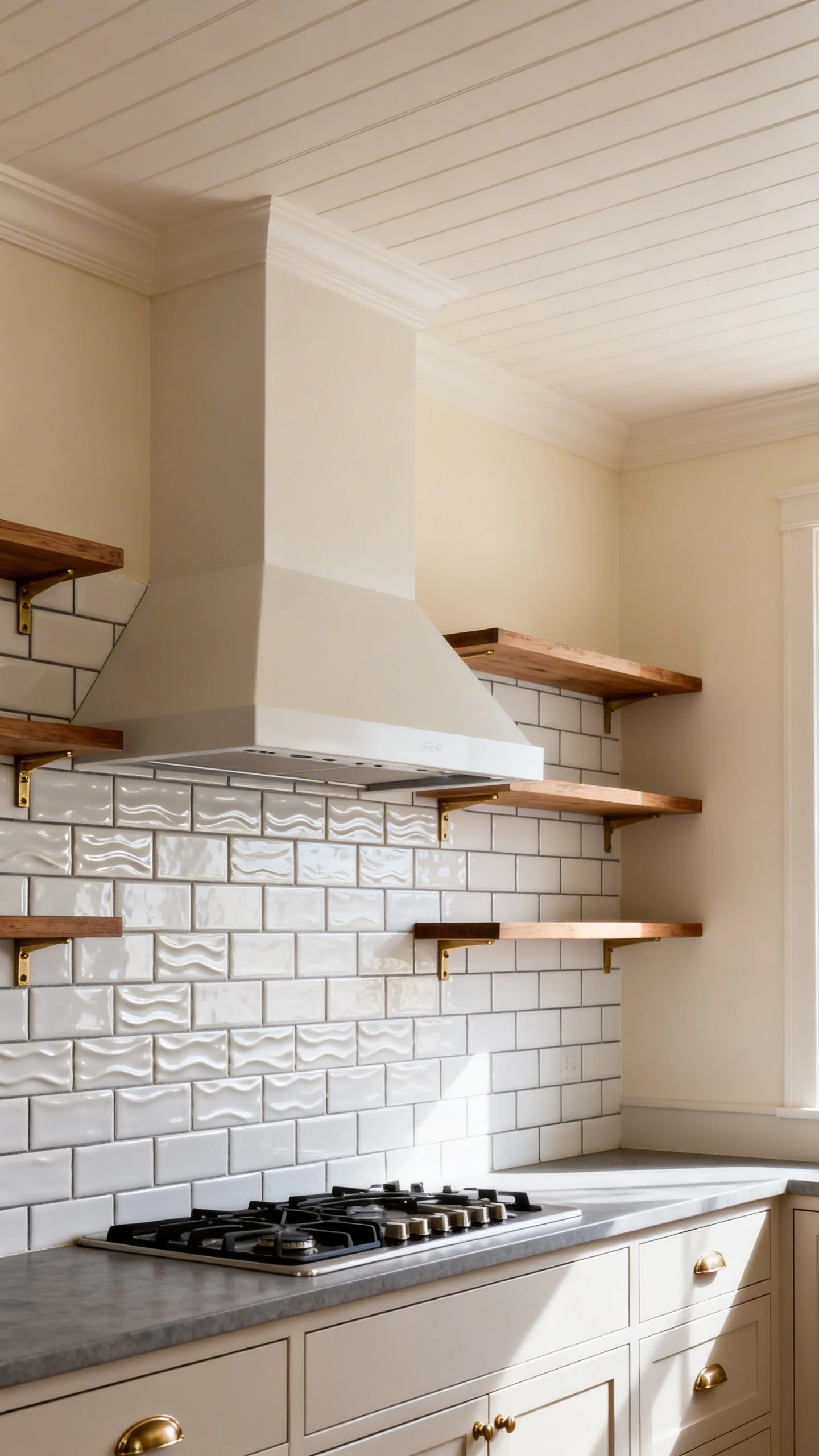
Make The “Basic” Look Feel Designer
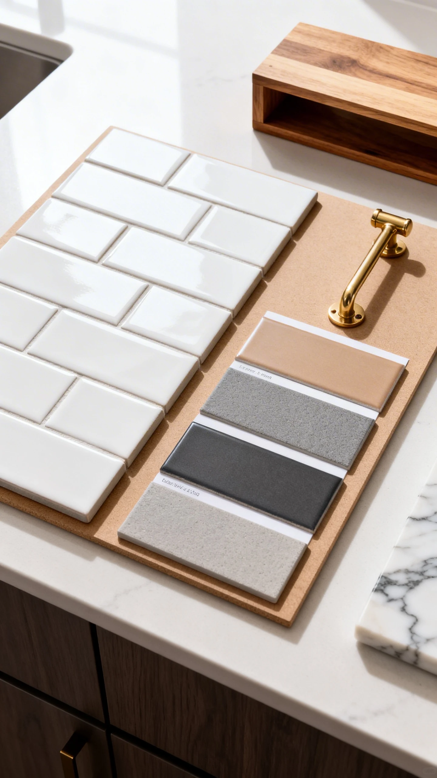
Start by choosing a white tile with a little something going on—soft ripples, handmade edges, or a satin finish. Those tiny imperfections are what make it feel high-end, IMO.
- Pick a finish on purpose: glossy for sparkle, matte for calm, satin for “I hired a designer” vibes.
- Upgrade the grout: warm gray adds depth, white blends seamlessly, charcoal brings drama.
- Choose a slightly larger size: 3×12 or 4×16 feels fresher than the standard 3×6.
- Run it to the ceiling: especially behind a range hood for instant “custom kitchen” energy.
FYI, grout color is basically makeup for your tile. It can contour, brighten, or totally change the mood. So yeah, it matters.
Quick “Oops-Proof” Tips
If you’re worried about it looking too stark, bring in warmth with wood shelves, brass hardware, or a creamy paint color. White tile is a team player—it’s not trying to be the main character.
Unless you pair it with black grout. Then it absolutely is.
2. Flip The Script With Vertical Stacked Subway Tile
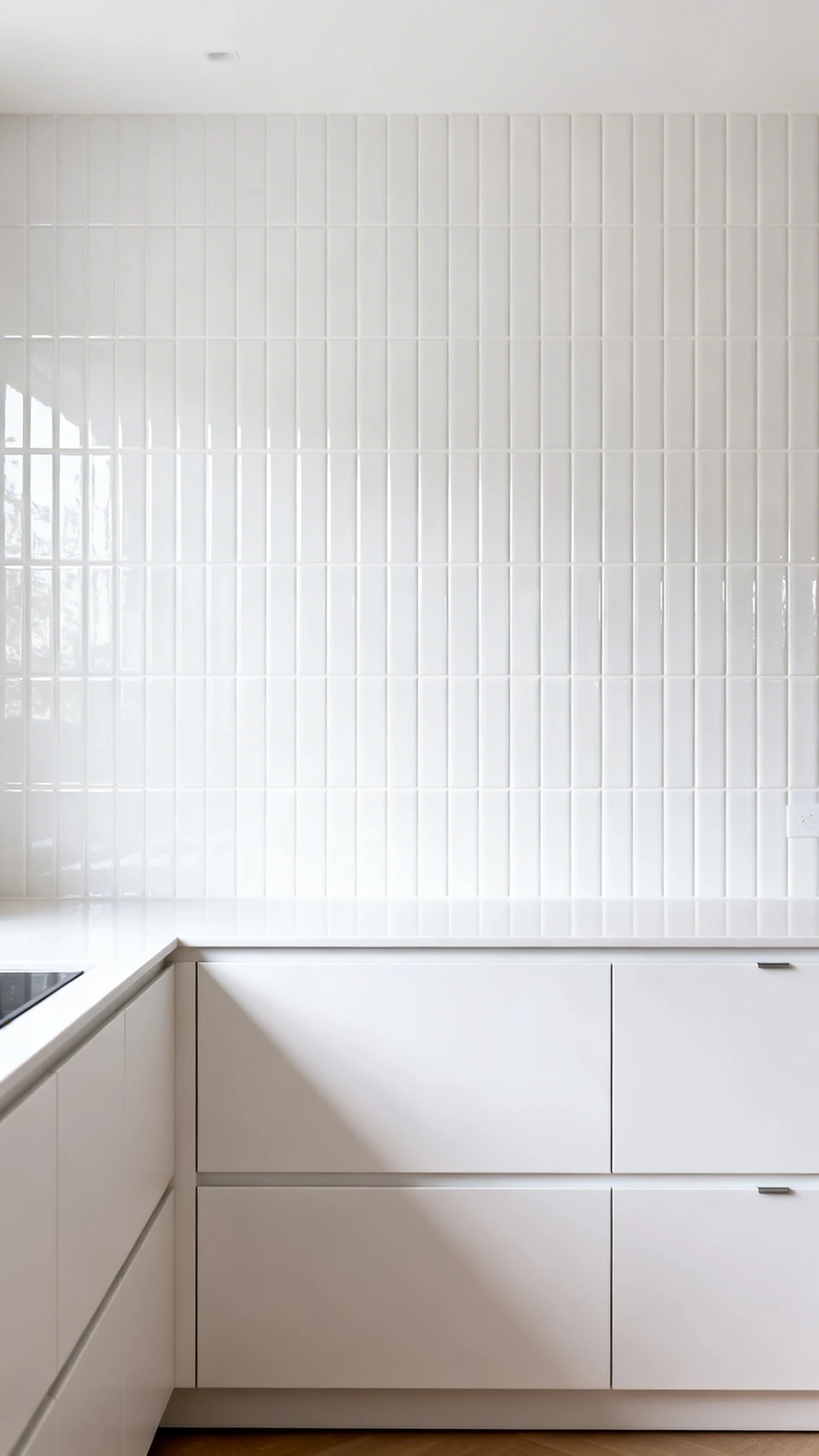
If you want something that feels modern but still timeless-ish, meet your new best friend: vertical stacked subway tile. It’s clean, graphic, and makes your kitchen look taller—like a good pair of jeans.
Instead of the classic offset pattern, you stack tiles directly on top of each other, and you run them vertically. Simple move, big payoff.
Why It Works So Well
Vertical lines draw the eye up, which is amazing if you have low ceilings or upper cabinets that feel a little… heavy. This pattern also looks extra crisp with slab-front cabinets and minimal hardware.
- Best for: modern, Scandinavian, and minimalist kitchens.
- Tile picks: glossy white, soft greige, pale sage, or even a muted blush.
- Grout move: match the tile for a sleek look, contrast it for a grid effect.
Make It Feel Intentional, Not Random
Commit to the pattern across the whole backsplash area. Half vertical, half something else can look like you changed your mind mid-project (unless you’re doing a planned transition, which is… advanced).
Also, use tile spacers. This is not the time to freestyle. Your future self does not want wavy grout lines.
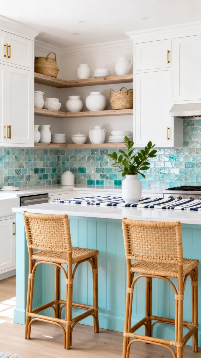
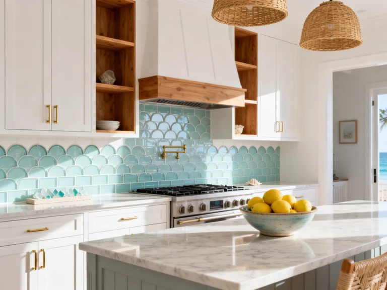
3. Try A Bold Color Subway Tile (Yes, You’re Brave Enough)
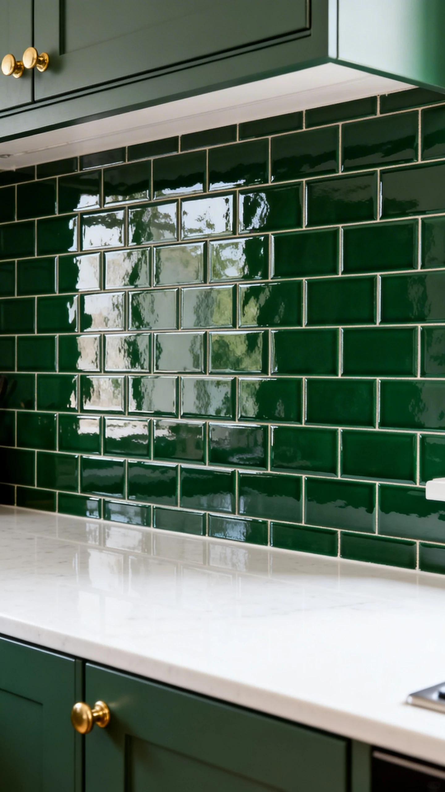
White is safe. But a colored subway tile backsplash? That’s where your kitchen starts getting compliments from strangers. And by strangers, I mean your friends who suddenly want to “drop by” more often.
Color doesn’t have to be loud. It just has to be deliberate.
Color Ideas That Age Well
Go for shades that feel grounded and a little moody. They’re dramatic without screaming for attention like a reality TV reunion.
- Deep green: rich, earthy, looks unreal with brass or black hardware.
- Navy: classic, upscale, and surprisingly neutral.
- Dusty blue: soft and coastal without going full “beach house sign.”
- Warm taupe or greige: a gentle twist if you’re color-shy.
If you’re nervous, start with a smaller area—like behind the coffee station or just the range wall—then decide if you want to keep going. Baby steps. No shame.
How To Keep Color From Feeling Too Much
Balance is everything. Let the color be the moment, and keep the counters, cabinets, and floors relatively calm. You want “designed,” not “I bought everything I liked and now it’s arguing.”
- Pair with simple counters: white quartz, light granite, or butcher block.
- Use matching grout: it keeps things smooth and less busy.
- Add one metal finish: brass, chrome, or black—pick a lane.
And yes, glossy colored tile will show more smudges. But it also reflects light like a dream, so you win some, you Windex some.
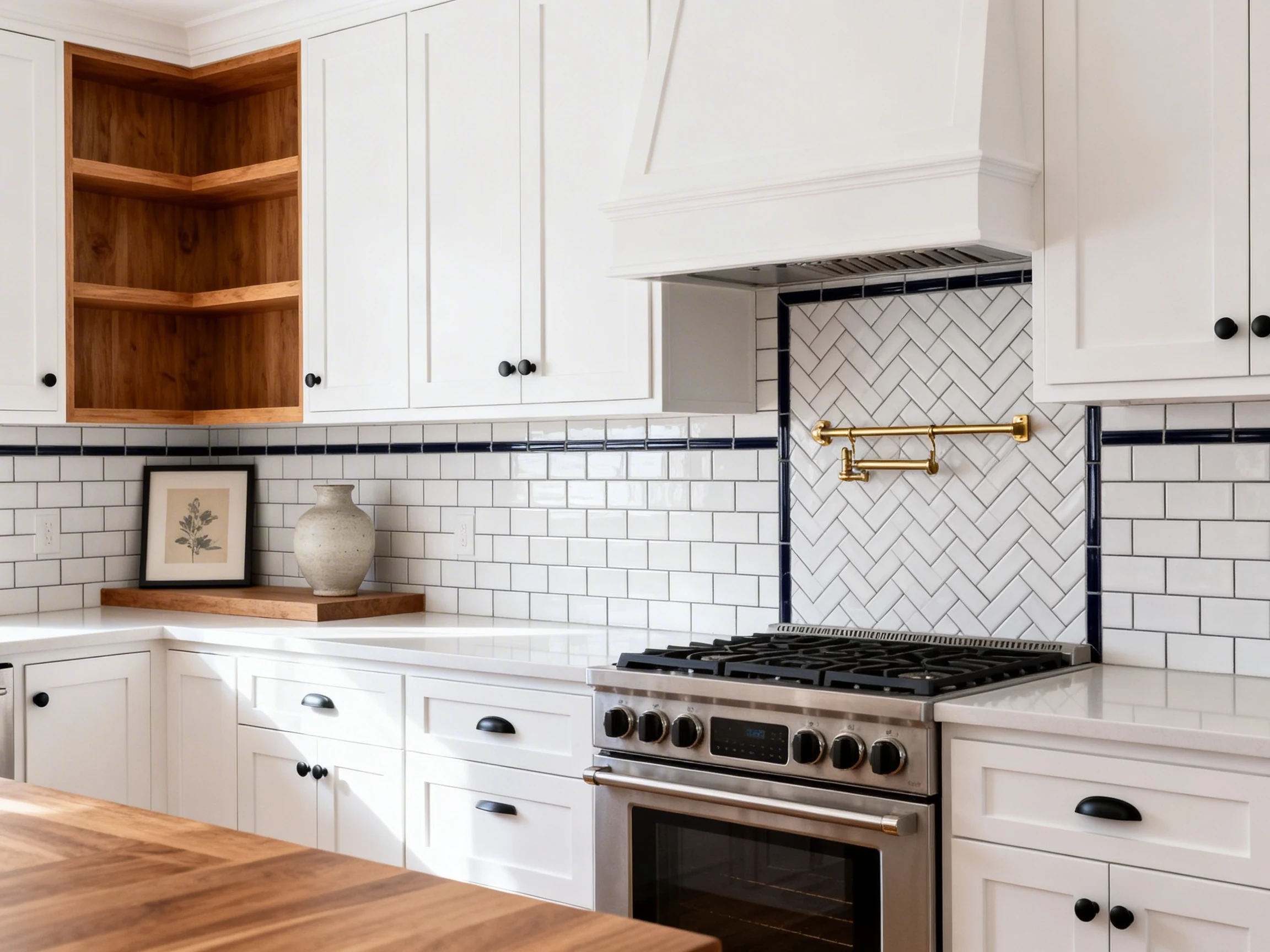
4. Get Artsy With Herringbone Or Chevron Subway Patterns
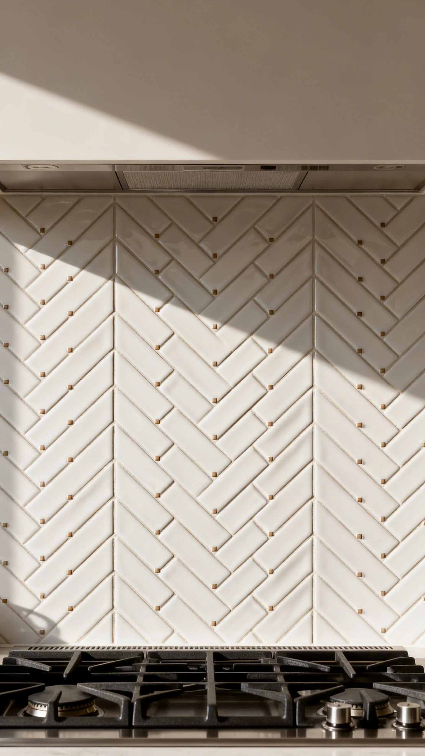
Okay, you want your backsplash to do a little more. You want movement. You want texture. You want someone to say, “Wait, what tile is that?” as if you discovered it on a secret trip to Italy.
That’s where herringbone subway tile or chevron comes in. Same basic tile shape, but the layout looks instantly elevated.
Herringbone Vs. Chevron (Quick And Pain-Free)
Herringbone uses rectangular tiles that overlap in a staggered V pattern. Chevron creates a cleaner V shape, usually with angled tile edges. Both look amazing. One is just slightly more “math.”
- Herringbone: classic, detailed, works in traditional and modern kitchens.
- Chevron: sharper, more contemporary, and a little more precise to install.
Pro Tips So It Doesn’t Turn Into A Grout Nightmare
Busy patterns need calm surroundings. If your counters have wild veining or your cabinets have heavy detailing, go with a quieter tile color and grout to avoid visual chaos.
- Choose a smaller grout line: it keeps the pattern crisp.
- Use a contrasting border sparingly: only if you want a framed, custom look.
- Plan the center point: especially behind the stove so it looks symmetrical.
This is also the pattern that makes people swear you spent more than you did. Which is, frankly, my favorite kind of design trick.
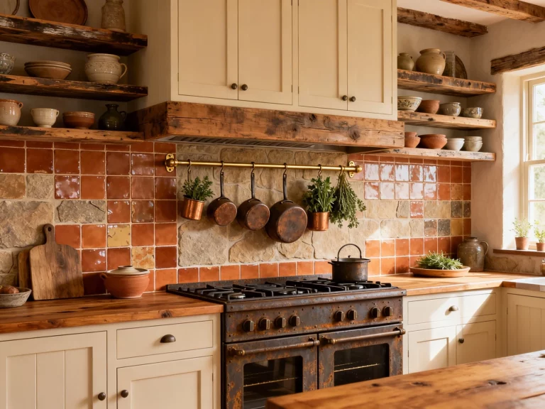
5. Mix Materials With Subway Tile for A High-End, Layered Look
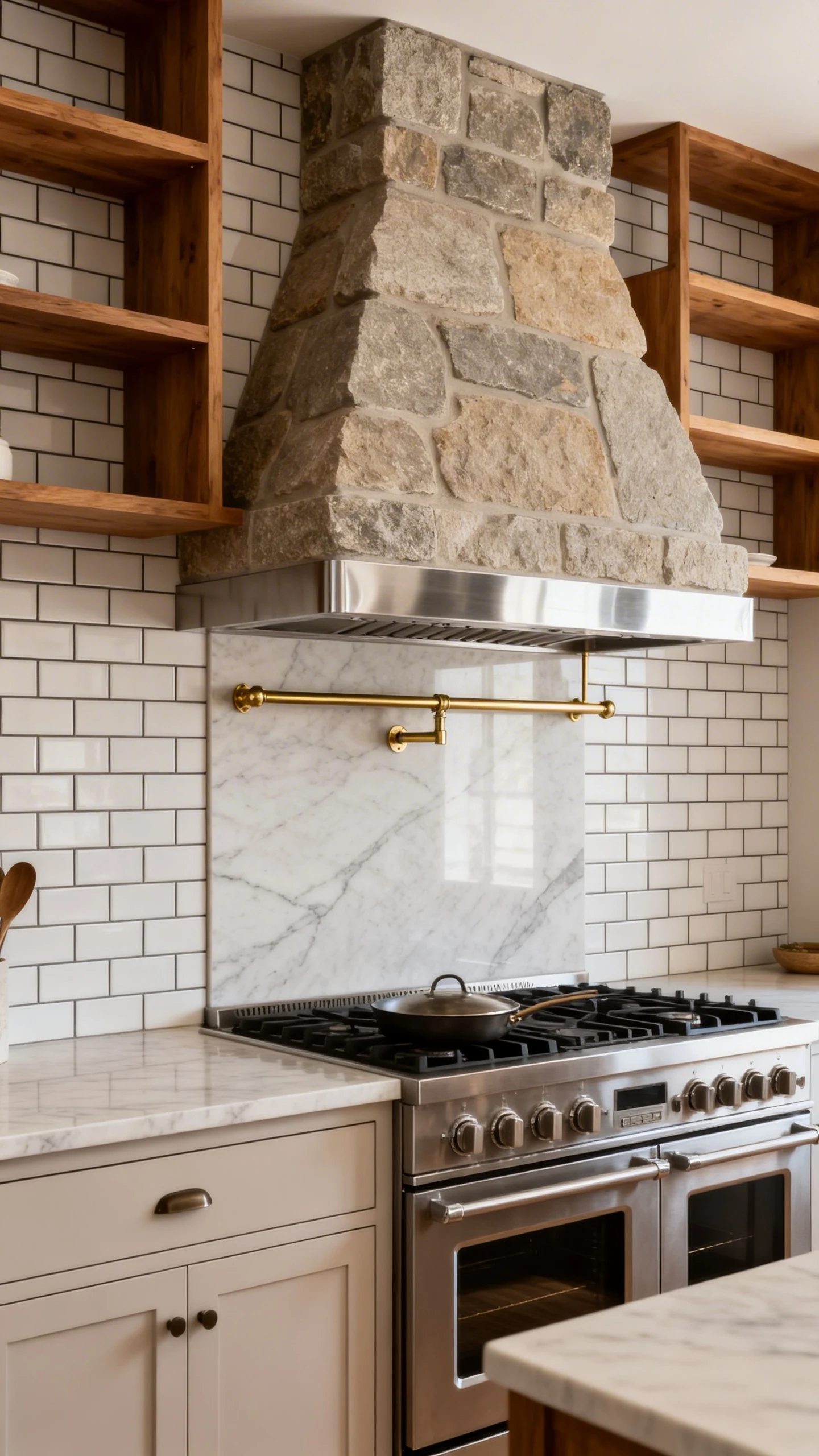
If you want your kitchen to feel curated—like you didn’t buy every finish from the same aisle—mixing materials is the move. Subway tile plays really well with others. It’s friendly like that.
The goal is intentional contrast: smooth with textured, matte with glossy, modern with rustic.
Easy Material Mixes That Look Custom
You don’t need to invent a new trend. Just pair subway tile with one interesting supporting player.
- Subway tile + open wood shelves: warmth, texture, and instant styling opportunities.
- Subway tile + stone range hood: soft, organic, and very “Pinterest reveal.”
- Subway tile + metal accents: think stainless hood, brass pot rail, or black sconces.
- Subway tile + a slab backsplash section: run quartz up the wall behind the stove, tile everywhere else.
Keep It Cohesive (So It Looks Designed, Not Accidentally Mixed)
Pick a unifying element: repeat a color tone, match undertones (warm with warm, cool with cool), or keep the shapes simple. When in doubt, let subway tile be the calm base and let the other material bring the drama.
- Repeat a finish: match faucet to cabinet hardware.
- Echo a color: pull a grout tone from your countertop veining.
- Limit to two “stars”: tile plus one standout feature is usually plenty.
Also, a gentle reminder: too many statement pieces turns into a design group chat where everyone talks at once. Let one thing shine.
You really can’t go wrong with subway tile—unless you ignore scale, skip planning, and choose grout like it’s an afterthought. But you’re not doing that, right?
Pick one of these subway tile kitchen backsplash ideas, commit to the details, and your kitchen will look pulled together fast. And if anyone asks, just casually say, “Oh this? I just had a vision.”