5 Kitchen Cabinet Color Ideas Two Tone That Instantly Upgrade Your Whole Kitchen
You know that moment when you walk into your kitchen and think, “Why does this feel… fine?” Like it’s not ugly, it’s just not giving. That’s where two tone kitchen cabinets swoop in and save the day.
Two tone is basically the cheat code of kitchen design. It adds contrast, personality, and that “designer did this” vibe without needing to demolish your life. And yes, it can work in tiny kitchens, builder-grade kitchens, and kitchens with that one weird soffit you pretend doesn’t exist.
Below are 5 kitchen cabinet color ideas two tone that look expensive, feel fresh, and won’t get old in six months. Let’s go.
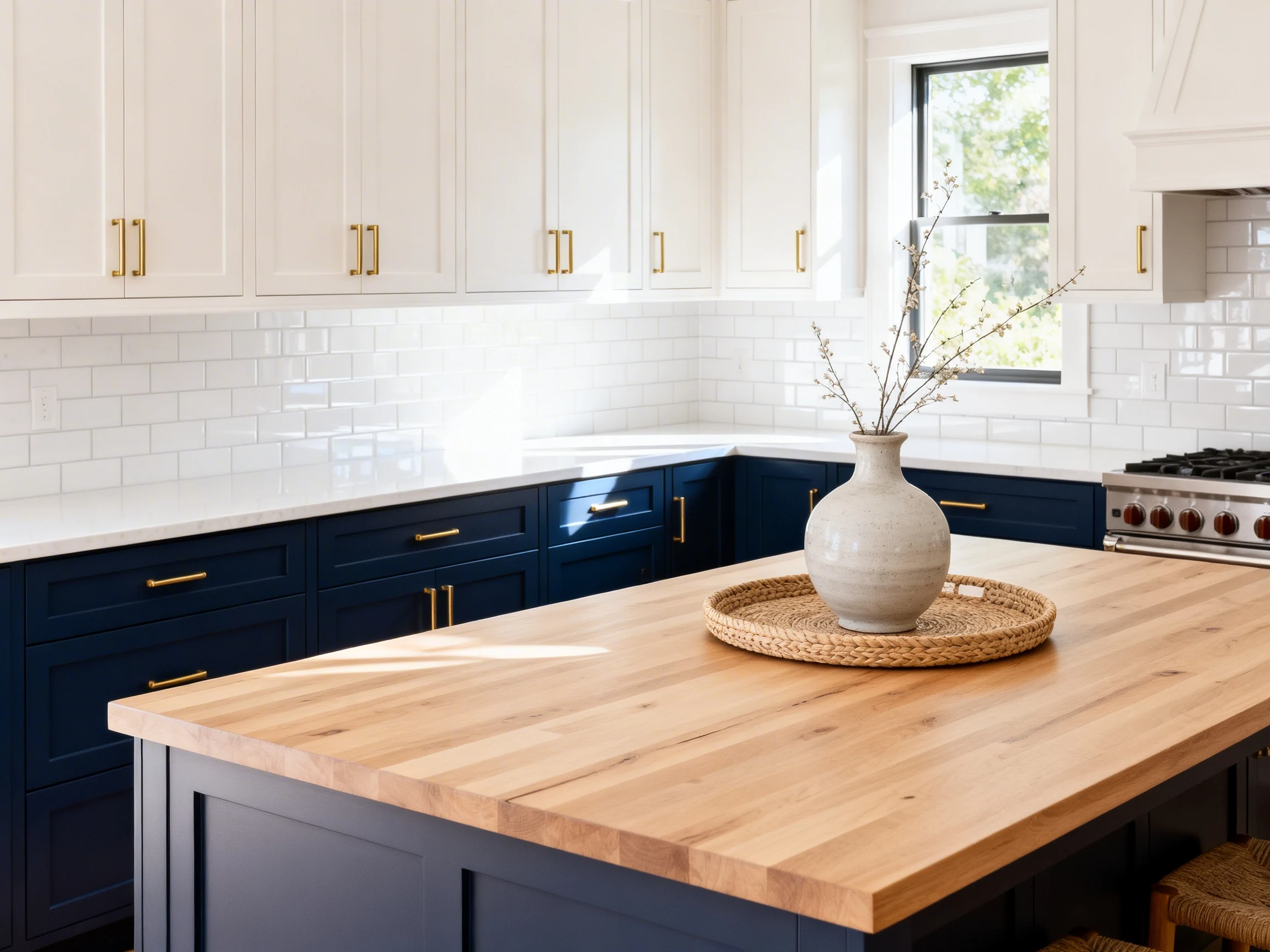
1. The “Bright Top, Moody Bottom” Power Move
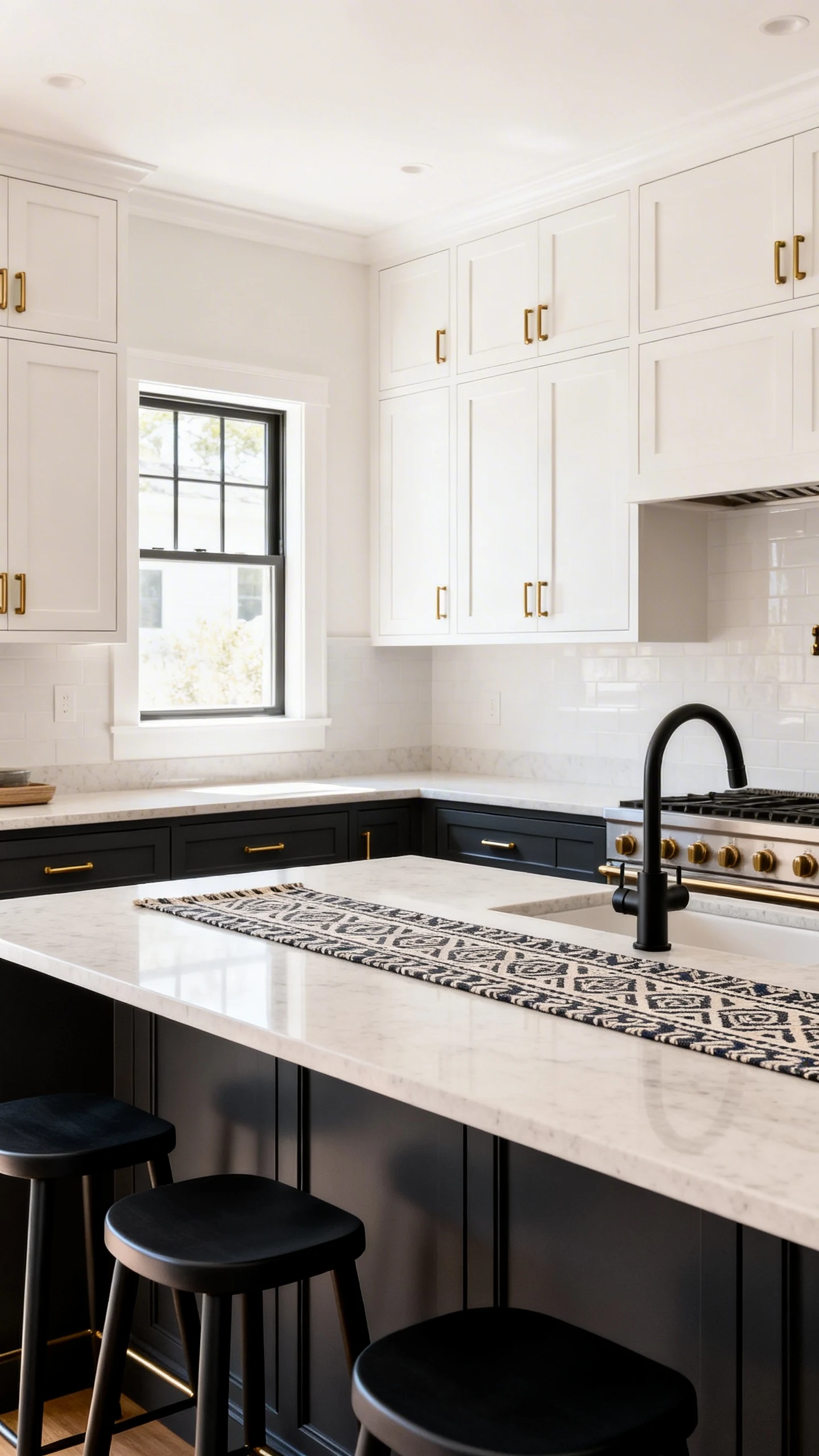
This is the classic two-tone setup for a reason. You keep the upper cabinets light so the room feels open, then go darker on the lowers for drama and grounding. It’s like eyeliner for your kitchen: subtle impact, major confidence.
Best Color Combos To Try
If you want a look that feels timeless but not boring, start here. These combos play well with most countertops and backsplashes.
- Warm white uppers + charcoal lowers for a crisp, modern vibe
- Ivory uppers + deep navy lowers for classic “fancy coastal” energy
- Soft cream uppers + forest green lowers for that cottage-but-make-it-cool look
Make It Look Intentional (Not Accidental)
The key is to make the two tones feel like a decision, not like you ran out of paint. Tie the colors together with consistent hardware and a unifying countertop.
- Use the same cabinet style on top and bottom
- Repeat the darker color in accents like bar stools or a runner
- Choose one metal finish for hardware, like brushed brass or matte black
FYI: Dark lowers are also forgiving. Between shoes, pets, and life, the bottom cabinets take the most damage. Darker paint is basically your kitchen’s concealer.
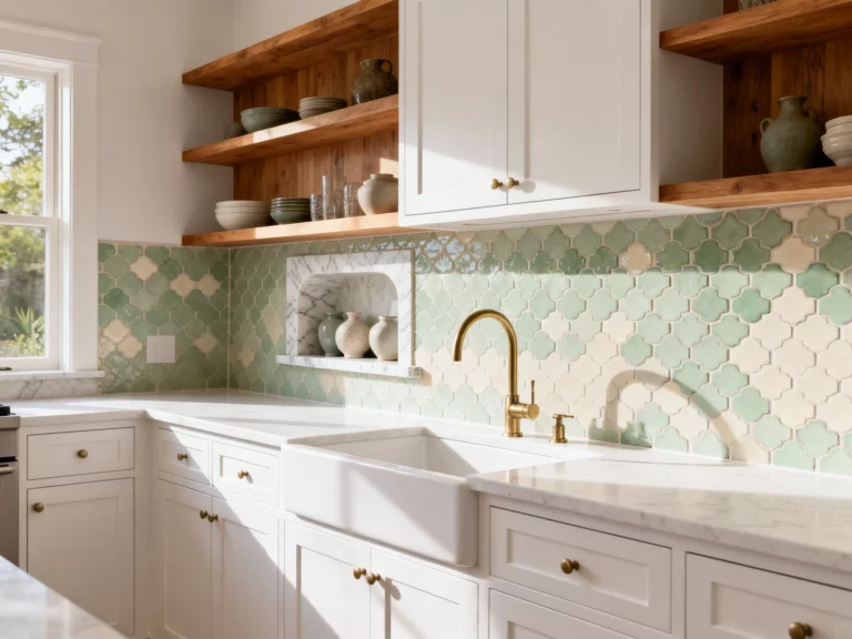
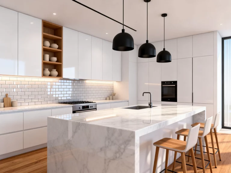
2. The “Color Pop Island” That Does All The Talking
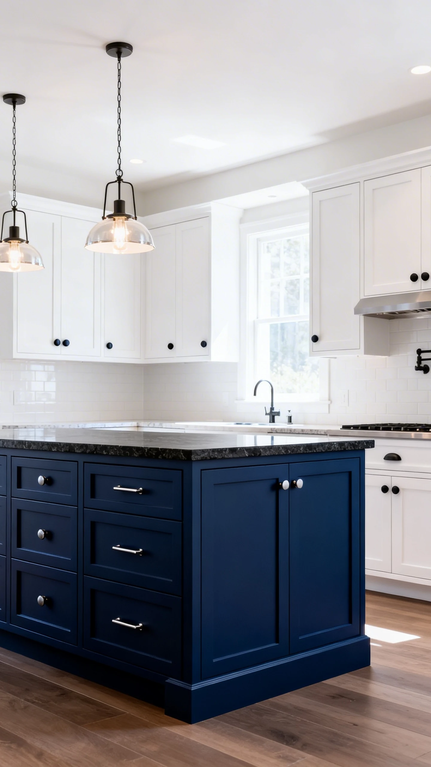
If your kitchen feels like it’s missing a personality, give your island the spotlight. Keeping perimeter cabinets one color and making the island a contrasting tone is a low-drama way to do two tone without committing to a whole two-color wall situation.
It’s the decor equivalent of wearing a neutral outfit with a killer bag. Simple, but everyone notices.
Island Colors That Always Hit
Your island is the perfect place to try something bolder, because it’s a contained zone. If you hate it later, you’re repainting one piece, not your entire identity.
- White cabinets + navy island for an elevated classic
- Greige cabinets + black island for modern farmhouse that isn’t cheesy
- Light oak cabinets + sage island for a calm, organic look
- Soft beige cabinets + terracotta island for warm, Mediterranean vibes
Pro Tips For A “Designer” Finish
IMO, the island looks best when it gets a little extra attention. Think of it as your kitchen’s main character.
- Add statement pendants above it to “frame” the color
- Use slightly different hardware on the island, like knobs instead of pulls
- Consider a contrasting countertop on the island for extra wow
And if someone tells you it’s “too bold,” just smile. You’re not decorating for their beige comfort zone.
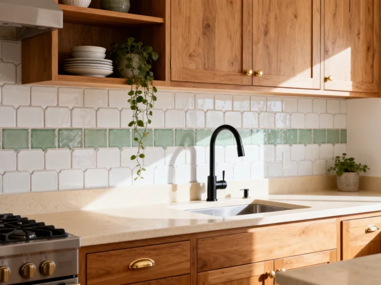
3. The “Warm Wood + Painted Cabinets” Cozy-Modern Combo
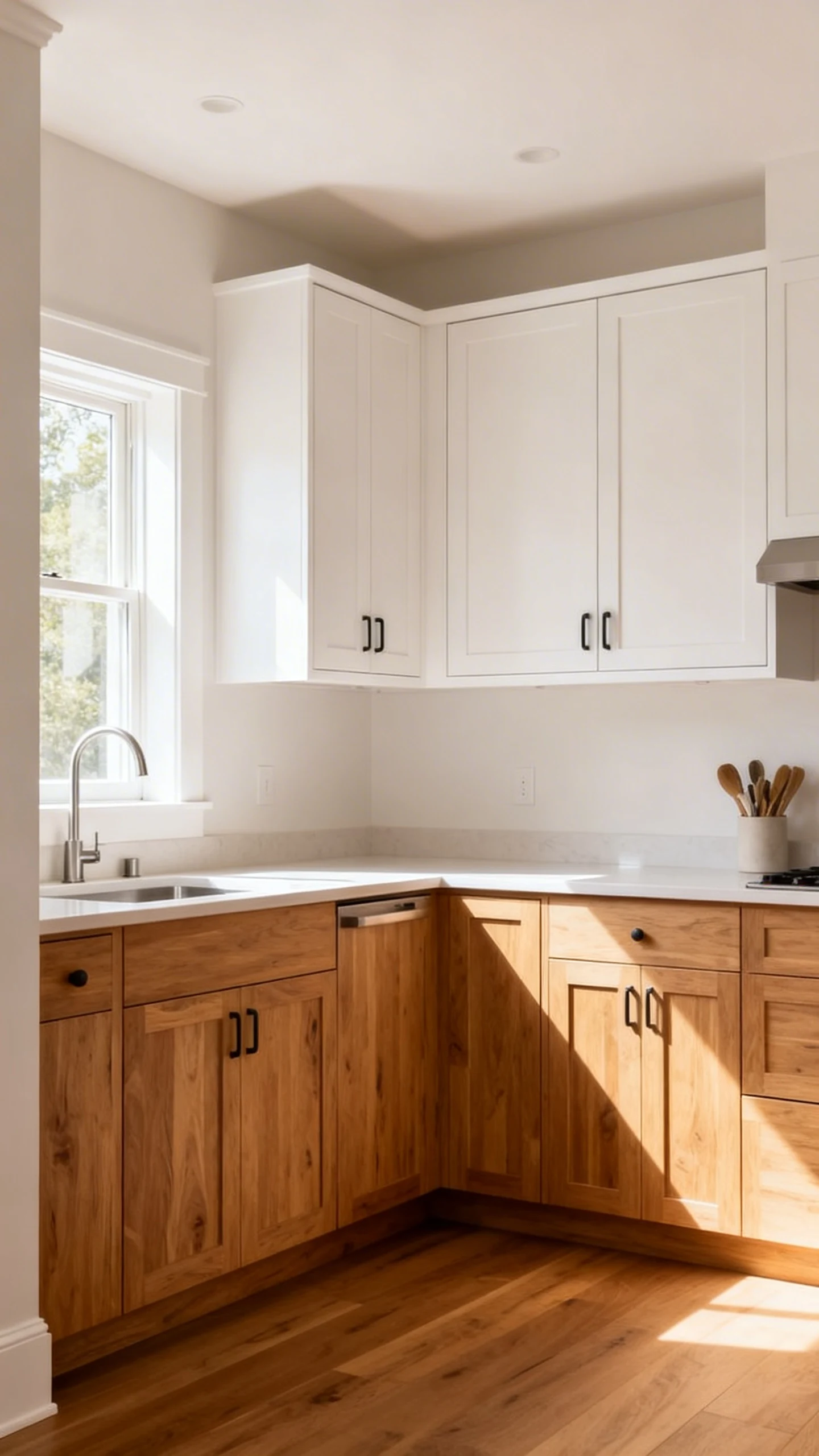
Okay, this one is a heart-stealer. Mixing wood tones with painted cabinets creates warmth without turning your kitchen into a rustic log cabin. It’s modern, it’s inviting, and it looks amazing in photos. Yes, your kitchen can be photogenic too.
This is especially great if you’re bored of all-white everything but still want it to feel light and airy.
How To Use Wood Without Overdoing It
The trick is balance. Use wood as a texture and a visual break, not as a full-on wood takeover.
- Do wood lowers + painted uppers for a grounded, organic look
- Try wood uppers with painted lowers if you want a more modern twist
- Use wood just on the island if you’re testing the waters
Paint Colors That Pair Beautifully With Wood
Wood already brings warmth, so the best pairings tend to be calm, earthy, or slightly moody. You want the paint to feel intentional, not like it’s fighting for attention.
- Soft white for classic, bright contrast
- Sage green for a relaxed, nature-inspired vibe
- Dusty blue for subtle color without screaming “trend”
- Charcoal for a bold, modern edge
One more thing: pay attention to undertones. If your wood is orange-y, choose warmer whites. If it’s a cooler oak, you can lean into cooler paint shades. Yes, paint undertones are annoying. No, you can’t ignore them.
4. The “Same Color, Different Shade” Two-Tone Trick
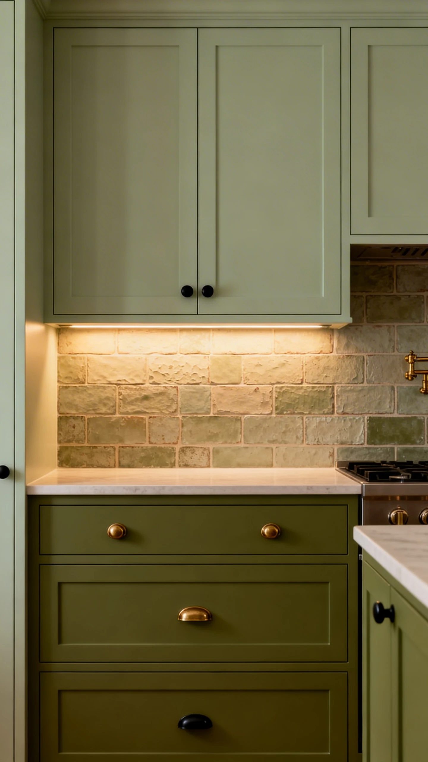
Want two tone cabinets but you’re scared of contrast? Say less. The tonal approach uses one color family in two different depths, so it reads sophisticated instead of chaotic.
This is perfect if you like calm, cohesive spaces but still want that layered, custom look.
Tonal Combos That Feel Effortlessly Elevated
Think of this as the “quiet luxury” version of two tone. Subtle, but definitely not boring.
- Light gray uppers + medium gray lowers for soft structure
- Pale sage uppers + olive lowers for earthy depth
- Powder blue uppers + slate blue lowers for a serene coastal feel
- Warm beige uppers + taupe lowers for cozy neutrals done right
How To Keep It From Looking Flat
Because the colors are close, you’ll want to build in a little contrast elsewhere. Otherwise it can feel like one big blur of “nice.”
- Choose a backsplash with texture, like handmade-look tile
- Pick hardware that pops, like matte black or aged brass
- Add under-cabinet lighting to highlight the upper color
If you’re nervous about choosing shades, grab paint samples and look at them morning, noon, and night. Kitchen lighting is sneaky and will absolutely change the vibe when you least expect it.
5. The “Unexpected Contrast” That Makes People Ask Questions
Ready to get a little spicy? This is where you mix a neutral with a surprising color, or go bold with an unexpected pairing. It’s not for the faint of heart, but it’s also the kind of kitchen that makes guests say, “Wait… what paint is that?”
And yes, that’s the compliment we live for.
Bold Two-Tone Pairings That Actually Work
The goal is playful but polished. You want contrast, not clown energy.
- Black lowers + pale wood uppers for modern, gallery-like drama
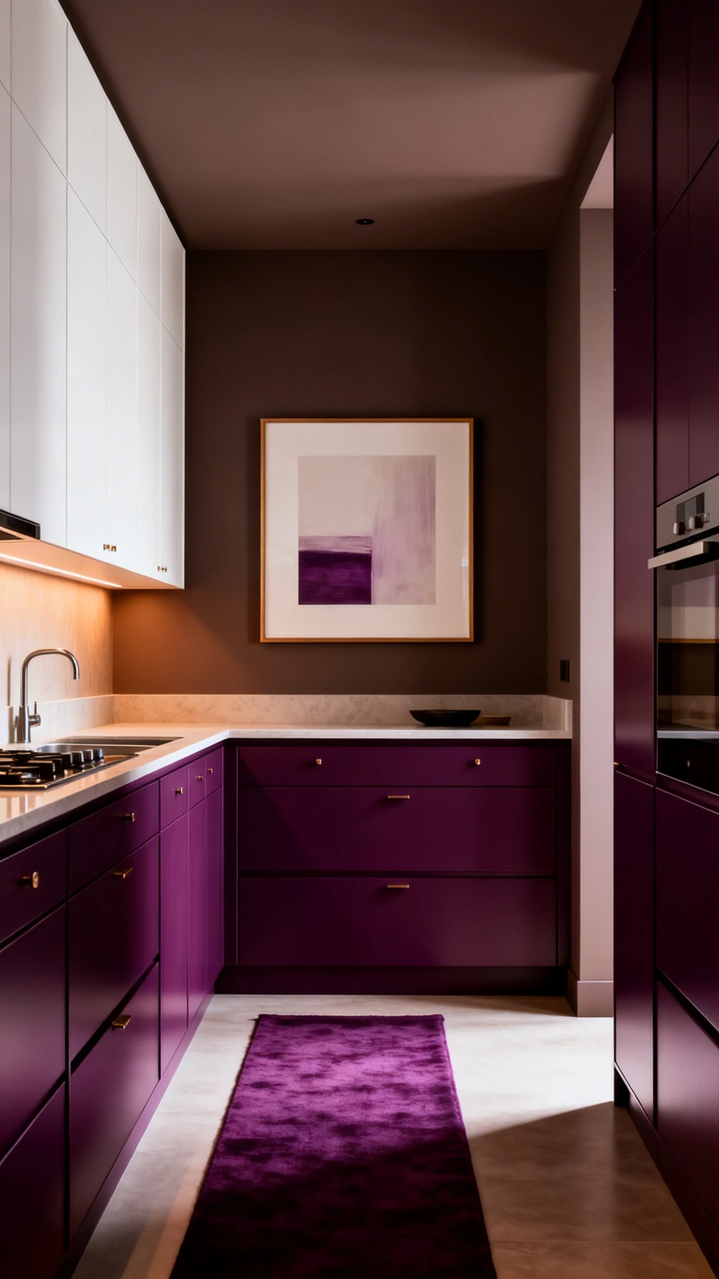
- Deep plum lowers + warm white uppers for moody elegance
- Ink blue lowers + creamy greige uppers for sophisticated depth
- Muted teal island + white perimeter cabinets for a fun focal point
Rules Of Thumb So It Doesn’t Go Sideways
This is the section where we pretend we’re “winging it,” but we’re actually being strategic. Because repainting cabinets is not a casual weekend hobby unless you hate yourself.
- Keep one color neutral or grounded so the bold shade has a partner
- Repeat the bold color at least once elsewhere, like art or textiles
- Choose finishes thoughtfully: satin for cabinets is usually a safe bet
- Test the color next to your countertop and floor, not just on a random wall
Also, if your kitchen has a lot of visual noise already, go bolder on the island instead of all the lowers. Let the “wow” live in one area, not everywhere at once. Your eyes deserve peace.
You don’t need a full renovation to get a kitchen that feels fresh. Two tone cabinets give you contrast, style, and that “this was intentional” polish with way less chaos than changing everything.
Pick one of these kitchen cabinet color ideas two tone, grab some samples, and trust your gut. Worst case? You repaint. Best case? You fall in love with your kitchen again.