5 Kitchen Cabinet Color Ideas Blue That’ll Make Your Kitchen Look Ridiculously Expensive
So you want blue kitchen cabinets. Love that for you. Blue is basically the “I have taste” color of the kitchen world—calm, confident, and just a little dramatic when it wants to be.
But not all blues hit the same. Some feel beachy, some feel moody, and some scream “I definitely watch design videos at midnight.” Let’s talk kitchen cabinet color ideas blue in a way that won’t make your eyes glaze over.
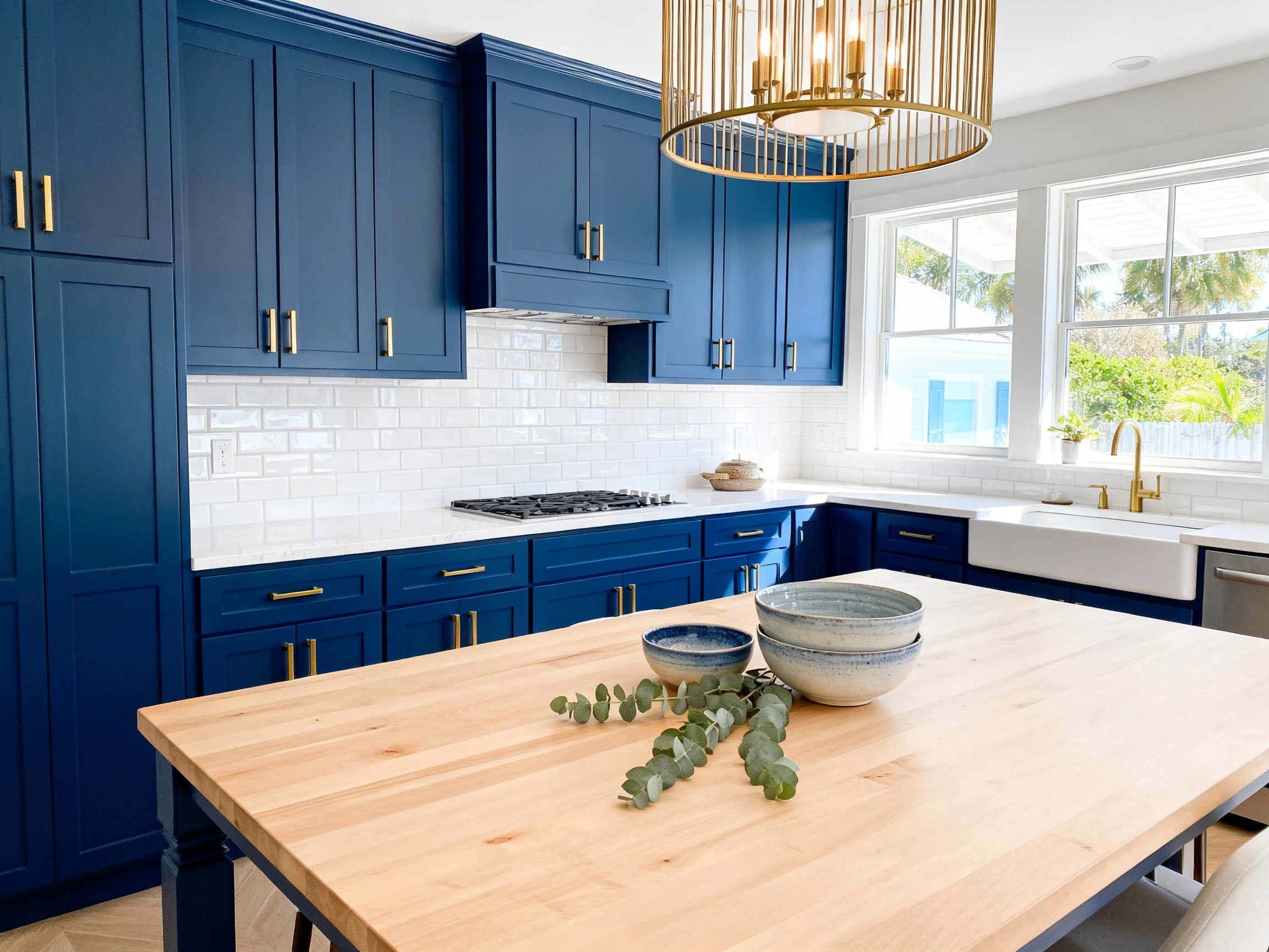
1. Navy Cabinets: The “I Mean Business” Blue
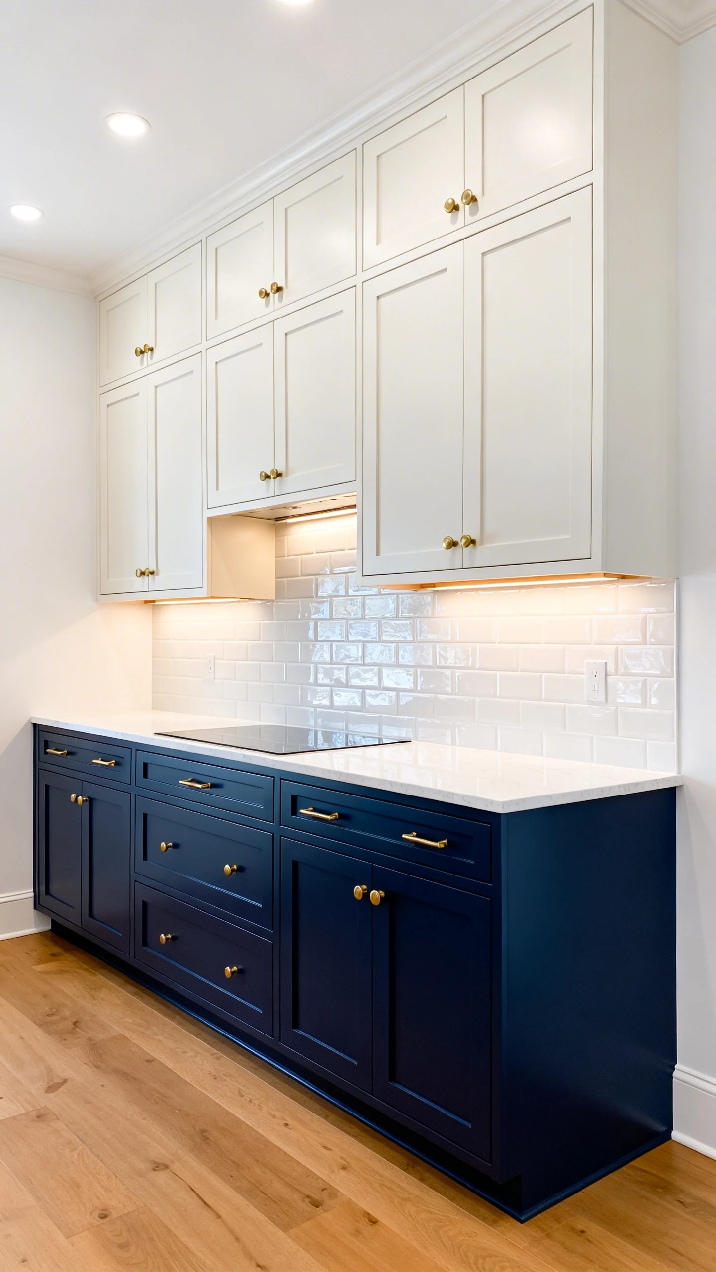
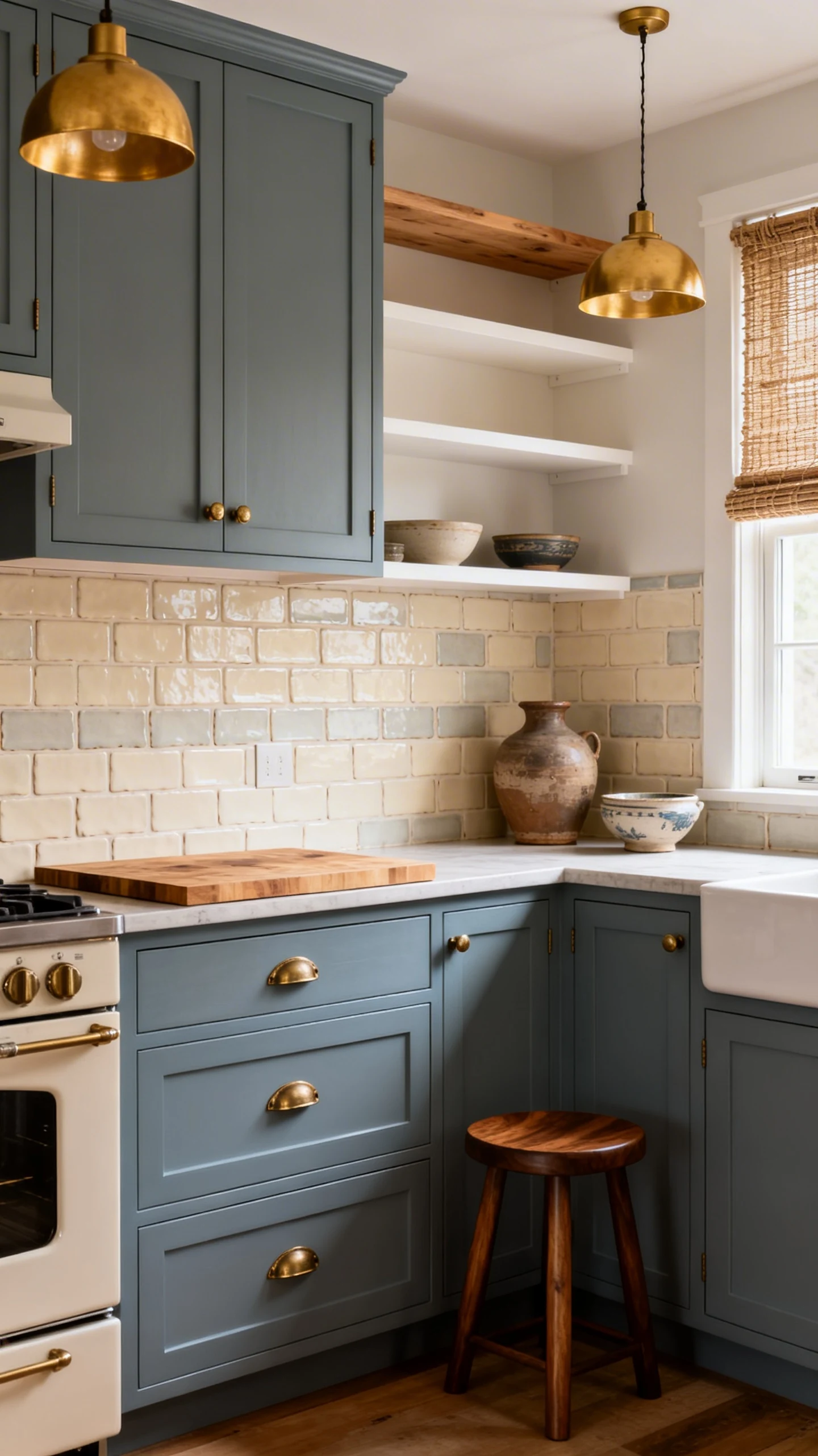
If you want your kitchen to feel instantly polished, navy blue cabinets are the move. Navy is deep, classic, and somehow makes even basic hardware look intentional. Like, “Oh this old thing?” Sure.
It’s also shockingly forgiving. Fingerprints? Crumbs? Life happening? Navy kind of shrugs and keeps looking fabulous.
Best Pairings So Navy Doesn’t Feel Too Heavy
Navy can go moody fast, so give it a little balance. Think light surfaces, reflective finishes, and warm metals.
- Countertops: white quartz, marble-look slabs, light granite
- Backsplash: glossy white subway tile, zellige, pale stone
- Hardware: brushed brass, polished nickel, matte black (for extra attitude)
- Wall color: warm white, creamy beige, soft greige
Where Navy Looks Best
IMO, navy shines on lower cabinets with lighter uppers. You get the drama without turning your kitchen into a cave. If you’re feeling bold, do full navy cabinetry—but make sure you’ve got decent lighting, okay?
FYI: Navy also looks insanely good with natural wood floors. It’s that “rich but not trying too hard” vibe.
2. Dusty Blue: The Soft, Vintage-But-Still-Cool Choice
Dusty blue is like navy’s chill cousin who owns linen napkins and somehow never spills coffee. It’s muted, cozy, and gives your kitchen a gentle personality without screaming for attention.
If you’re scared of going “too blue,” this is your safe-but-stylish entry point. It reads classic, a little French, and very “I thrifted this perfect vase on purpose.”
How To Style Dusty Blue Cabinets
Dusty blue plays well with warm tones. The goal is softness, not sterile showroom energy.
- Metals: aged brass, champagne bronze, antique nickel
- Wood tones: white oak, walnut accents, butcher block
- Backsplash ideas: creamy tile, handmade ceramic, light greige grout
- Finishing touches: woven shades, pottery, warm pendant lights
Quick Reality Check
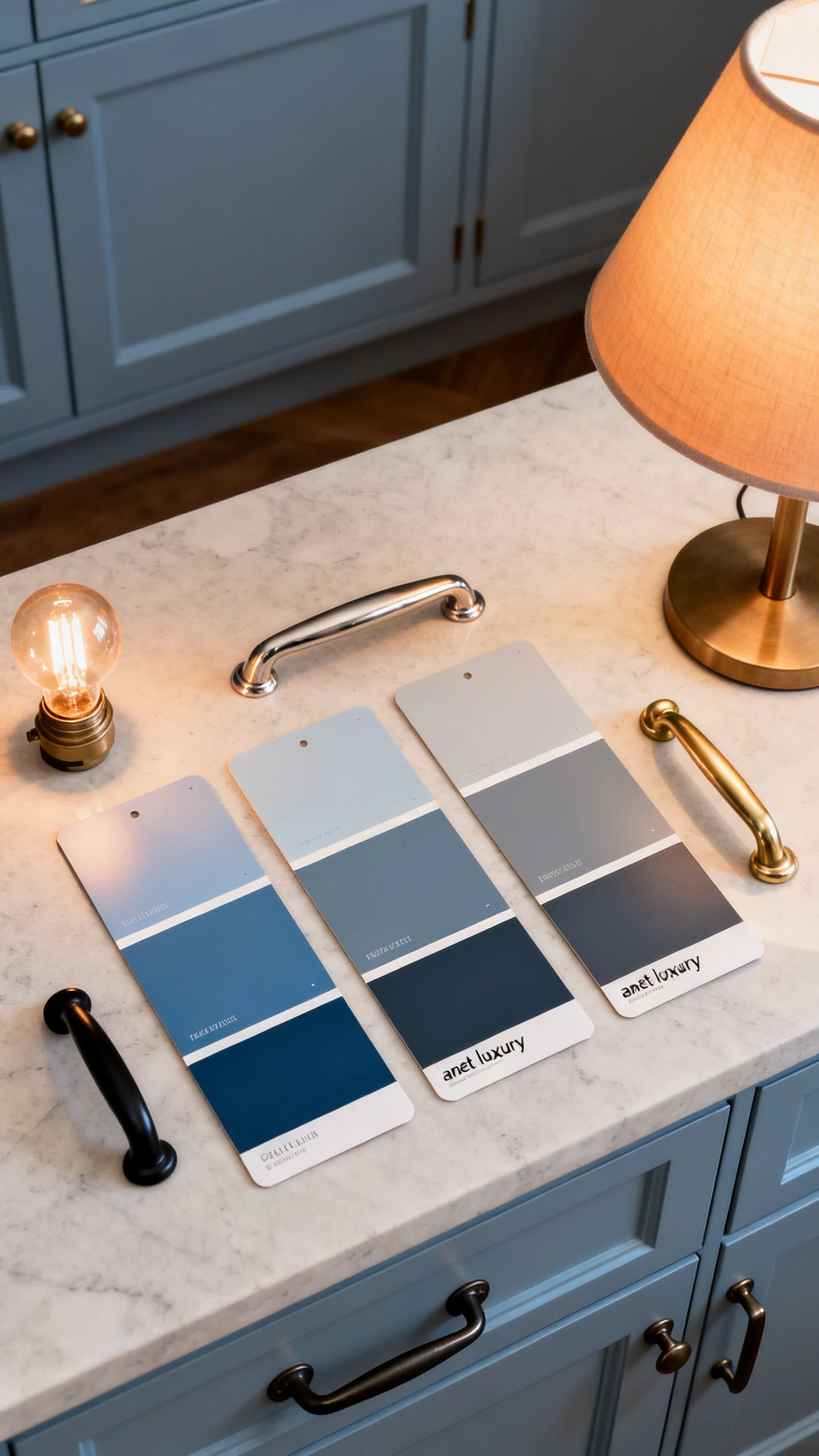
Dusty blues can shift depending on lighting. In north-facing kitchens, they can lean a little gray. In sunny kitchens, they get warmer and prettier. So yes, sample paint first—unless you enjoy chaos.
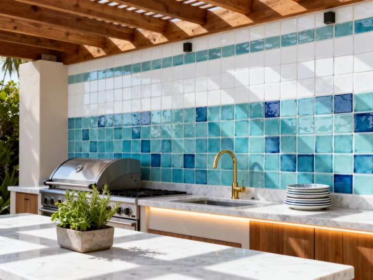
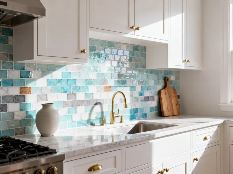
3. Powder Blue: The Bright, Airy “Good Mood” Cabinet Color
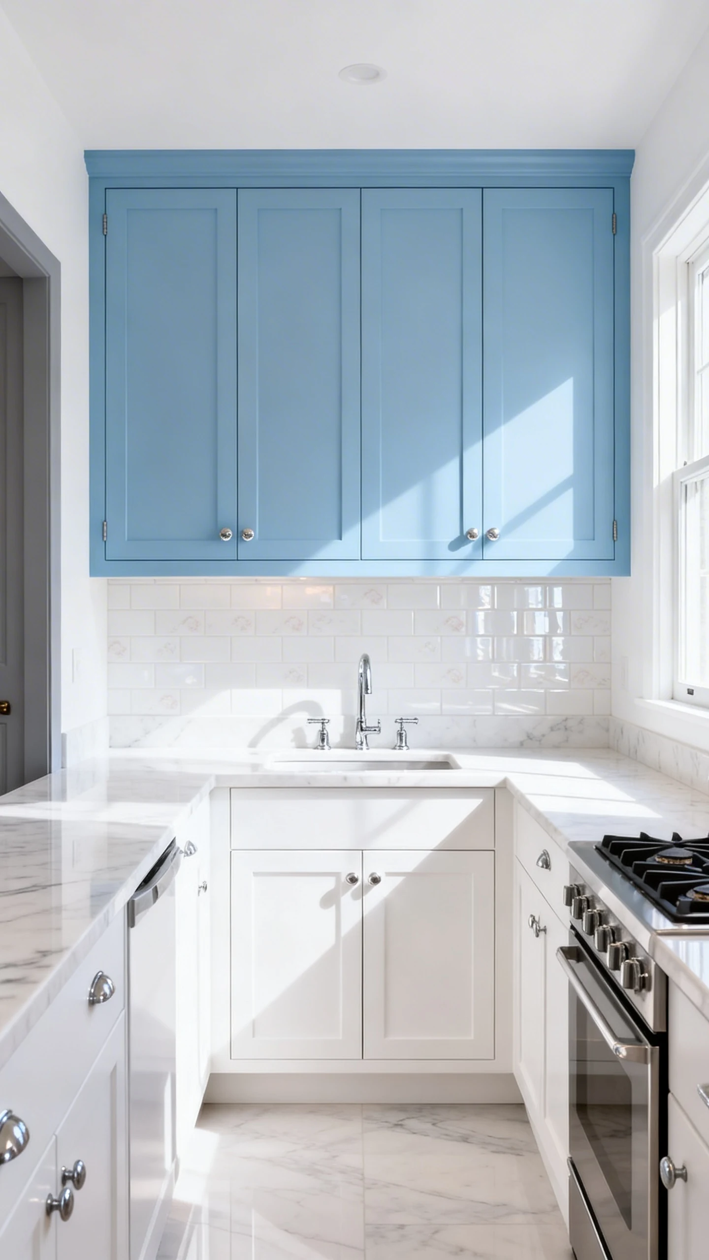
Powder blue cabinets are basically instant serotonin. They feel light, open, and a little playful—like your kitchen just started drinking more water and journaling.
This shade is perfect if your space is smaller or you’re trying to make a darker kitchen feel more open. It also gives serious retro charm without going full diner (unless you want that, and honestly, respect).
Make Powder Blue Look Elevated (Not Childish)
The trick is grounding it with grown-up materials. Powder blue is cute, but we’re aiming for cute and expensive-looking.
- Countertops: white quartz with subtle veining, light stone, pale terrazzo
- Hardware: polished chrome, satin nickel, or sleek brass pulls
- Backsplash: glossy white tile, pale blue tile, or even a soft patterned option
- Paint on walls: crisp white, soft cream, or a whisper of warm gray
Where Powder Blue Works Best
Try it on upper cabinets for an airy look, or on a kitchen island as a color pop. If the idea of fully committing makes you nervous, start with one element. You can always go bigger later—like everyone does after watching one renovation reel.
4. Teal Blue: The Bold, Statement-Maker Shade
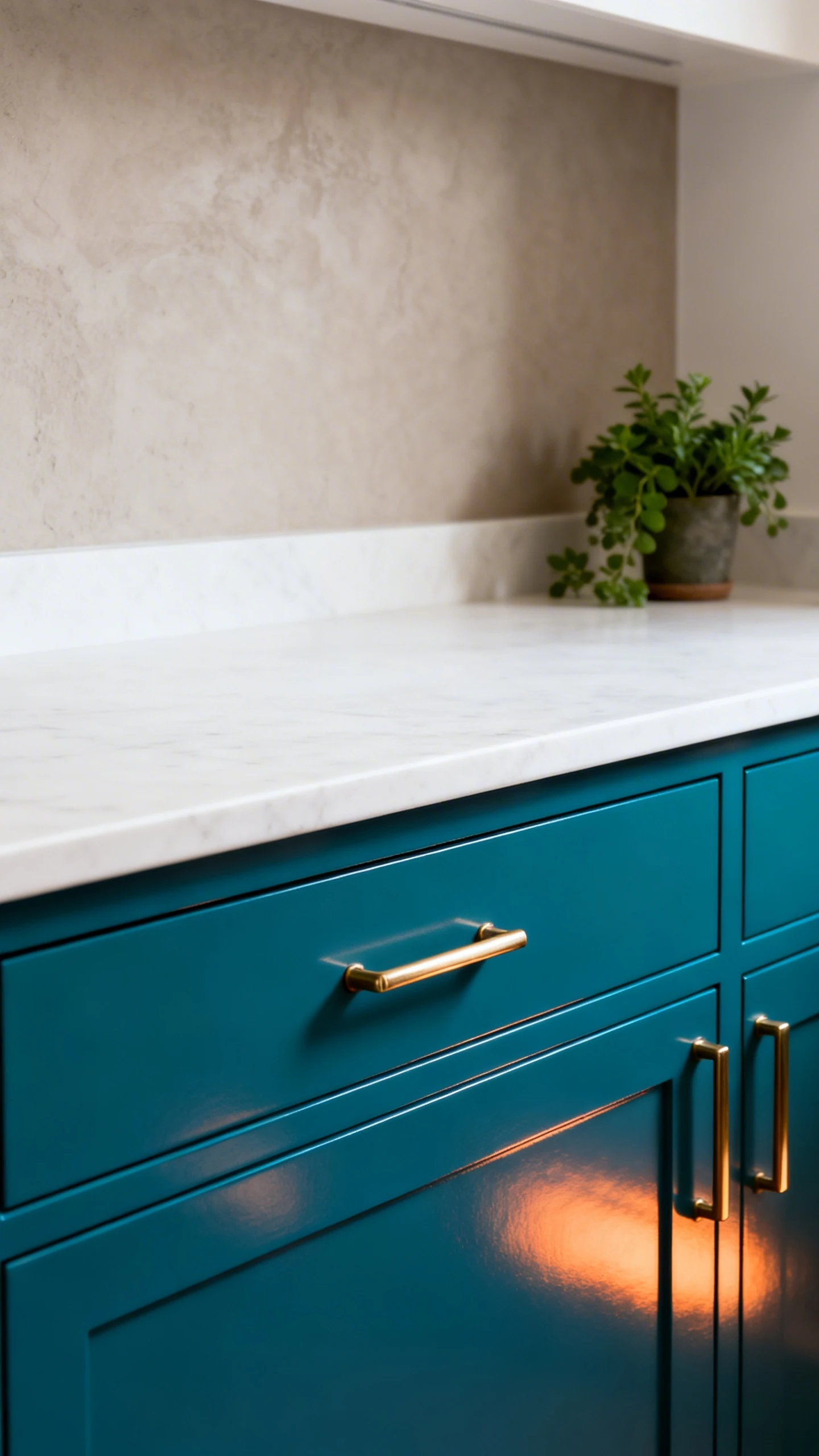
Teal is for people who want their kitchen to have a personality. It’s vibrant, a little moody, and somehow manages to feel both modern and artsy at the same time.
If navy is classic and dusty blue is soft, teal is the one that walks into the room and says, “Yes, I’m the moment.” And honestly? Sometimes your kitchen needs that energy.
How To Keep Teal From Taking Over Your Life
Teal cabinets look best when the rest of the kitchen knows how to behave. Keep surrounding materials simpler so teal can be the star.
- Countertops: clean white, pale stone, or warm light wood
- Backsplash: white tile, simple geometric, or a subtle textured neutral
- Hardware: brass (gorgeous), matte black (edgy), or chrome (crisp)
- Accents: add greenery, natural textures, and warm lighting to soften the boldness
Teal Placement Ideas
Teal looks amazing on base cabinets only with white uppers. It also kills on a statement island—especially if you add statement pendants and pretend you didn’t plan it that perfectly.
One more thing: teal loves contrast. If everything is teal-on-teal-on-teal, it can feel like you live inside a paint swatch. Balance is your friend.
5. Blue-Gray Cabinets: The “I Want Blue, But Make It Subtle” Option
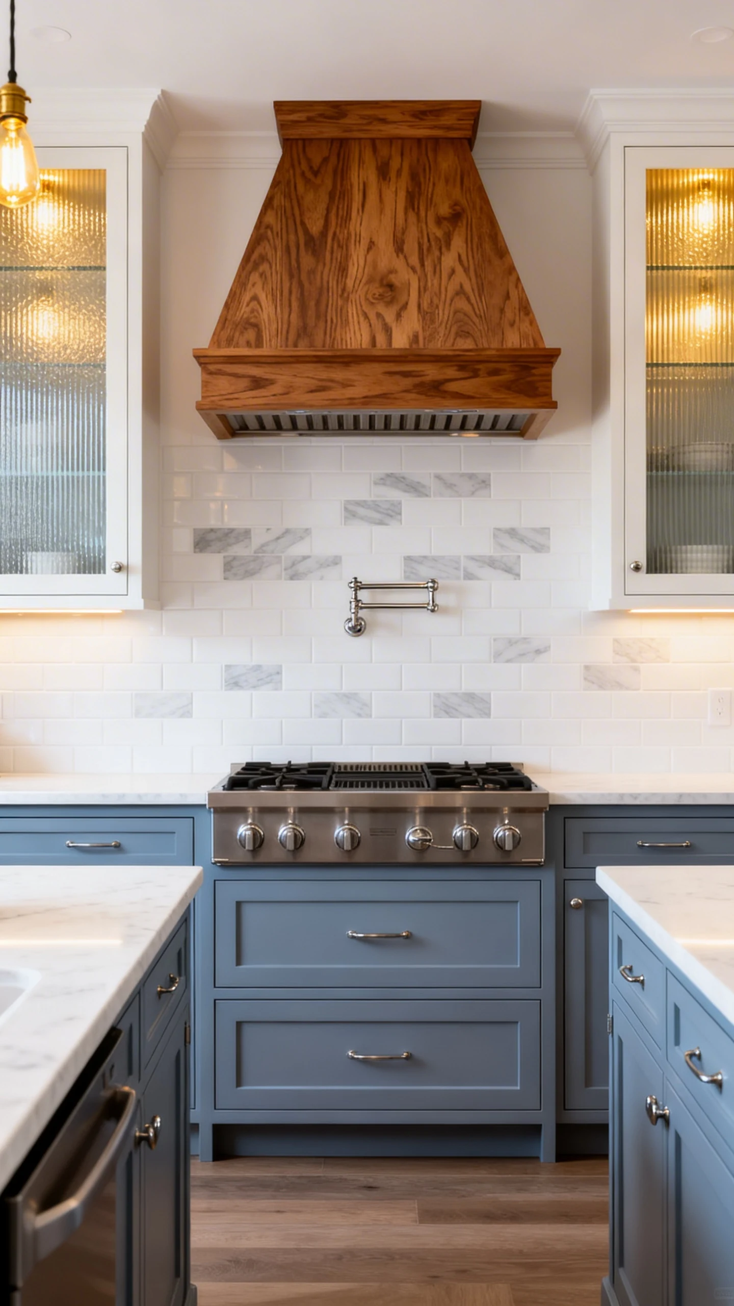
Blue-gray is the quiet luxury of kitchen cabinet color ideas blue. It’s understated, flexible, and fits into almost any style—modern, farmhouse, transitional, you name it.
It’s also the shade you choose when you want color, but you’re not trying to commit to something that might feel trendy in five minutes. (We’ve all been hurt before.)
Why Blue-Gray Is So Easy To Live With
This color shifts beautifully throughout the day. Morning light brings out the blue. Evening light pulls more gray. It’s basically two cabinet colors for the price of one—girl math, but for decor.
- Wall colors: warm whites, pale greige, soft taupe
- Countertops: white quartz, light granite, concrete-look surfaces
- Backsplash: white tile, light stone, or a soft gray pattern
- Hardware: brushed nickel for timeless, brass for warmth, black for contrast
Small Details That Make It Look Custom
Add a little texture and variation so it doesn’t feel flat. Think reeded glass doors, mixed metals, or a warm wood hood. Even switching to a slightly darker island color can make the whole kitchen look designed, not just painted.
And yes, lighting matters. Warm bulbs will make blue-gray feel cozy. Cool bulbs can make it feel a bit icy. Choose wisely, because nobody wants “dentist office chic.”
If you’re stuck between shades, remember this: your cabinets are the biggest “furniture” in the kitchen. Pick a blue you’ll still like when you’re not in a renovation honeymoon phase.
Go sample a few blues, stare at them way too long, and trust your gut. Your future self—cooking, hosting, and casually showing off—will thank you.