5 Kitchen Cabinet Color Combination Ideas That’ll Instantly Upgrade Your Whole Kitchen
If your kitchen cabinets are giving “builder basic” and your soul is slowly leaving your body every time you make coffee, hi, same. The fastest way to fake a full kitchen renovation (without eating ramen for six months) is a smart kitchen cabinet color combination. It’s like lipstick for your kitchen: dramatic payoff, minimal commitment… relatively.
Below are 5 kitchen cabinet color combination ideas that actually look designer, feel livable, and won’t have you repainting everything in a panic next weekend. Let’s do this.
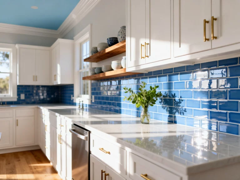
1. The “Clean But Not Cold” Combo: Warm White + Soft Greige
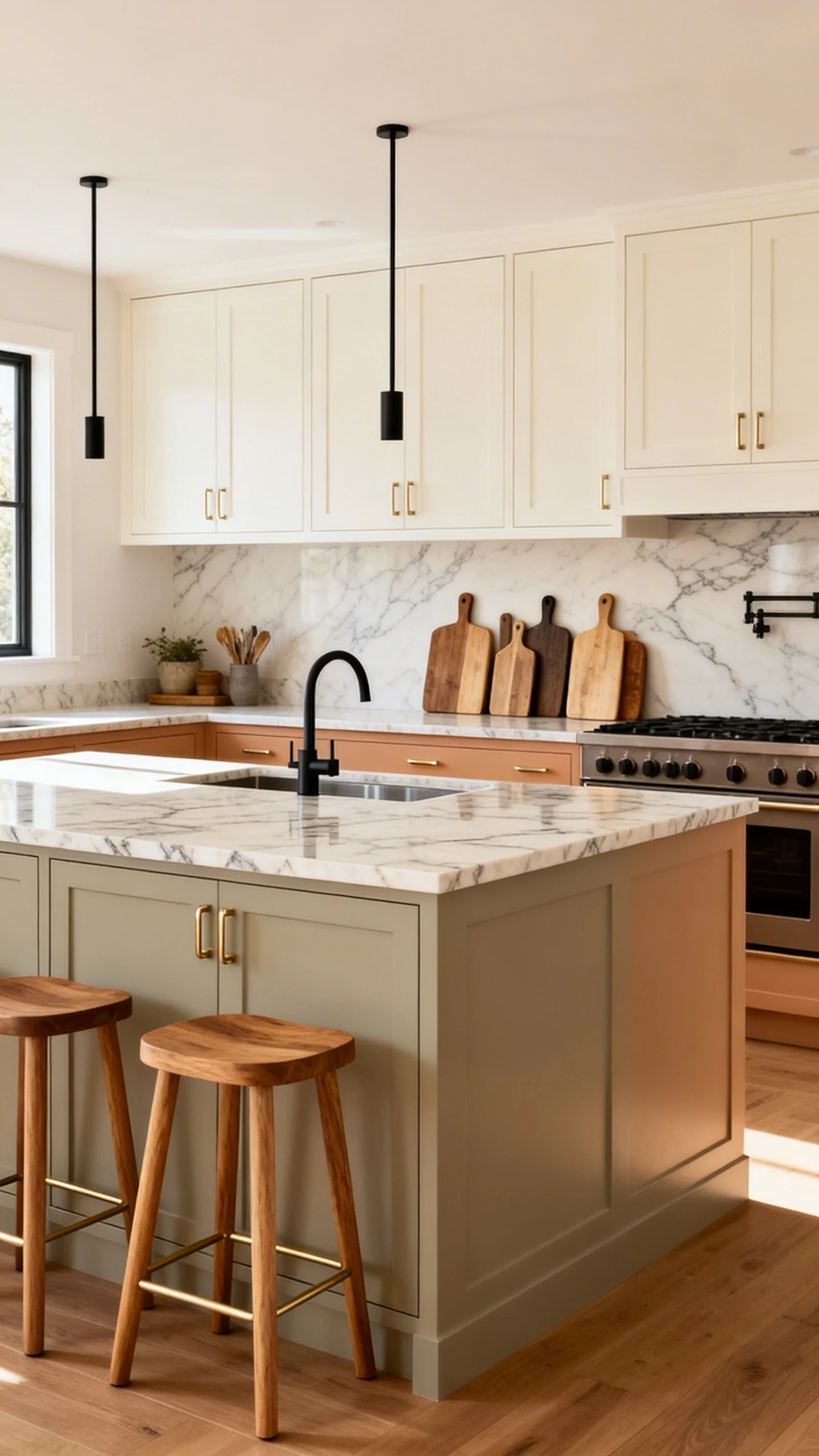
This is the classic “I want my kitchen bright, but I also want it to feel like humans live here” move. Warm white uppers keep things airy, while soft greige lowers ground the room and hide life’s little messes (aka fingerprints, dog hair, and your questionable cooking experiments).
Why It Works
Pure white can feel harsh, and all-gray can feel like a rainy Tuesday. But warm white plus greige? Cozy, balanced, and timeless. It reads expensive even if your budget reads… “creative.”
Make It Look Intentional (Not Accidental)
It’s all about the undertones. Your white should lean creamy, and your greige should have a hint of warmth so they don’t fight each other like siblings in the back seat.
- Use the warm white on uppers to brighten dark corners and make ceilings feel higher.
- Go greige on lowers so your kitchen feels anchored and less “floating cabinet showroom.”
- Pick one metal finish (brass, matte black, or polished nickel) and commit.
- Add a wood element like oak stools or a cutting board collection for instant warmth.
FYI, if your counters are already busy (strong veining, loud pattern), this combo is your peace treaty. It lets the countertops shine without turning the whole room into a design debate.
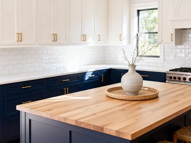
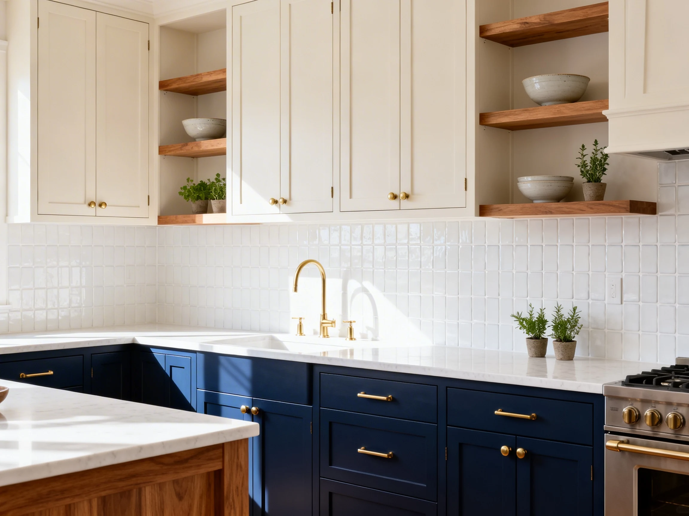
2. The “Modern Mood” Combo: Deep Navy + Crisp White
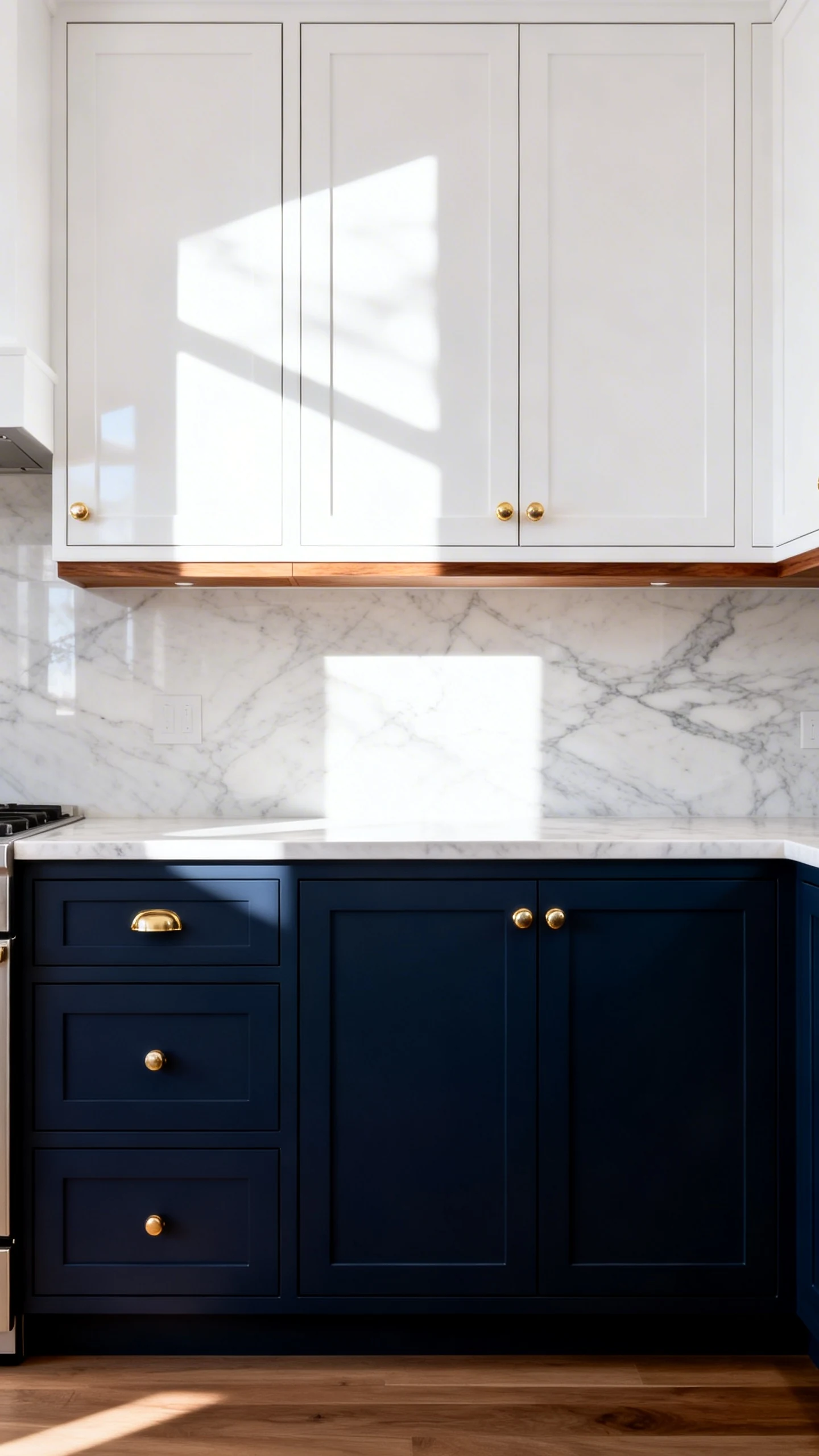
If you want your kitchen to feel like it has a skincare routine and reads design blogs, this one’s for you. Deep navy lowers bring drama, and crisp white uppers keep it from feeling like you’re cooking in a cave.
Where This Combo Shines
Navy is basically the new neutral, but with better taste. It pairs beautifully with marble-look counters, warm woods, and just about every hardware finish. It’s bold without being “why is my kitchen purple?” bold.
Tips To Nail the Contrast
The key is getting that high contrast without making it feel chopped up. Think sleek, not striped.
- Choose a navy with a hint of gray if your space has cool lighting.
- Choose a navy with a hint of green if you want it richer and cozier.
- Use white uppers to reflect light, especially if you don’t get tons of natural sun.
- Add brass or polished nickel hardware to make navy look extra luxe.
IMO, this combo is a slam dunk if you love “classic with a twist.” Also, navy lower cabinets are ridiculously forgiving. Spills? Smudges? That one cabinet you bump into every day? Navy doesn’t care.
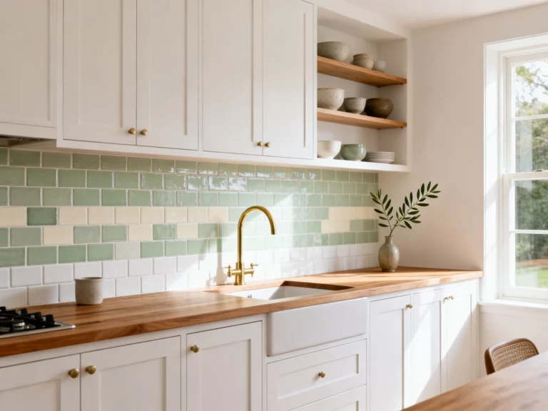
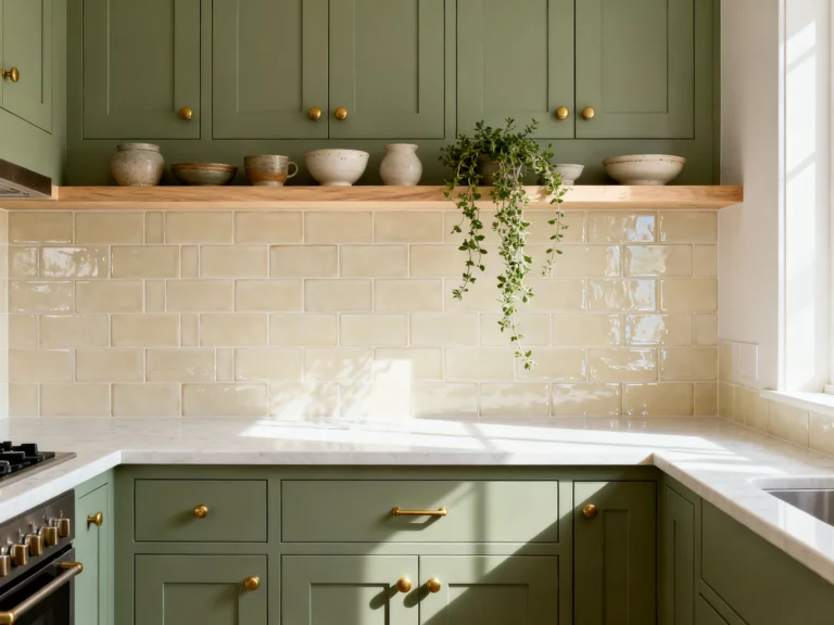
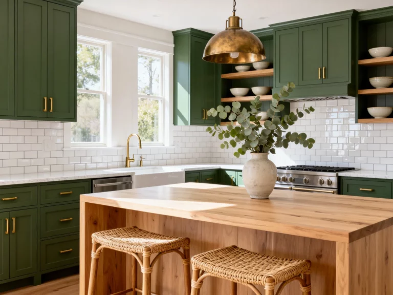
3. The “Earthy But Elevated” Combo: Sage Green + Natural Wood
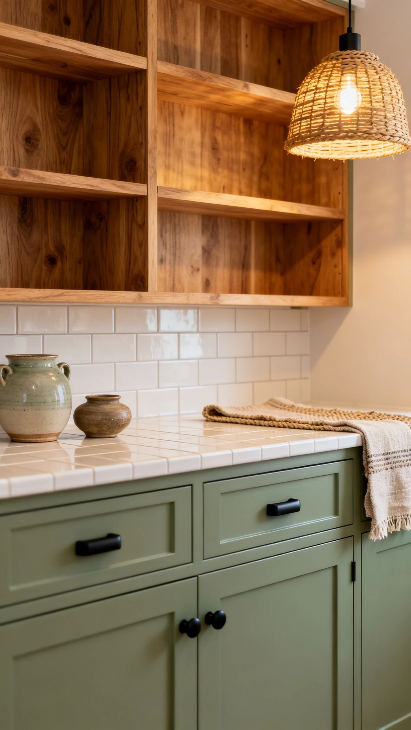
Want a kitchen that feels calm and a little fancy, like you drink iced matcha and own linen napkins on purpose? Sage green cabinets with natural wood accents are the vibe. It’s soft, grounded, and still interesting.
How To Use It Without Going Full Cottagecore
Sage can lean grandma if you pair it with frilly stuff. But if you keep the lines clean and add modern finishes, it feels fresh and current.
- Try sage on lowers with white or light neutral uppers for a bright, airy look.
- Or go sage all over and bring in wood via open shelving or a statement island.
- Use simple hardware like matte black or brushed brass to keep it modern.
- Layer textures with woven pendants, ceramic accessories, and a linen runner.
Natural wood adds warmth instantly, especially if your kitchen has a lot of hard surfaces. Think oak, white oak, or walnut depending on whether you want light and breezy or rich and moody.
Quick Styling Cheat Codes
This is one of those combos where tiny details make it look designer. You don’t need much, but what you add should feel intentional.
- Swap in warm bulbs so sage looks cozy, not minty.
- Add creamy whites in tile and textiles to soften the green.
- Bring in black accents for definition (faucet, hardware, frames).
4. The “Chef’s Kiss Luxe” Combo: Charcoal + Warm Brass
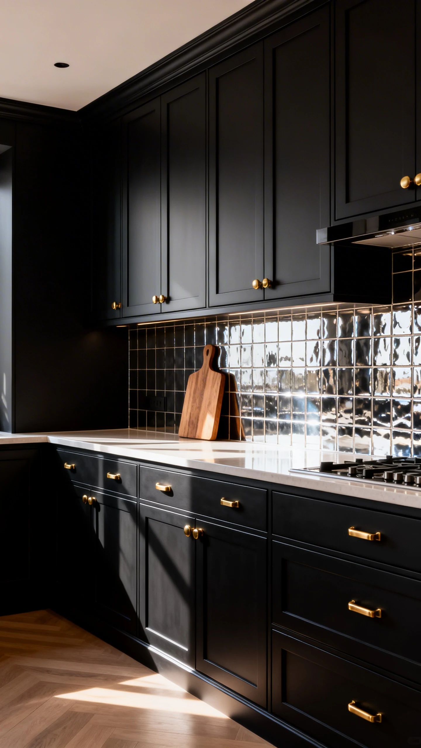
If you want your kitchen to feel high-end without screaming for attention, go charcoal cabinets with warm brass hardware. It’s moody, sophisticated, and honestly kind of irresistible. Like, you’ll suddenly want to host dinners just to show off.
Why Charcoal Beats True Black
Black can be stunning, but it can also show dust like it’s auditioning for a cleaning commercial. Charcoal gives you the drama with a little more forgiveness. Plus, it plays nicer with different countertops and floors.
How To Keep It From Feeling Heavy
The secret is balance. Dark cabinets need light somewhere else so the room still breathes.
- Pair with light countertops to brighten the work surfaces and add contrast.
- Use a reflective backsplash like glossy tile to bounce light around.
- Add warm brass to soften the charcoal and make it feel intentional.
- Incorporate wood tones (even a simple cutting board display counts).
And yes, brass can be shiny or brushed. Brushed brass feels modern and calm, while polished brass feels glam. Pick your personality and run with it.
5. The “Unexpected But Addictive” Combo: Two-Tone Blue + Creamy Beige
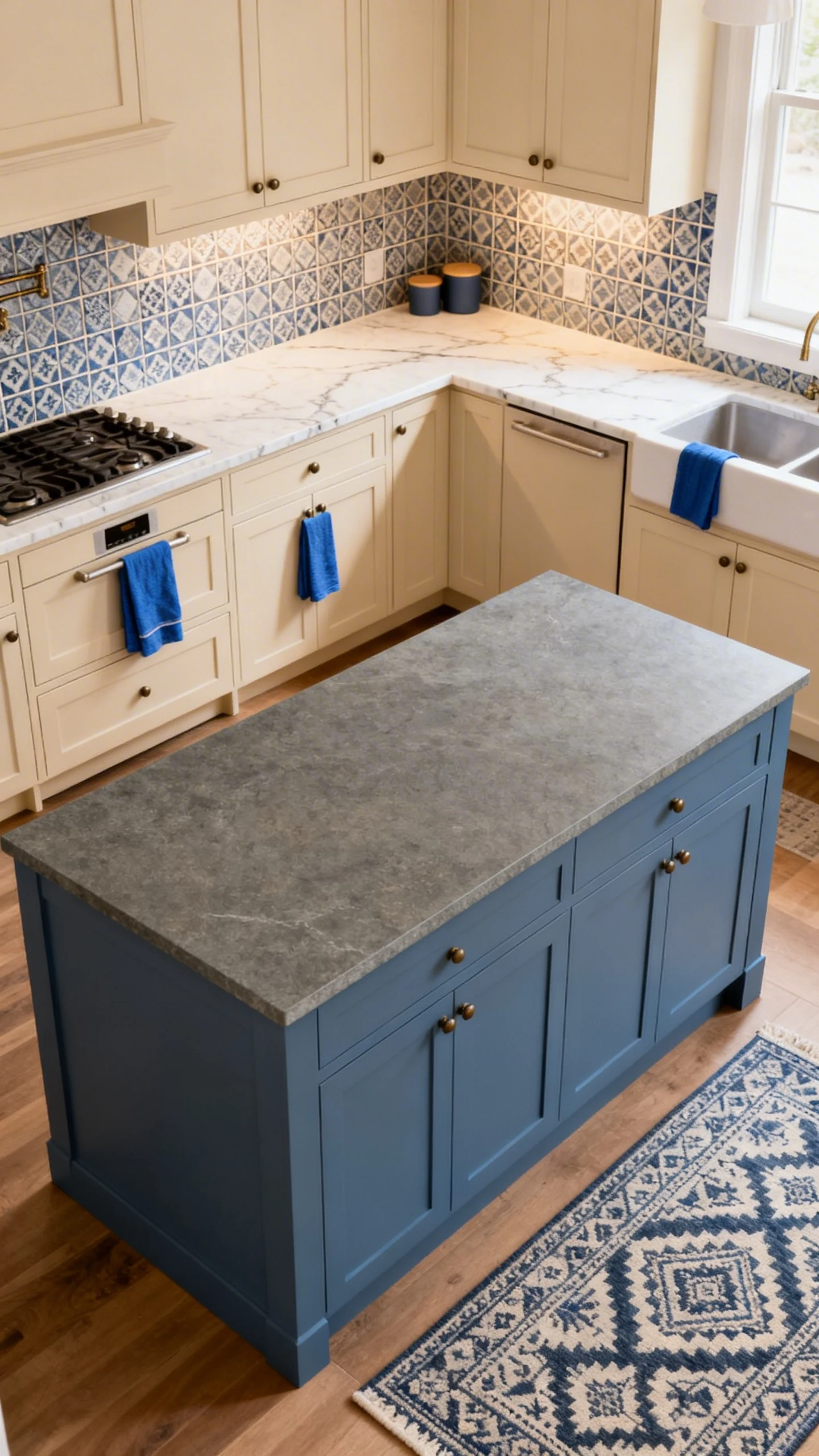
Ready for something that feels custom? Try a two-tone blue situation paired with creamy beige. It’s not as common as navy and white, but it’s still easy to live with. And it looks like you hired a designer who whispered, “Trust me,” and you actually did.
What This Looks Like in Real Life
Think a dusty, denim-like blue on the island or lowers, then creamy beige on the remaining cabinets. Or flip it: beige lowers for warmth, blue uppers for a pop. Either way, it feels layered and collected.
- Pick a muted blue (dusty, slate, or steel) for a softer, more timeless feel.
- Choose a beige with warmth so it doesn’t read yellow under warm lights.
- Use consistent hardware across both colors for a cohesive look.
- Repeat the blue elsewhere (dish towels, art, rug) so it feels intentional.
Easy Pairings That Make It Pop
This combo loves warm natural materials and subtle pattern. Nothing too loud, unless you’re going for maximalist chaos (no judgment, but also… a little judgment).
- Countertops: warm white quartz, creamy stone, or subtle veining.
- Backsplash: zellige-style tile, soft white subway, or a gentle geometric.
- Hardware: champagne bronze, brushed brass, or matte black.
This is also a great option if you’re scared of committing to one bold cabinet color everywhere. You get the personality, but with a safety net.
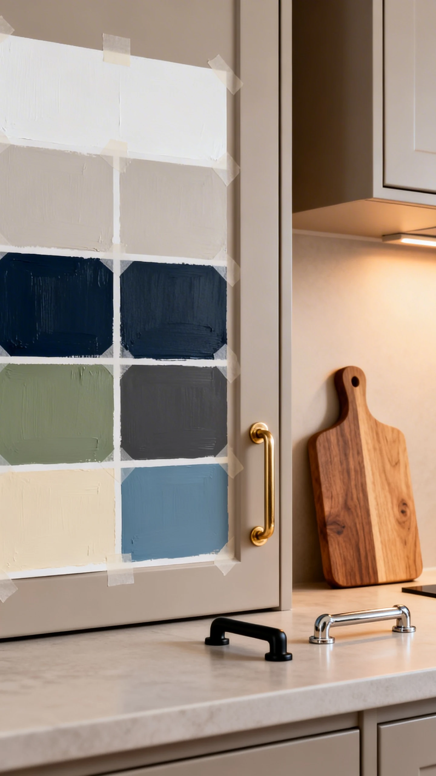
And there you have it: five combos that can take your kitchen from “meh” to “wait, did you renovate?” Pick the one that matches your vibe, your lighting, and your tolerance for wiping fingerprints. Then grab some paint samples and start taping them to your cabinets like the decor-obsessed legend you are.