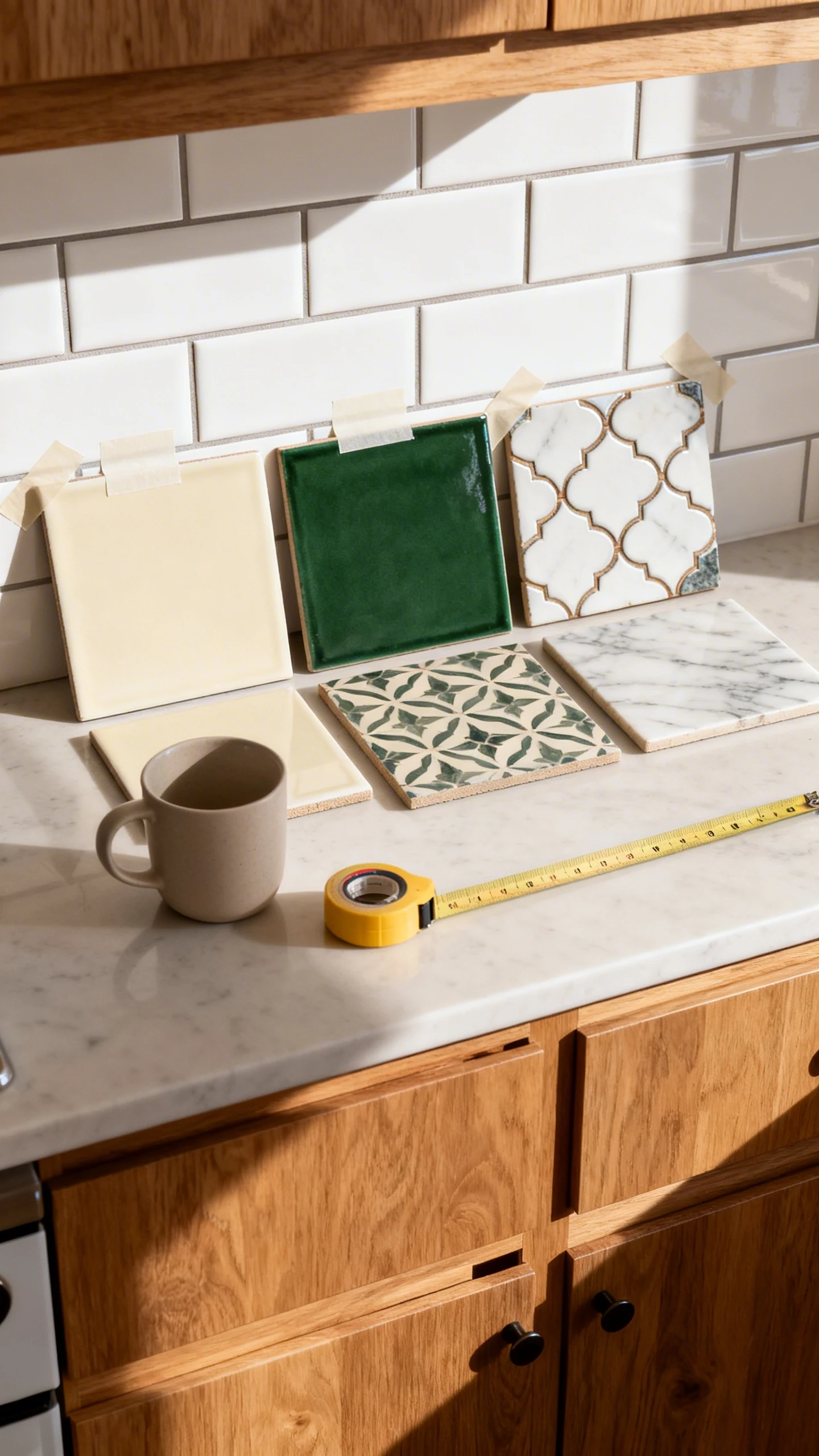
5 Kitchen Backsplash Ideas Oak Cabinets Fans Will Screenshot Immediately
Oak cabinets are having a moment again. Yes, really. And before you panic and start Googling “how to paint oak cabinets without crying,” let’s talk about the easiest glow-up: the backsplash.
The right tile can make oak look intentional, warm, and designer-y. The wrong tile can make it feel like a time capsule from 1997. Let’s pick the good kind of nostalgic.
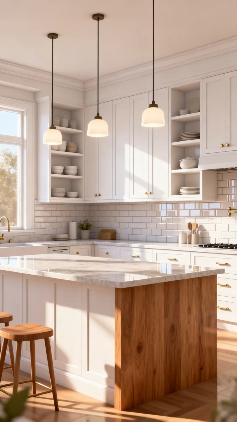
1. Make It Classic (But Not Boring) With Warm White Subway Tile
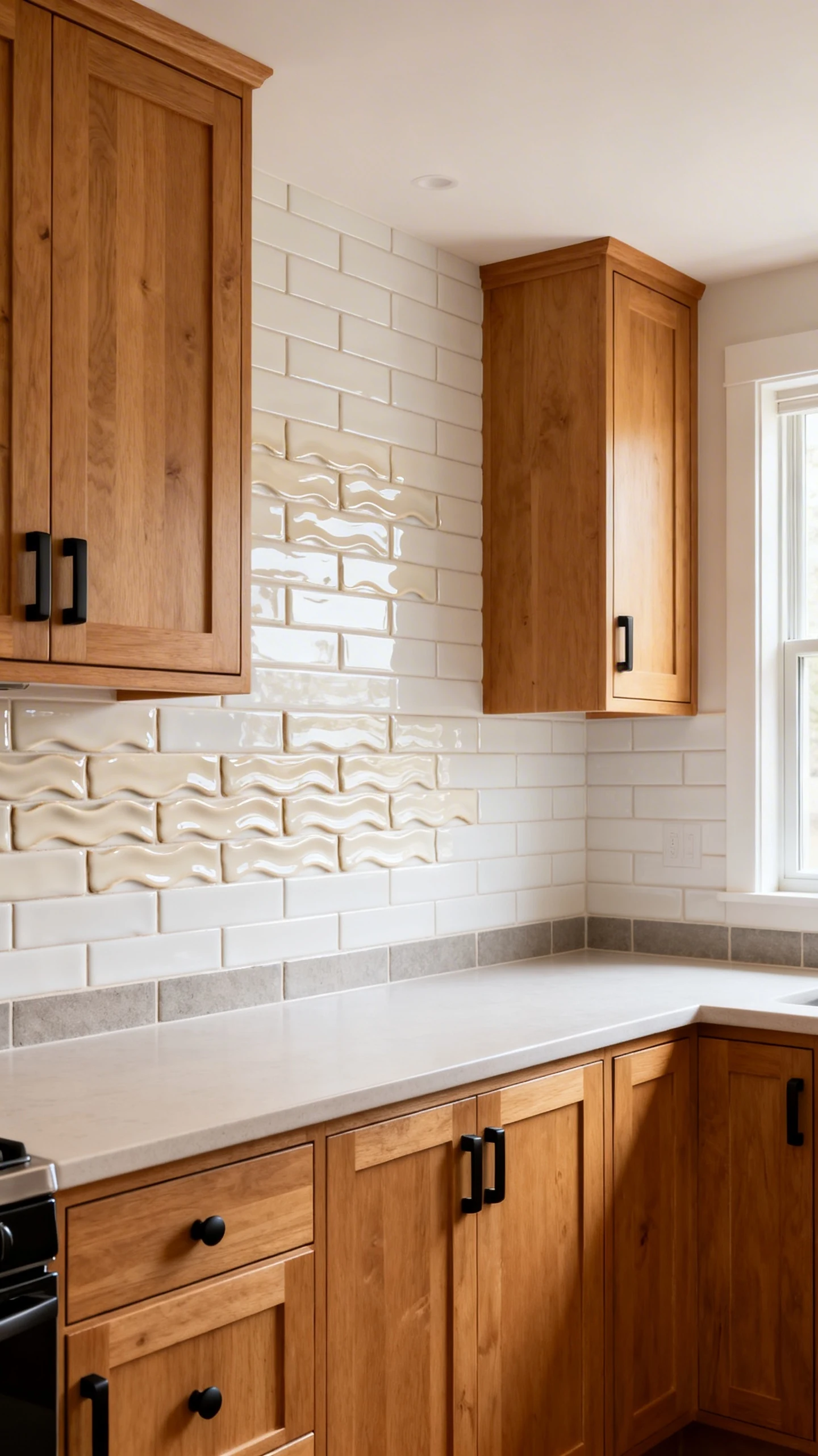
If you want a backsplash that’s basically impossible to regret, start here. Warm white subway tile is the little black dress of kitchens—except it wipes clean and doesn’t judge your snack choices.
Oak has golden and honey undertones, so stark icy white can look harsh. Go for creamy whites instead, and suddenly your cabinets look rich instead of “why is everything yellow?”
How To Nail The Undertones
Undertones are the whole game with kitchen backsplash ideas oak cabinets. You’re not just choosing tile—you’re choosing vibes.
- Pick “warm white” or “soft white” tile labels, not “bright white.”
- Use a warm gray or greige grout for a subtle outline that doesn’t scream.
- Try a slightly handmade look (wavy edges, glossy finish) to keep it from feeling builder-basic.
Want it to feel extra custom? Do a vertical stack instead of the classic brick pattern. Same tile, way more “I totally hired a designer” energy.
Quick Styling Bonus
Pair this with matte black hardware or aged brass and watch your oak cabinets suddenly look curated. Like they have a skincare routine.
2. Go Moody And Modern With Deep Green Tile
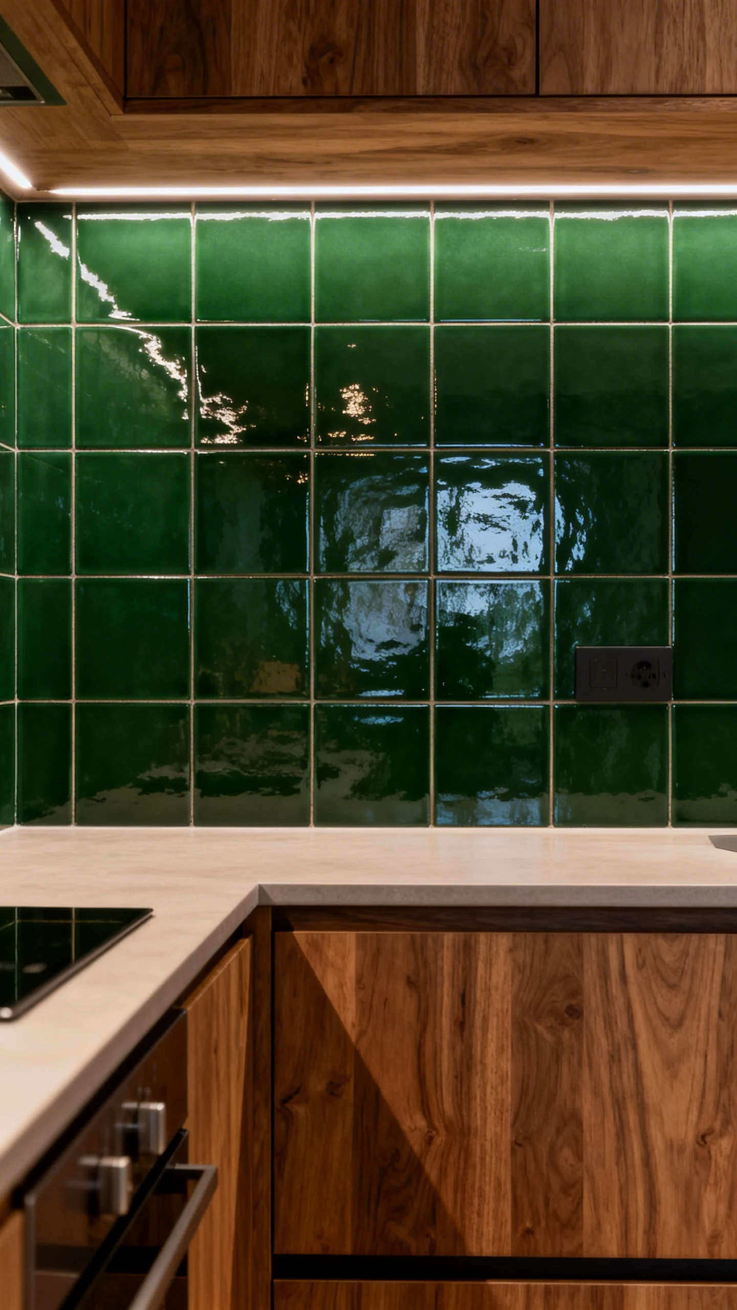
Okay, hear me out: oak + green is a power couple. Deep green backsplash tile makes oak feel earthy and elevated, not dated. It’s like your kitchen went on a wellness retreat and came back with taste.
IMO, this is one of the fastest ways to make oak cabinets look high-end without changing them at all. And yes, your friends will ask where you got the tile.
Best Green Shades With Oak
Not all greens play nice with wood tones. You want greens that feel grounded, not neon or minty.
- Forest green for dramatic contrast that still feels natural.
- Sage if you want softer, calmer, “Sunday morning coffee” vibes.
- Olive for a warm, vintage-leaning look that complements golden oak.
If your oak is very orange, lean toward olive or moss. If your oak is lighter or more neutral, forest green looks incredible.
Make The Finish Work For You
Glossy green tile bounces light and feels fresh. Matte green tile feels more modern and a little edgy. Either way, keep counters simple so the backsplash gets its moment.
FYI: Green tile also hides splatters better than plain white. Because real life happens, even in “pretty” kitchens.
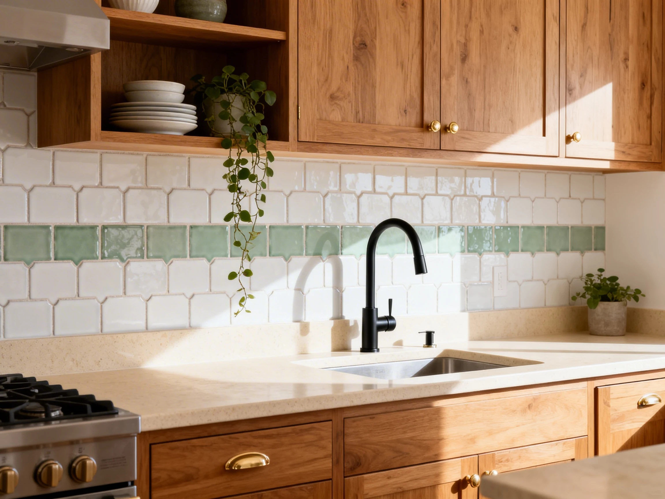
3. Add Texture With Zellige Or Handmade-Look Tile
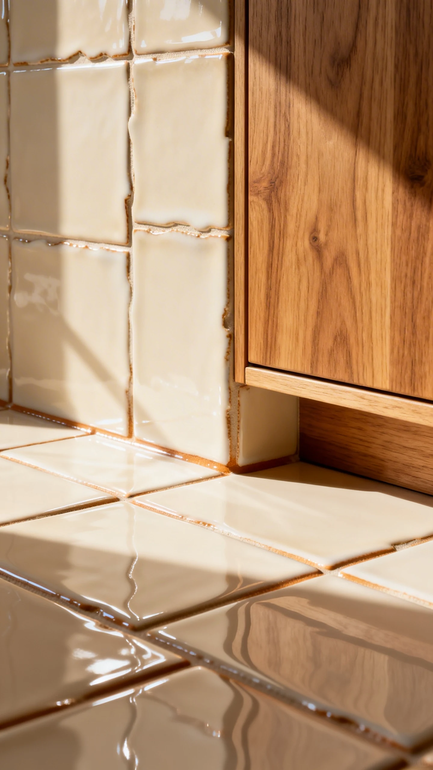
If you want instant character, go for zellige-style tile or anything handmade-looking. Oak cabinets already bring warmth and grain, and textured tile adds that “collected over time” depth that makes a kitchen feel expensive.
This is the move when you don’t want a backsplash that looks like it came in a box labeled “Generic Kitchen Option A.”
Why It Looks So Good With Oak
Oak is naturally busy with grain. Flat, perfectly uniform tile can sometimes feel a little too sterile next to it. Zellige has variation, glaze movement, and imperfect edges—aka the fun stuff.
- Glossy cream zellige keeps things bright but not boring.
- Sand or beige tones create a soft, tonal look that feels calm.
- Smoky white or bone adds dimension without going dark.
And yes, you can absolutely do this look even if your budget says “cute, but no.” There are tons of ceramic tiles that mimic the style.
Grout: The Sneaky Detail That Changes Everything
With zellige, grout color matters a lot. Choose a grout close to the tile color for a seamless, glowy wall. Choose a darker grout if you want more definition—but be careful, because it can look busy fast next to oak grain.
Also, don’t be shocked if your tile has “variation.” That’s literally the point. If you want perfect consistency, zellige will offend you.
4. Bring In Pattern With Moroccan Or Vintage-Inspired Tile (Tastefully)
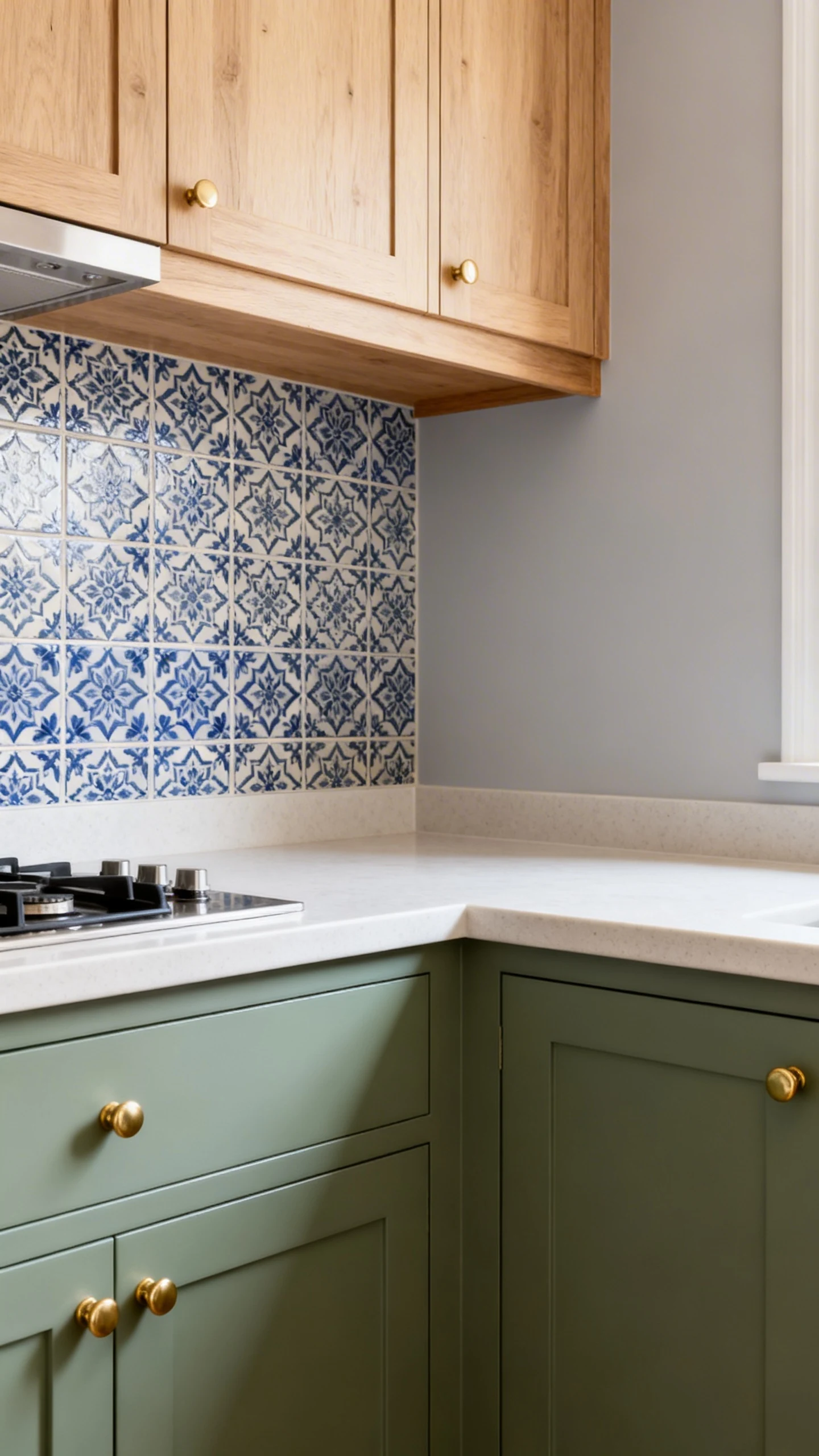
Pattern with oak cabinets can look stunning… or like you got lost in a showroom. The secret is controlled chaos: pick one pattern that’s bold, then keep everything else calm.
A Moroccan or vintage-inspired backsplash works especially well if your oak cabinets are on the simpler side. It adds personality without needing a full kitchen reno.
How To Keep Pattern From Taking Over Your Life
Ask yourself: do you want the backsplash to be the main character? If yes, great. Just don’t also add five other statement finishes. Your kitchen is not a group project.
- Stick to a tight color palette: cream, soft gray, muted blue, dusty green.
- Choose smaller-scale patterns if your kitchen is small.
- Use simple countertops (solid quartz, light granite) to balance the detail.
If you’re nervous, try patterned tile behind the range only and keep the rest more neutral. It’s like commitment issues, but make it design.
Color Combos That Just Work
For kitchen backsplash ideas oak cabinets, pattern looks best when it either echoes oak’s warmth or cools it down gently.
- Cream + taupe pattern for a soft, tonal, cozy look.
- White + muted blue to freshen up golden oak.
- Greige + charcoal for a modern twist without going too cold.
And yes, you can still use brass hardware with patterned tile. It’s not illegal. It’s actually gorgeous.
5. Get Sleek With Marble-Look Slab Or Large-Format Tile
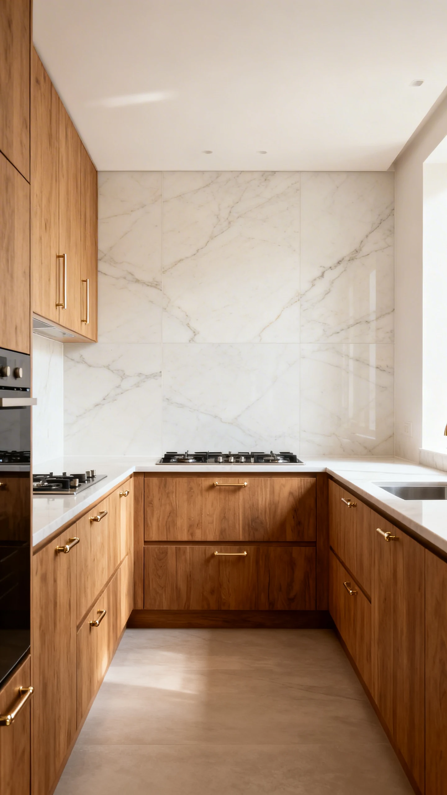
Want oak cabinets to feel instantly more modern? Go bigger. Large-format tile or a marble-look slab backsplash reduces grout lines and creates that smooth, upscale look you see in fancy kitchens online.
This is especially good if your counters are already stone. Extending that “stone wall” effect up the backsplash makes everything feel intentional and architectural.
Why Large-Format Works With Oak
Oak brings organic texture. A slab or big tile brings clean simplicity. Together, they balance each other out like a perfectly curated outfit: one textured piece, one sleek piece, no overthinking required.
- Marble-look porcelain gives you the vibe without the maintenance drama.
- Soft veining pairs better with oak than super high-contrast veining.
- Light beige or warm white backgrounds keep oak looking rich and calm.
Pro Tip: Match The Metal To The Mood
If you go slabby and sleek, finish the look with hardware that fits. Polished nickel feels crisp. Aged brass feels warm and luxe. Matte black feels modern and graphic. Pick one lane and commit, because your kitchen deserves stability.
Also, if you’re doing a slab backsplash, budget for installation. It’s not a DIY “weekend craft,” unless your weekend includes stress and three emergency trips to the hardware store.
Oak cabinets aren’t the problem. They just need the right sidekick. Choose a backsplash that either warms them up, cools them down gently, or adds texture and personality—and suddenly your kitchen looks like you planned it this whole time.
Now go order samples, tape them up, and stare at them with a coffee like the decor detective you are. You’ve got this.