5 Bloxburg Interior Ideas Kitchen That’ll Make Your Build Look Expensive
If your Bloxburg kitchen is giving “starter apartment with one sad lamp,” don’t panic. We can fix it. Fast.
The trick is to stop thinking like you’re placing furniture and start thinking like you’re designing a vibe. You want cozy, functional, and just a little bit “yes, I definitely have my life together.”
Here are 5 bloxburg interior ideas kitchen players swear by—easy upgrades, realistic layouts, and a few sneaky details that make people go, “Wait… how did you do that?”
1. Make A “Real Kitchen” Layout (Not A Furniture Parade)
Let’s start with the biggest glow-up: your layout. Because nothing screams “I placed things randomly” like a fridge on one wall, sink on another, and stove in a completely different zip code.
IMO, the easiest way to make a Bloxburg kitchen look legit is to copy real-life logic. You know… like humans do when they cook.
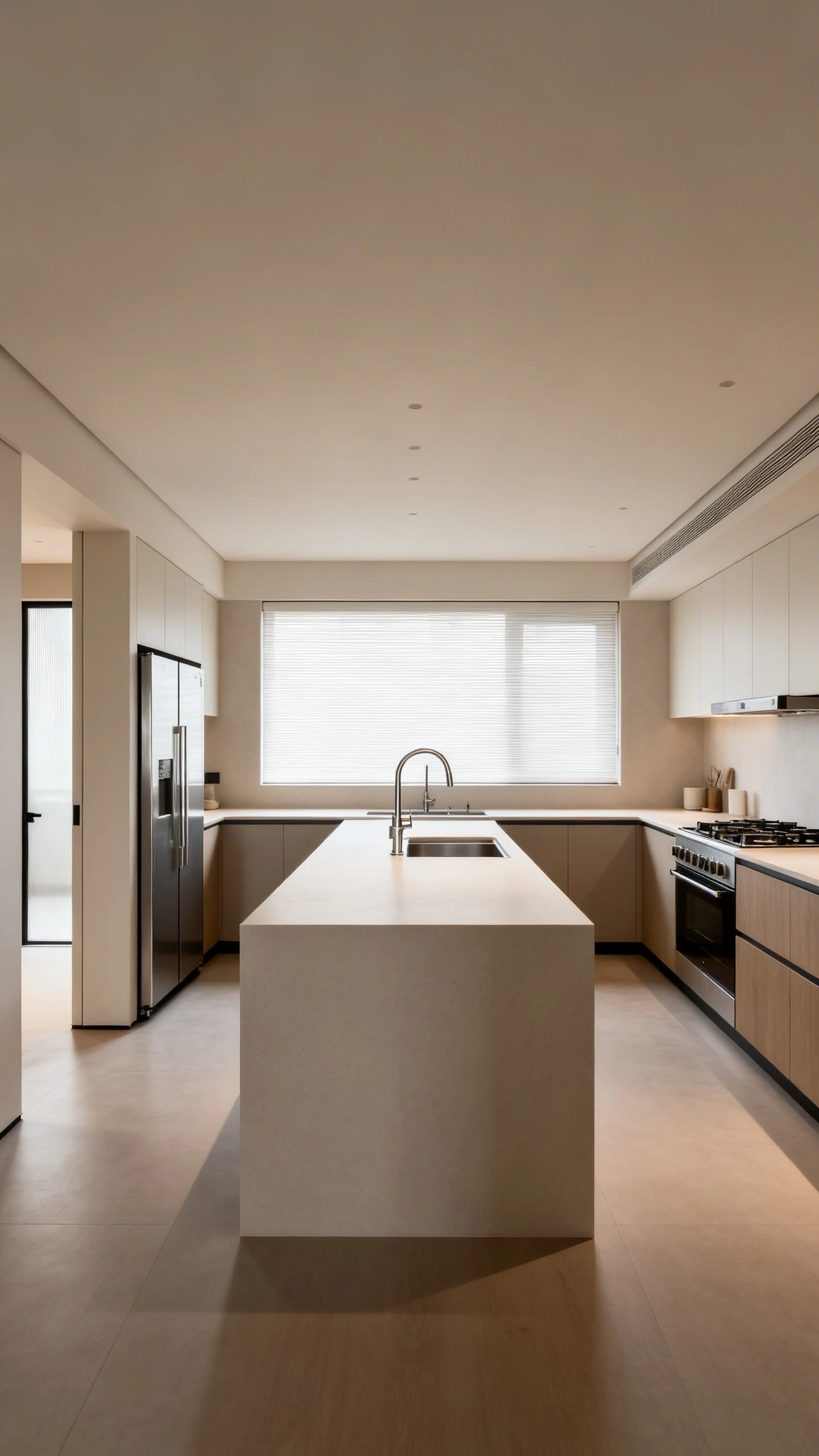
Try The Classic Work Triangle
The work triangle is the holy trinity: fridge, sink, stove. They should be close enough that your Sim-ish character isn’t training for a marathon every time they make toast.
- Fridge near the entrance for quick grabbing
- Sink centered on a main counter run for prep
- Stove with counter space on both sides so it doesn’t feel lonely
And yes, you can break the triangle rule if you’re doing a huge mansion kitchen. But if you’re in a normal house build, it’s basically instant realism.
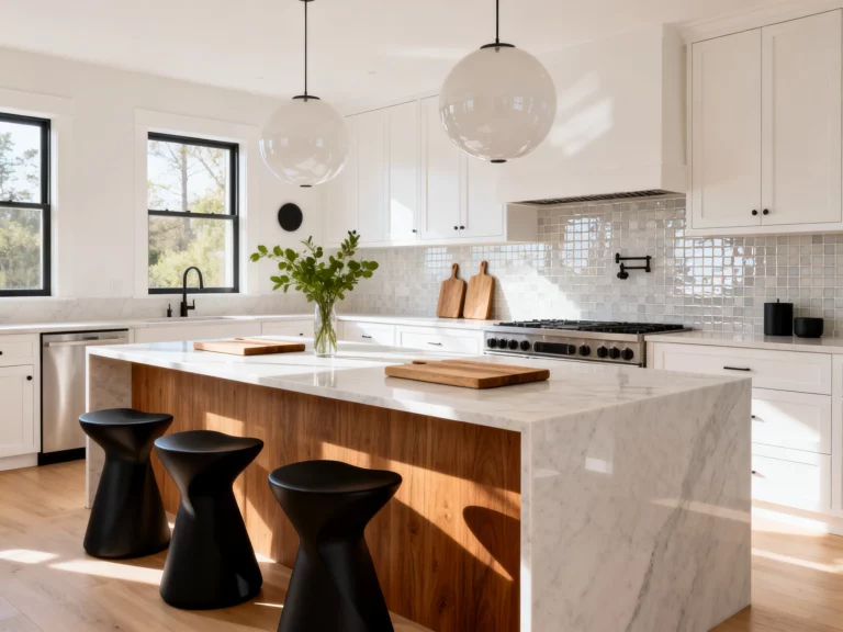
Pick One Statement Shape
Choose a layout and commit. A clean shape looks intentional, and intentional looks expensive.
- L-shaped for small-to-medium homes
- U-shaped for maximum counter space and that “chef” vibe
- Galley for modern, narrow builds with strong aesthetic energy
FYI, islands are amazing, but they’re not mandatory. If the room can’t breathe, skip the island and do a peninsula instead. Your walking space will thank you.
2. Use Cabinets Like A Designer (Upper, Lower, And “Oops That’s Fancy”)
Cabinets are the backbone of every gorgeous Bloxburg kitchen. Counters are cute, but cabinets make it look finished. Like, “this is a real house someone lives in,” not “I just discovered Build Mode yesterday.”
The secret is layering. One row of cabinets can look flat. Two levels? Now you’re doing something.
Build Depth With Upper And Lower Variation
Don’t slap the same cabinet everywhere and call it a day. Mix heights and placements so your walls feel styled, not spammed.
- Run lower cabinets under most counters for consistency
- Use upper cabinets in clusters instead of wall-to-wall
- Leave small gaps for open shelving moments (more on that soon)
If your kitchen feels heavy, reduce uppers on one side and add a window or a hood feature. Balance is the whole game.
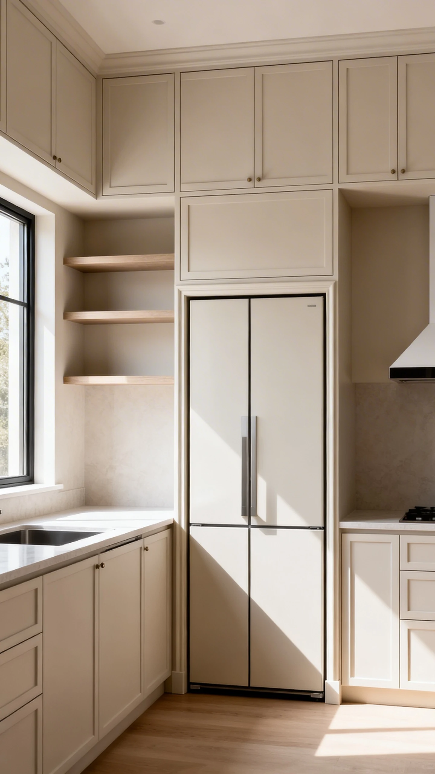
Add One “Custom” Cabinet Moment
This is where your kitchen goes from basic to “did you watch an HGTV montage before building this?”
- Create a tall pantry wall with floor-to-ceiling cabinets
- Frame the fridge with cabinets for a built-in look
- Add a faux “appliance garage” area with cabinets above a small counter nook
Even one of these makes your whole kitchen feel planned. People notice. They always notice.
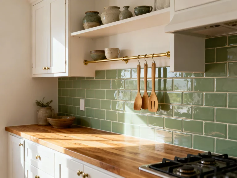
3. Add Open Shelves And Styled Clutter (Yes, Clutter)
Okay, here’s the truth: empty counters look sad. But counters covered in random stuff look chaotic. The sweet spot is styled clutter—the kind that whispers “I bake sometimes” without screaming “help, I hoard mugs.”
Open shelving is the easiest way to add personality, especially if your kitchen is modern and needs warmth.
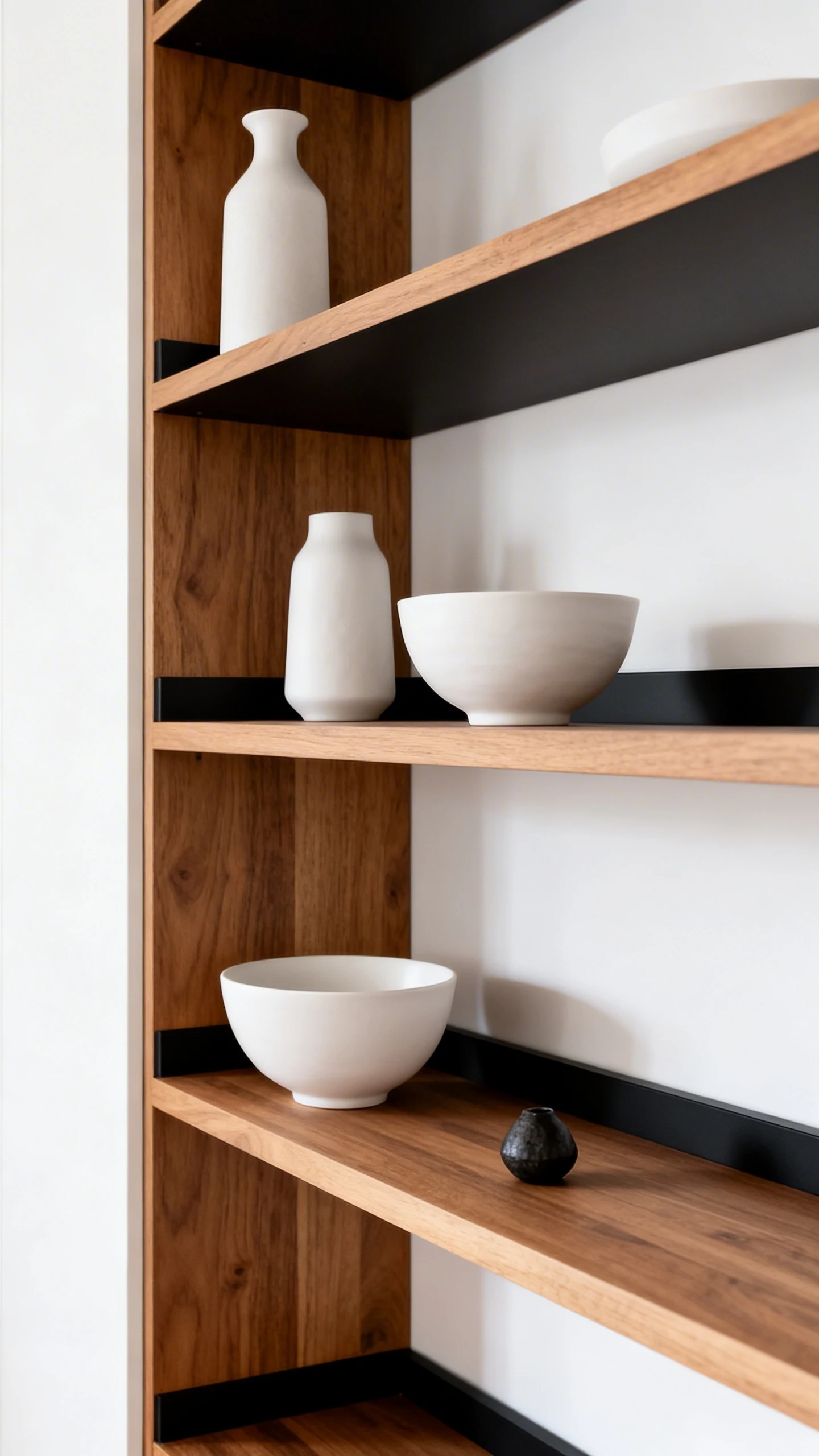
Open Shelves That Don’t Look Like A Storage Unit
Keep it curated. Think “Pinterest shelf,” not “garage sale leftovers.”
- Place two to three shelves max in one zone
- Mix heights slightly so it looks intentional
- Style with a repeating color palette (white, wood, black accents is a safe win)
If everything on the shelves is the same size, it’ll look weirdly robotic. Add variety—one tall item, a couple medium items, one small accent.
Counter Styling That Looks Lived-In (Not Messy)
This is the part where your kitchen starts feeling like someone actually uses it. Keep your “clutter” in clusters, not scattered everywhere.
- A cutting board leaned against the backsplash
- A utensil holder near the stove
- A coffee corner with mugs and a machine
- A tiny tray with oil bottles or jars for a chef-y vibe
And yes, you can absolutely create a coffee nook that makes visitors jealous. That’s basically a Bloxburg rite of passage.
4. Light It Like You Mean It (Goodbye, Flat Ceiling Glow)
If you do nothing else, please fix your lighting. Bad lighting makes even the prettiest bloxburg interior ideas kitchen feel like a school cafeteria.
Great lighting adds depth, drama, and that “expensive house tour” mood. Also, it hides the fact that you spent 45 minutes choosing the perfect cabinet color. Respect.
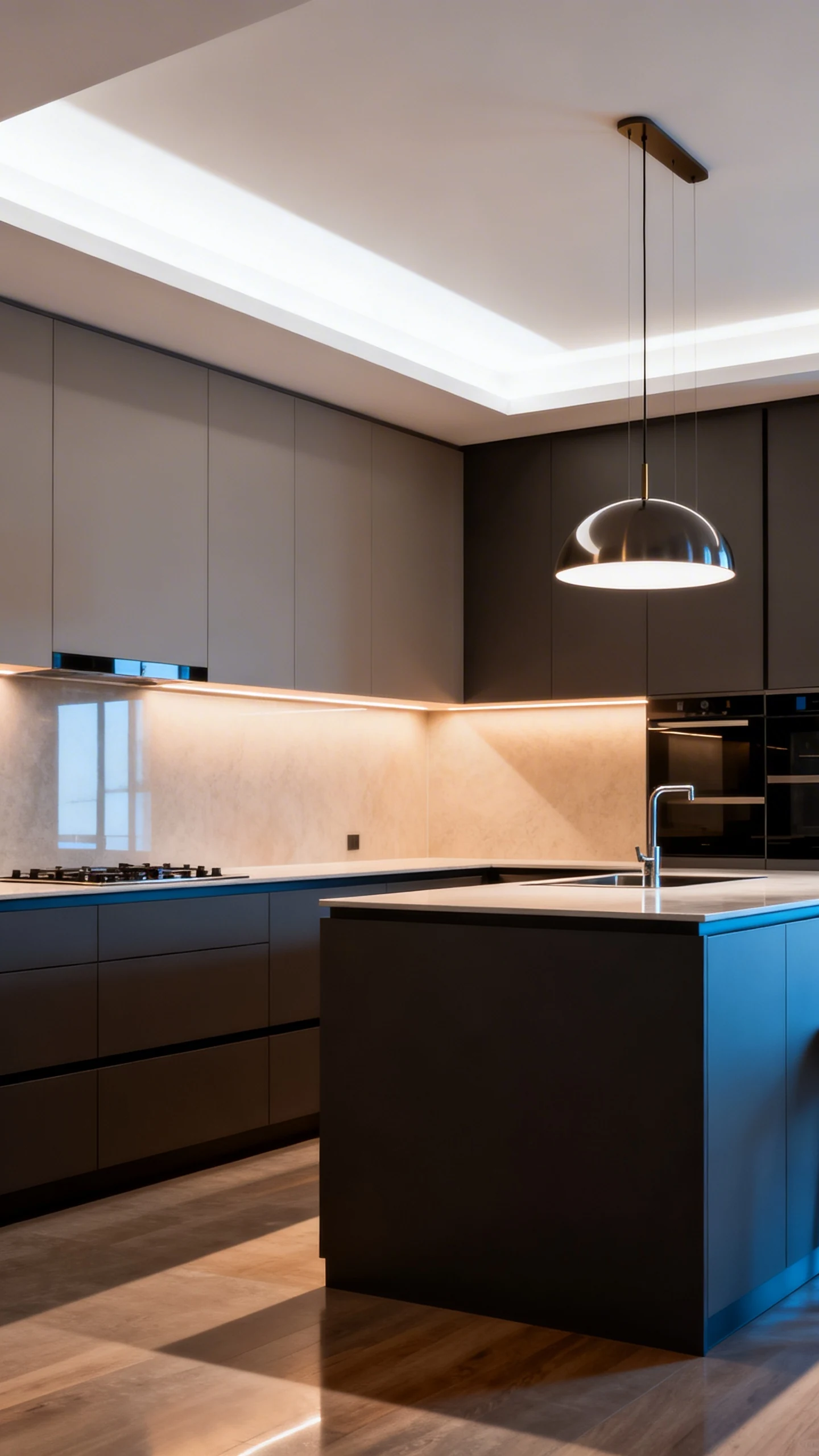
Layer Your Lighting (It’s Not Just A Fancy Phrase)
One ceiling light is the kitchen equivalent of wearing pajamas to a party. Technically allowed, but… come on.
- Overhead lighting for general brightness
- Pendant lights over the island or peninsula for style points
- Under-cabinet lighting or subtle wall lighting for glow and depth
Even if you can’t do true under-cabinet lights with your current setup, you can fake it with carefully placed small lights to create a soft wash along the backsplash.
Choose A Lighting Temperature And Stick To It
Mixing warm and cool lighting randomly can make your kitchen look off, like two different timelines collided.
- Warm lighting for cozy farmhouse, traditional, or neutral kitchens
- Cool lighting for sleek modern, monochrome, or ultra-minimal builds
FYI, warm lighting with wood tones is basically an instant “homey” cheat code.
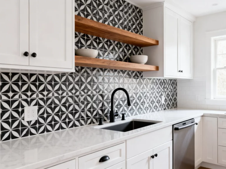
5. Upgrade The Details: Backsplash, Hardware, And One Wow Feature
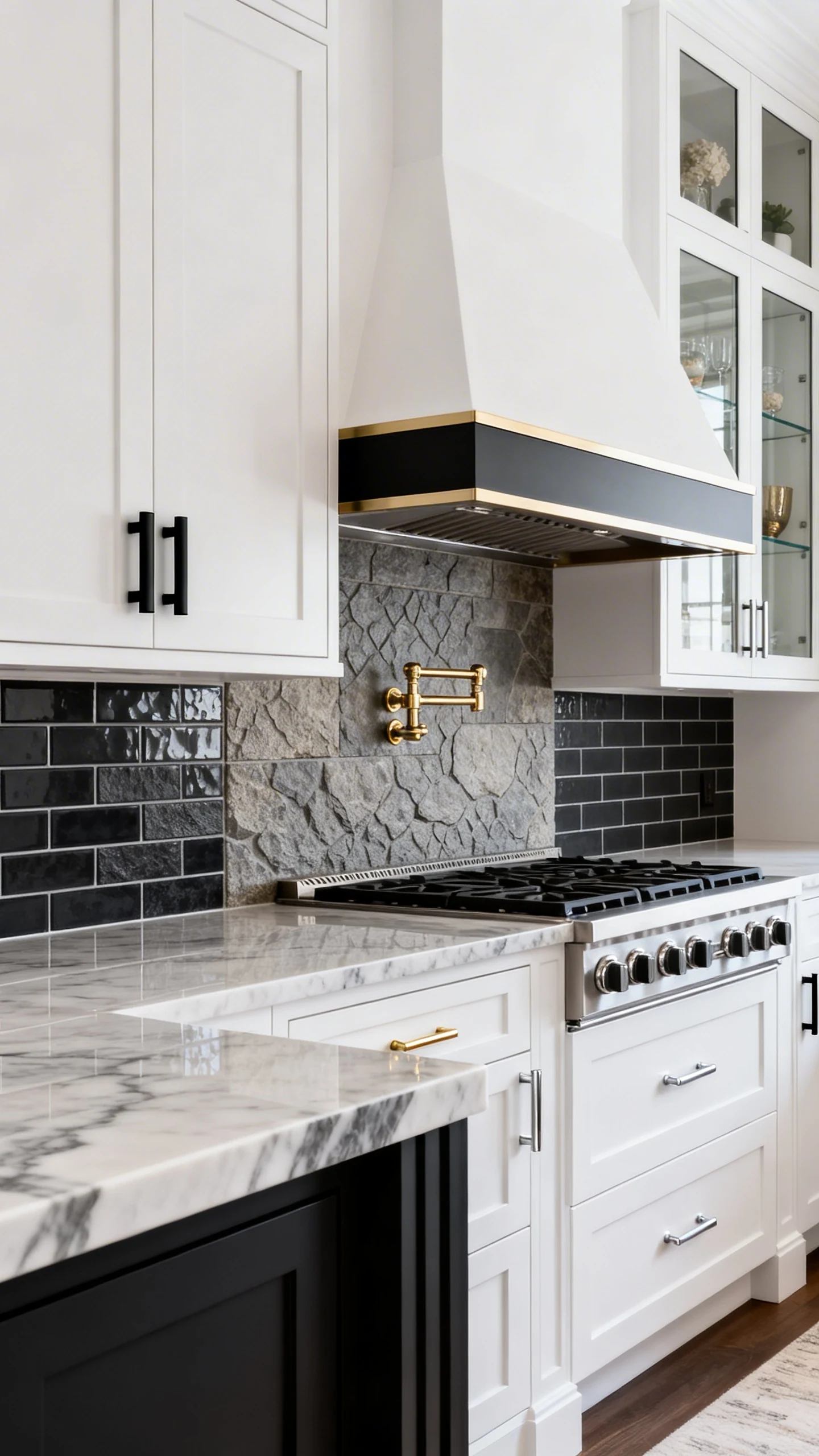
This is the finishing school section. The part that makes your kitchen look like you didn’t just build it… you designed it.
Details are where the “nice” kitchens become the “how is this even Bloxburg” kitchens.
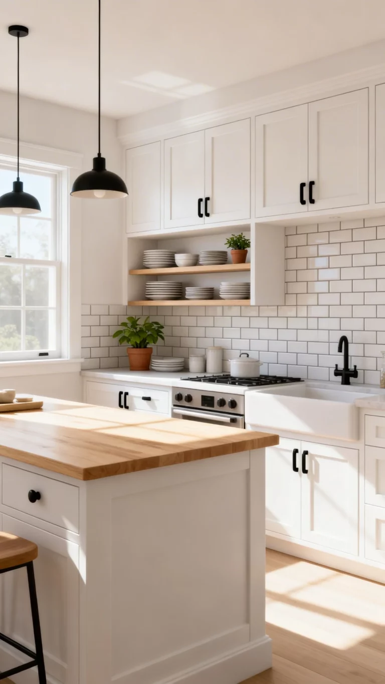
Backsplash = Instant Texture
A backsplash is a small area with huge impact. Without one, walls can feel blank and unfinished.
- Use subway tile for clean and timeless
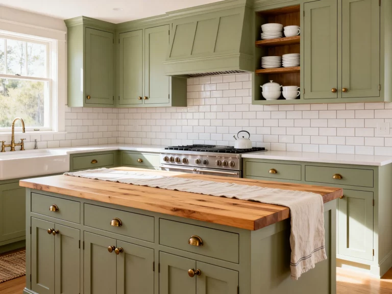
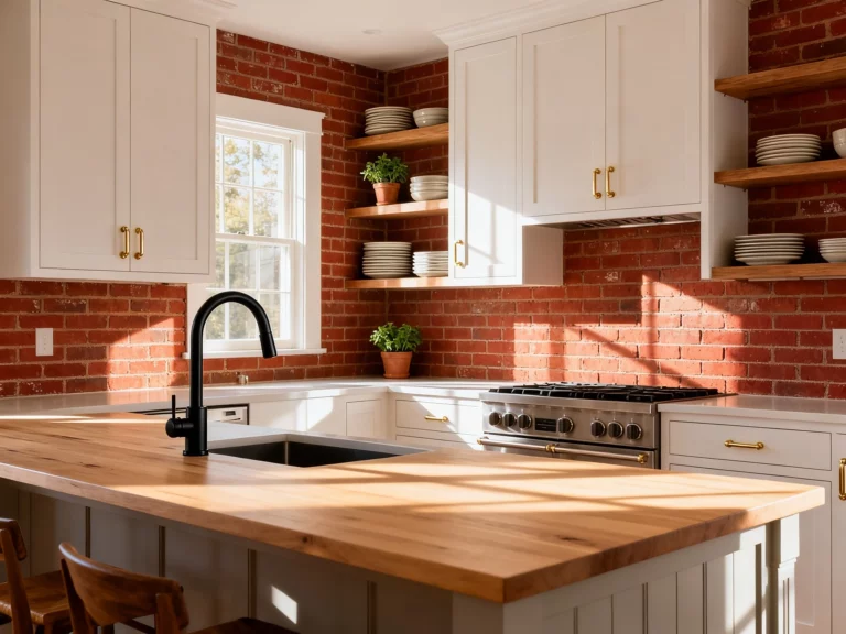
- Use stone texture for rustic or luxury builds
- Use a dark backsplash to add contrast in a white kitchen
Keep it consistent with your counters. If your counters are super busy, go simple on the backsplash. If your counters are plain, let the backsplash have its moment.
Hardware And Accents (The “Jewelry” Of The Kitchen)
Cabinet hardware is tiny but powerful. It’s like adding earrings to an outfit—suddenly everything looks more put together.
- Black hardware for modern, industrial, or high contrast
- Gold hardware for glam, cozy luxury, or warm neutrals
- Silver hardware for classic and safe coordination
Keep your metal finishes consistent across the kitchen if possible. Mixing metals can be cute, but it can also look accidental if you don’t do it intentionally.
Add One “Wow” Feature People Will Remember
This is your signature move. One feature that makes guests pause and zoom in.
- A statement range hood with a contrasting surround
- A waterfall island look using matching textures
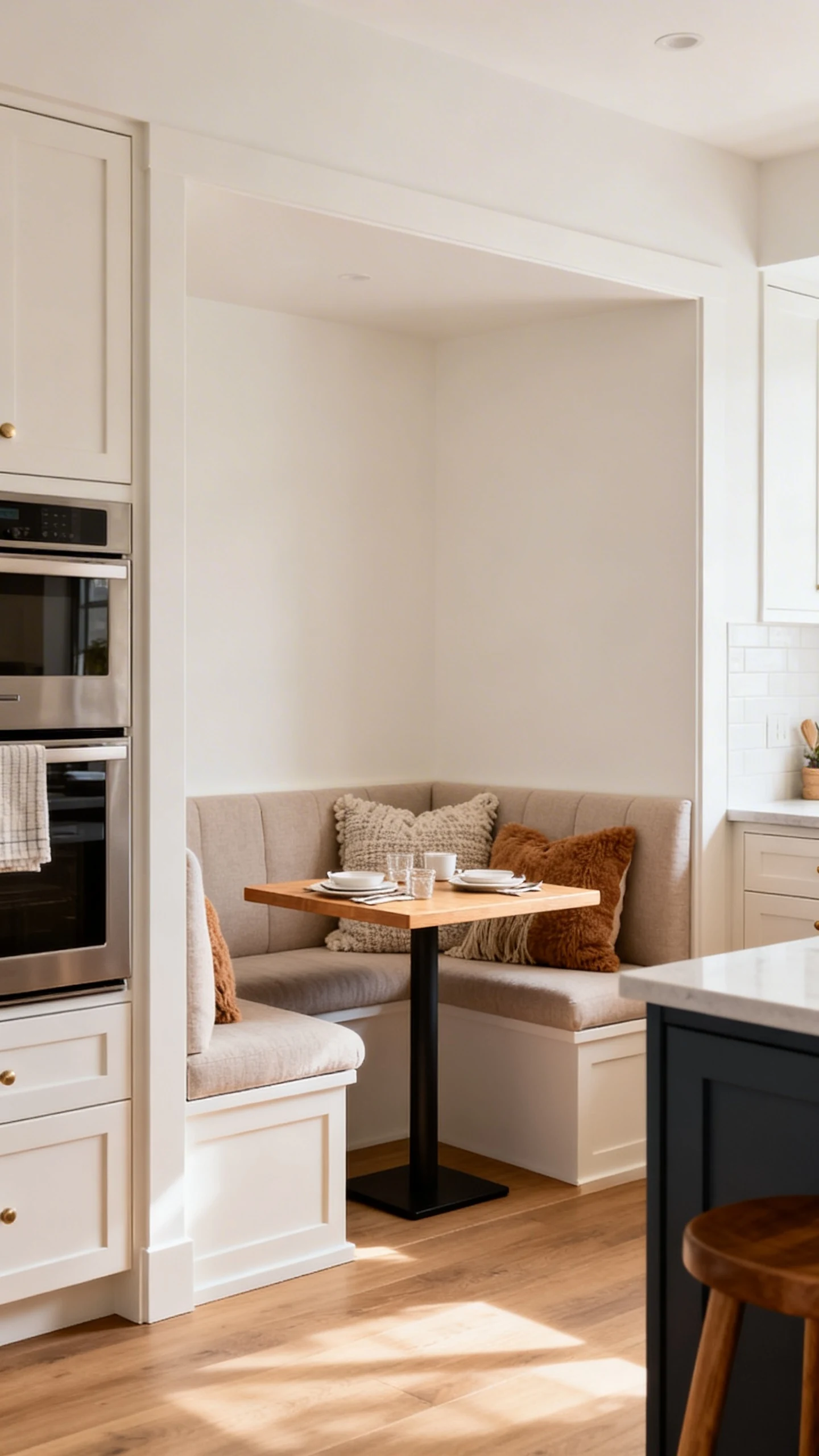
- A built-in breakfast nook with cushions and a cute table
- A glass-door cabinet section for a fancy display vibe
Just pick one. Not three. We’re going for “designer,” not “I couldn’t decide so I did everything.”
If you’re unsure, go with the breakfast nook. It’s cozy, it’s practical, and it makes your house feel like it has a life outside of cooking skill points.
You don’t need a mansion budget to build a jaw-dropping kitchen. Nail the layout, layer your cabinets, style your clutter, fix the lighting, and add one unforgettable detail.
Do those five things and your kitchen won’t just look good—it’ll look like the kind of place where someone casually whips up cookies while hosting a perfect little friend group hangout. And honestly? That’s the dream.